Pieter Neefs I Palette 3

Palette Analysis
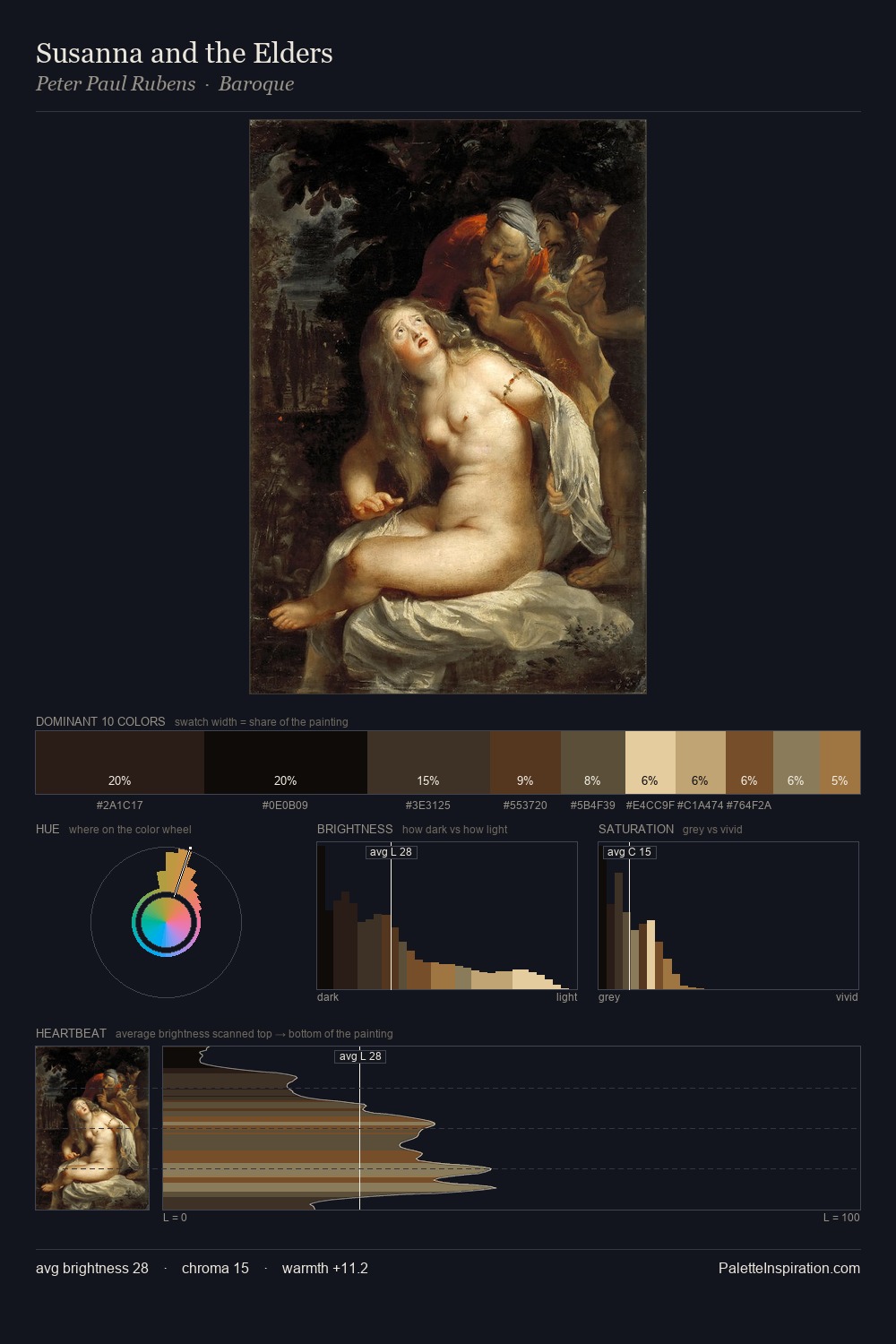
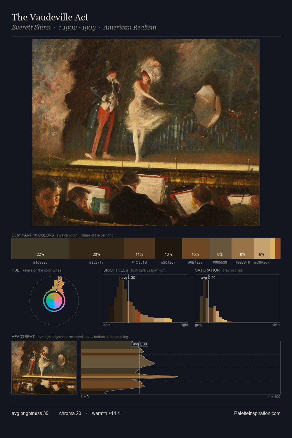
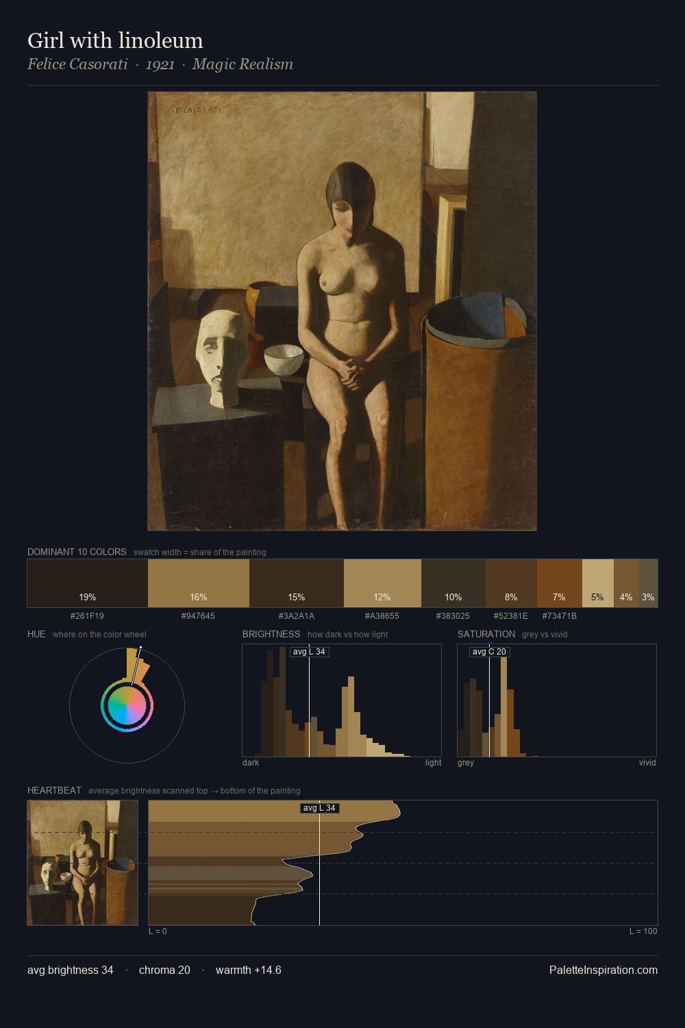
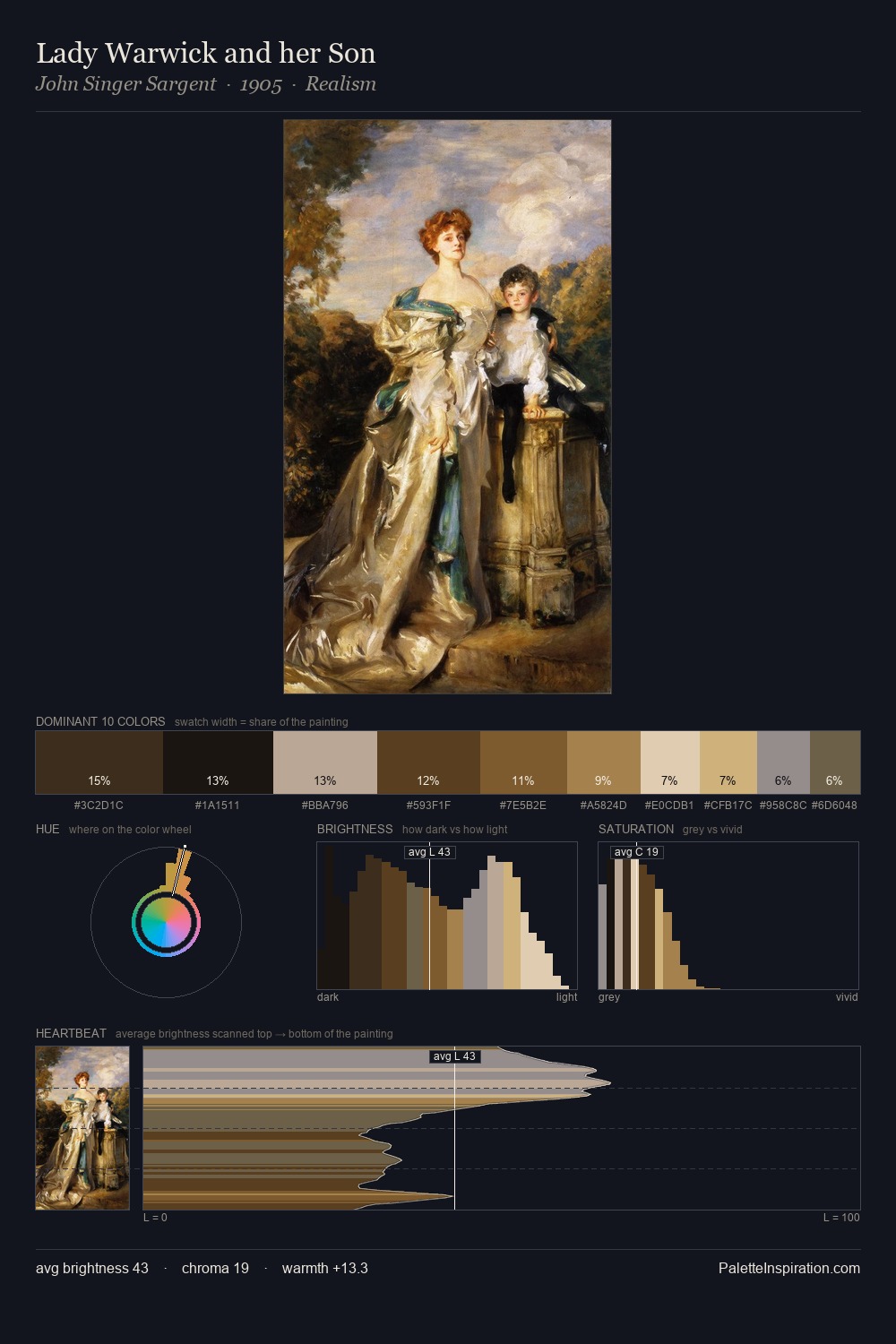
Low-key values are the structural spine of Pieter Neefs I, giving it gravity and atmosphere. Warmth dominates - the palette of Pieter Neefs I leans heavily on the yellow-orange-red arc of the colour wheel. Every colour is desaturated; the palette proceeds through near-neutrals and gently-coloured greys. At 29.9%, #120C06 functions less as a colour accent and more as a complete atmospheric environment. At 4.5%, #755530 carries the palette's sharpest chromatic charge: an accent that earns its place precisely because it is withheld. A value spread of 59 units gives the palette both depth and air - shadows are genuinely dark, lights genuinely light. This tonal restraint is characteristic of the Pieter Neefs I approach: colour serves light, not the reverse. In the context of Pieter Neefs I's full range of palettes, group 3 represents one movement in an ongoing chromatic dialogue.
Example use cases
- theater design
- jewelry brands
- tobacco-adjacent retail
- event branding
- film & entertainment
I Love This!
Copy, export, or download for your project