Pieter Neefs I Palette 1
Veiled Caramel
Veiled Partially obscured light - mid-dark with a hazy, scrim-filtered quality.
Caramel Warm mid-brown - the color of cooked sugar, smooth and amber-toned.

Palette Analysis
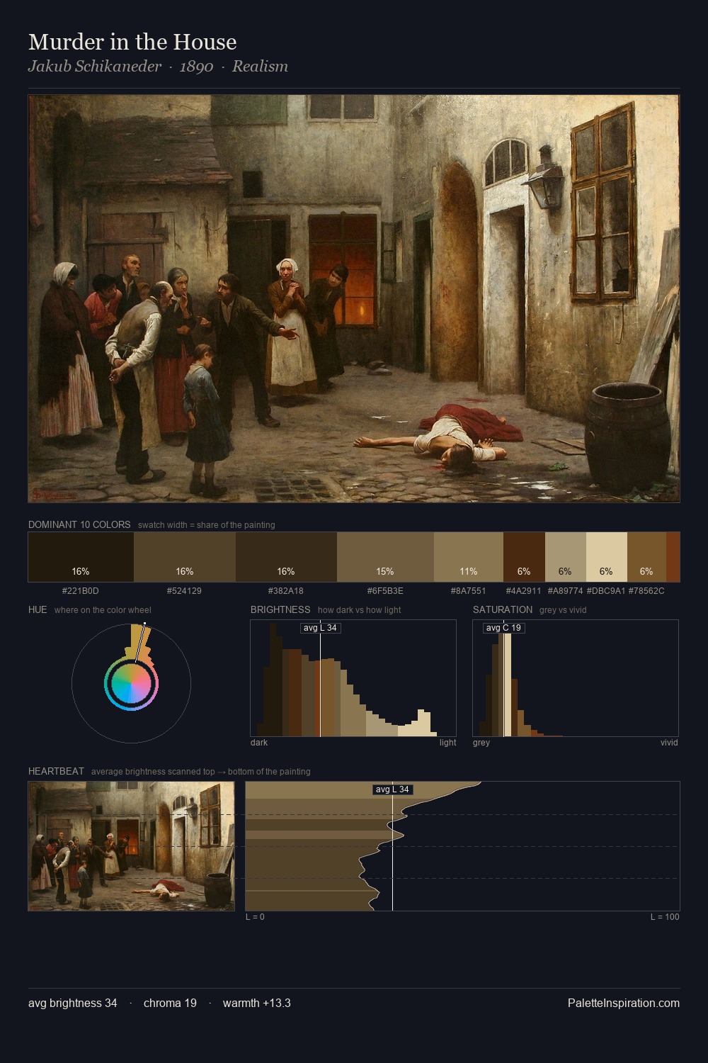
The value structure of Pieter Neefs I is mid-key: quiet, controlled, and cohesive. Temperature reads distinctly warm: the reds and earth tones from Pieter Neefs I carry the compositional weight. Chroma is kept low across all colours, producing the soft, enveloping quality that characterises tonal painting. The most saturated colour, #5A4325, is reserved to 10.0% of the surface, where it acts as a focal punctuation. The full value range is 64 units: broad enough to build convincing three-dimensional form. This is palette 1 of Pieter Neefs I's sequence - a single chapter in a chromatic story told across many works.
Example use cases
- theater design
- jewelry brands
- tobacco-adjacent retail
- event branding
- film & entertainment
I Love This!
Use This Palette
Copy, export, or download for your project
Copy, export, or download for your project
Copy:
Download:
Share: