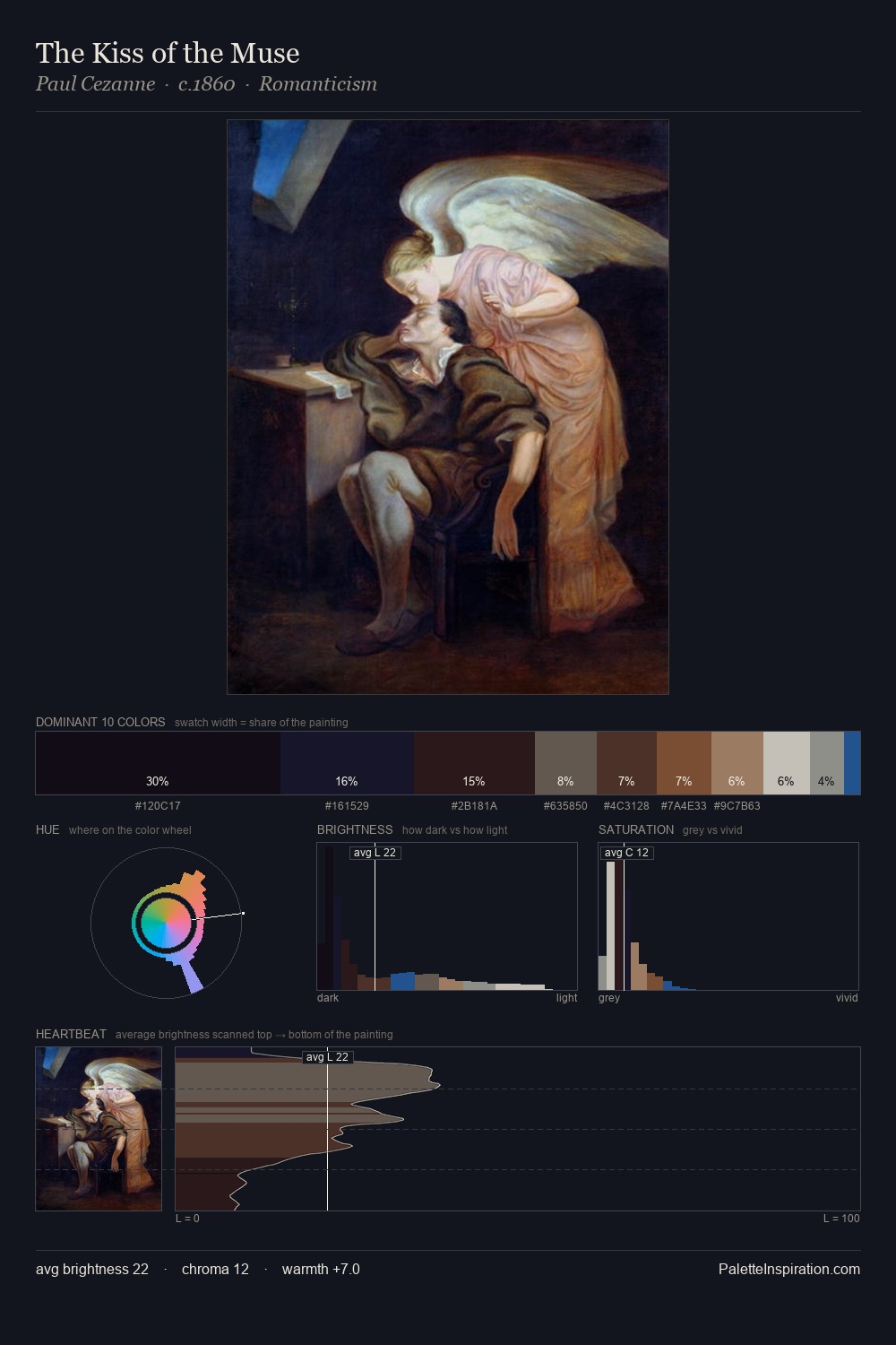
Pieter Alardus Haaxman Palette 3
Shadowed Sienna
Shadowed Low-key - values weighted toward shadow, the palette of dim interiors and overcast skies.
Sienna Warm red-brown earth - named after the Sienese pigment, a fundamental artist earth color.

Palette Analysis
Pieter Alardus Haaxman distributes its values across the middle register, creating harmony without high contrast. The palette achieves thermal balance - reds and blues, ochres and greens, each holding the other in check. Chroma is kept low across all colours, producing the soft, enveloping quality that characterises tonal painting. Only 7.3% is devoted to #3B2B20, yet that small allocation delivers the palette's entire chromatic tension. From deepest dark to palest light, the palette traverses 63 units of the value scale - a span that creates natural depth. This is palette 3 of Pieter Alardus Haaxman's sequence - a single chapter in a chromatic story told across many works.
Example use cases
- theater design
- jewelry brands
- tobacco-adjacent retail
- event branding
- film & entertainment
I Love This!
Use This Palette
Copy, export, or download for your project
Copy, export, or download for your project
Copy:
Download:
Share: