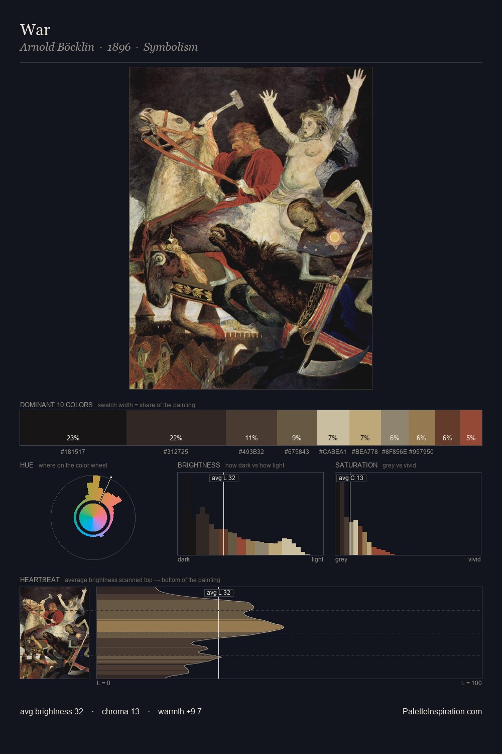
Pieter Aertsen Master Palette
Shadowed Gamboge
Shadowed Low-key - values weighted toward shadow, the palette of dim interiors and overcast skies.
Gamboge Deep golden yellow - a traditional warm pigment, rich amber-gold.

Palette Analysis
The value structure of Pieter Aertsen is mid-key: quiet, controlled, and cohesive. Warmth dominates - the palette of Pieter Aertsen leans heavily on the yellow-orange-red arc of the colour wheel. All colours lean toward grey, building depth through value rather than colour punch. The highest-chroma note - #C6B499 - appears at just 2.0%, deployed as a precision accent against the quieter ground. 62 units of value range underpin the palette's structural clarity: the eye always knows where light falls. This is the light Pieter Aertsen preferred, made measurable.
Example use cases
- theater design
- jewelry brands
- tobacco-adjacent retail
- event branding
- film & entertainment
I Love This!
Use This Palette
Copy, export, or download for your project
Copy, export, or download for your project
Copy:
Download:
Share: