Pieter Aertsen Palette 2
Shadowed Gamboge
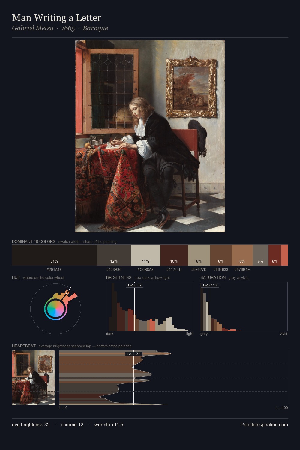
Shadowed Low-key - values weighted toward shadow, the palette of dim interiors and overcast skies.
Gamboge Deep golden yellow - a traditional warm pigment, rich amber-gold.

Palette Analysis
Pieter Aertsen occupies the comfortable middle of the value scale, avoiding both extremes to hold the eye in a sustained middle grey. Yellow, ochre, sienna: warm hues that Pieter Aertsen deploys as the palette's primary energy. Chroma is kept low across all colours, producing the soft, enveloping quality that characterises tonal painting. At 7.4%, #7D422F carries the palette's sharpest chromatic charge: an accent that earns its place precisely because it is withheld. At 67 units of value range, the palette has the tonal breadth to sustain complex spatial readings. In the context of Pieter Aertsen's full range of palettes, group 2 represents one movement in an ongoing chromatic dialogue.
Example use cases
- theater design
- jewelry brands
- tobacco-adjacent retail
- event branding
- film & entertainment
I Love This!
Use This Palette
Copy, export, or download for your project
Copy, export, or download for your project
Copy:
Download:
Share: