Pieter Aertsen Palette 3
Shadowed Bister
Shadowed Low-key - values weighted toward shadow, the palette of dim interiors and overcast skies.
Bister Dark warm brown - a traditional ink and wash pigment made from wood soot.

Palette Analysis
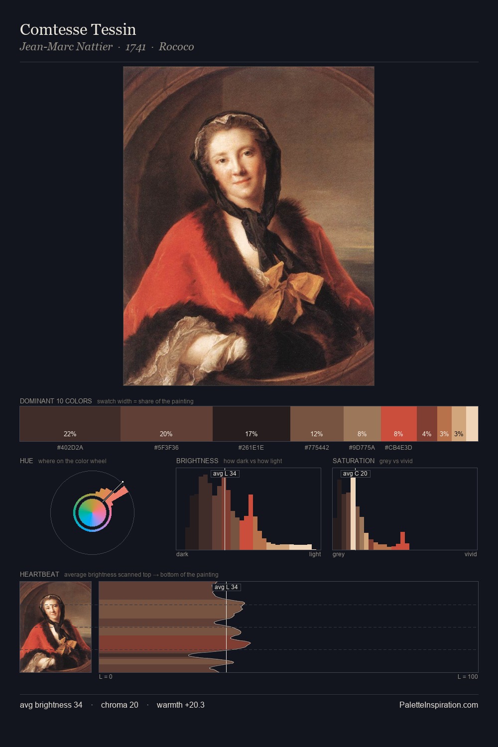
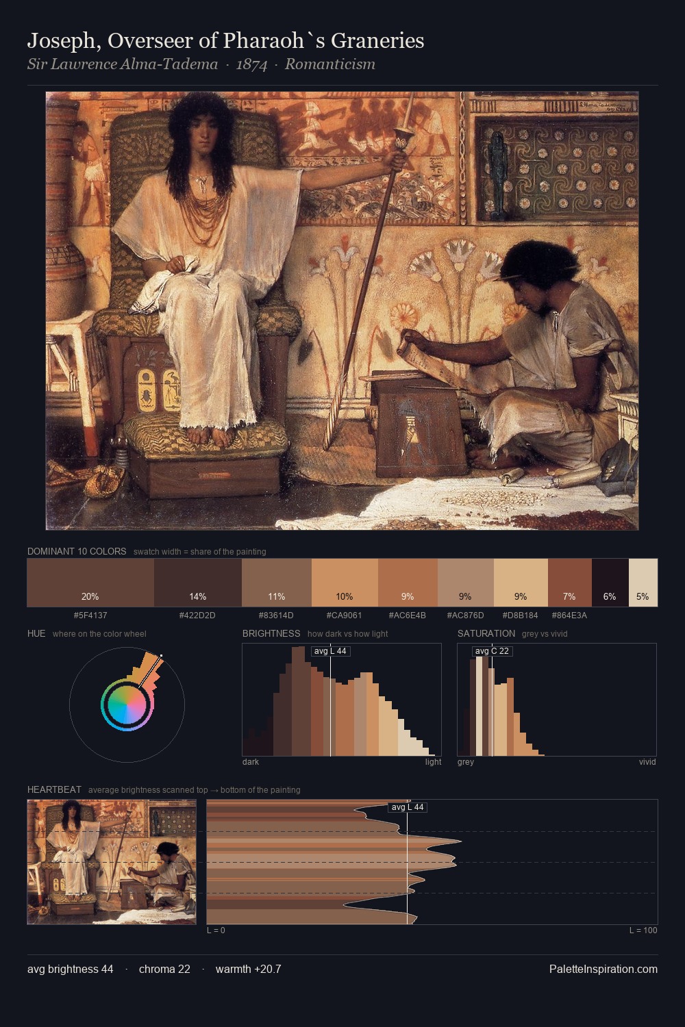
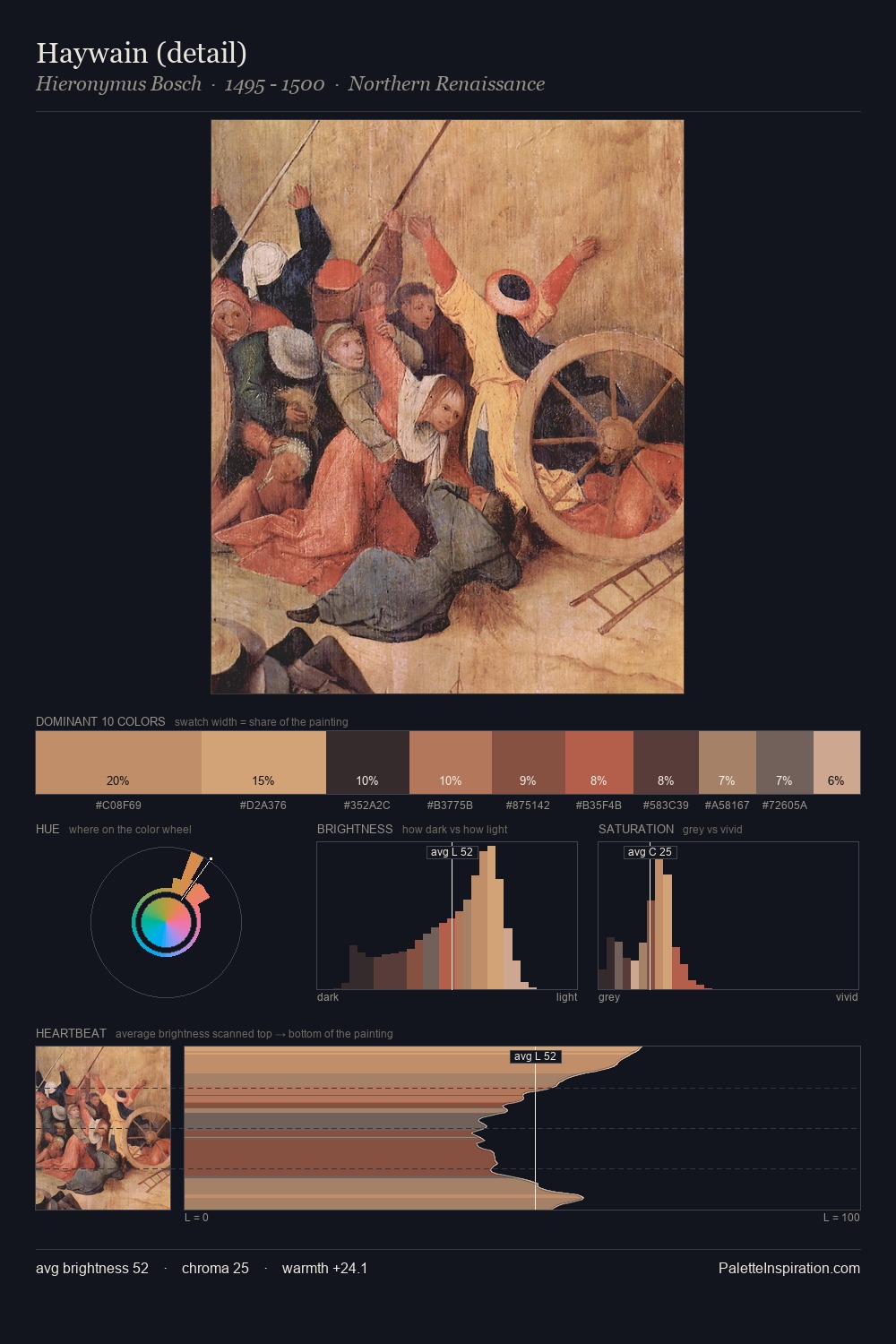
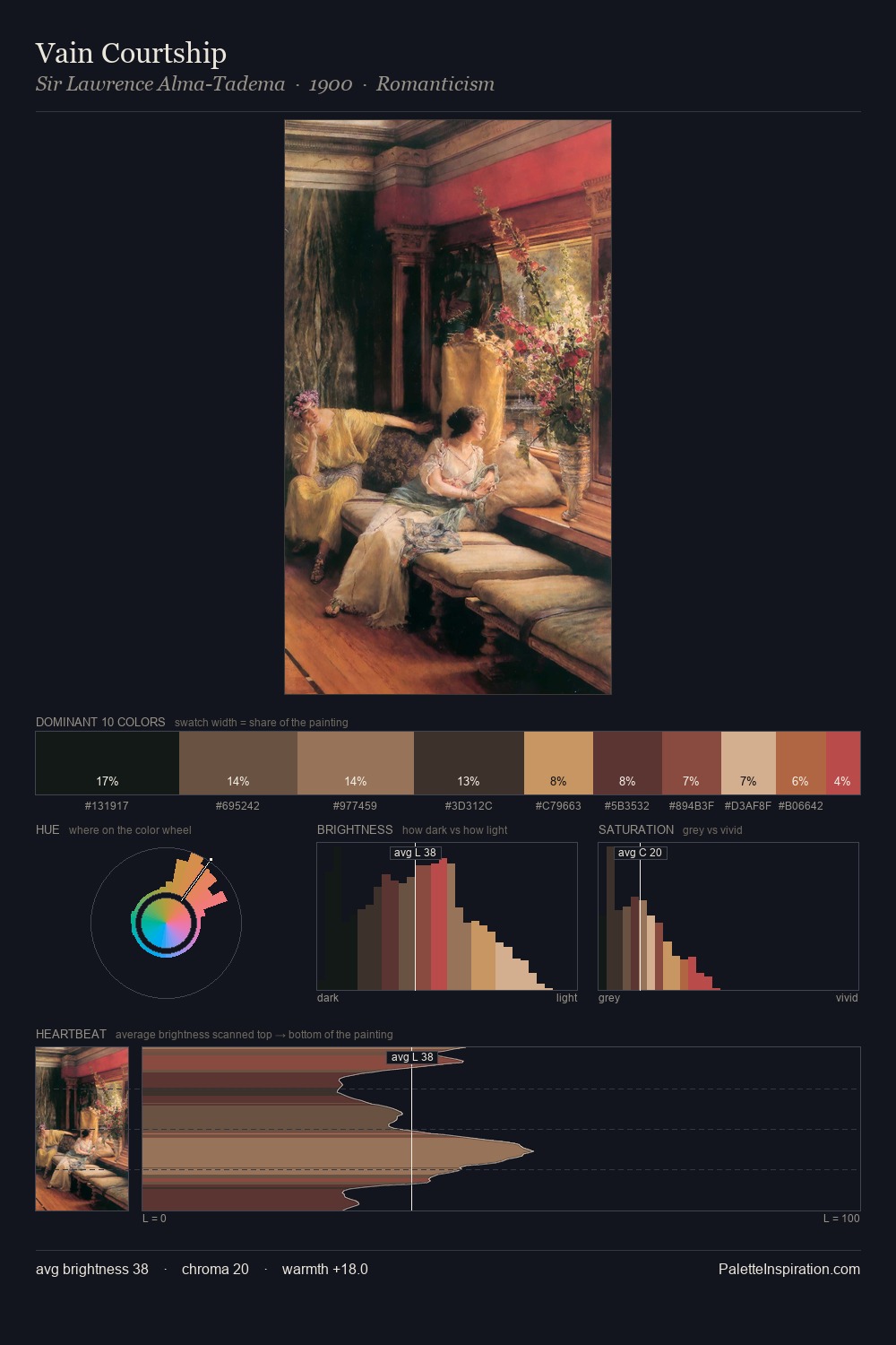
Mid-key values give Pieter Aertsen its characteristic quietness - nothing blazes, nothing disappears. Pieter Aertsen orchestrates warmth above all else - reds, ambers, and siennas take the lead. Chroma is kept low across all colours, producing the soft, enveloping quality that characterises tonal painting. The highest-chroma note - #B16F55 - appears at just 5.5%, deployed as a precision accent against the quieter ground. At 55 units of value range, the palette has the tonal breadth to sustain complex spatial readings. Palette 3 sits within the larger chromatic argument that Pieter Aertsen's complete body of work advances.
Example use cases
- theater design
- jewelry brands
- tobacco-adjacent retail
- event branding
- film & entertainment
I Love This!
Use This Palette
Copy, export, or download for your project
Copy, export, or download for your project
Copy:
Download:
Share: