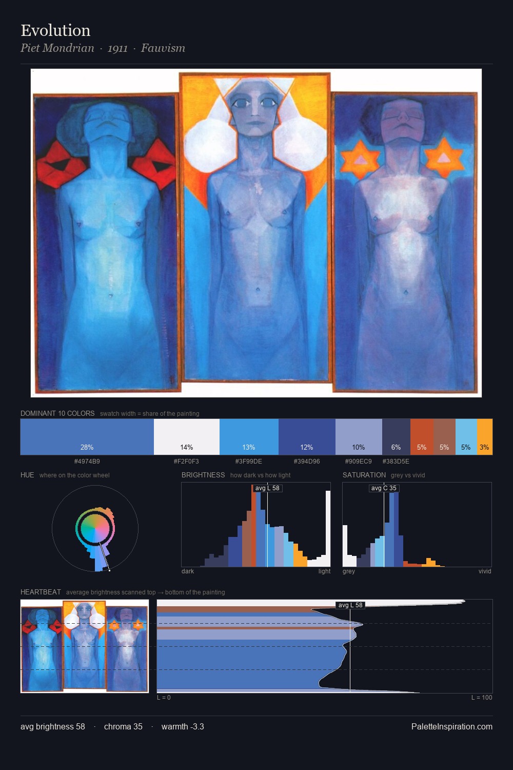
Piet Mondrian Palette 8
Dimmed Flint
Dimmed Moderate shadow - values pulled toward mid-dark, as if a light source has been reduced.
Flint Cool dark gray with a blue edge - the color of struck flint, hard and mineral.

Palette Analysis
Piet Mondrian keeps values measured and balanced, a hallmark of tonal restraint. Piet Mondrian tilts toward cool - blues and silver-greys carry the structural weight. Mid-range chroma keeps the palette grounded - colourful but not strident. The most saturated colour, #83ABD9, is reserved to 7.9% of the surface, where it acts as a focal punctuation. 55 units of value range underpin the palette's structural clarity: the eye always knows where light falls. The palette has the character of outdoor light: cool, mid-bright, with colour rendered faithfully rather than expressively. This is palette 8 of Piet Mondrian's sequence - a single chapter in a chromatic story told across many works.
Example use cases
- publishing
- corporate identity
- consumer apps
- hospitality
- design agencies
I Love This!
Use This Palette
Copy, export, or download for your project
Copy, export, or download for your project
Copy:
Download:
Share: