Pierre-Paul Prud'hon Palette 8

Palette Analysis
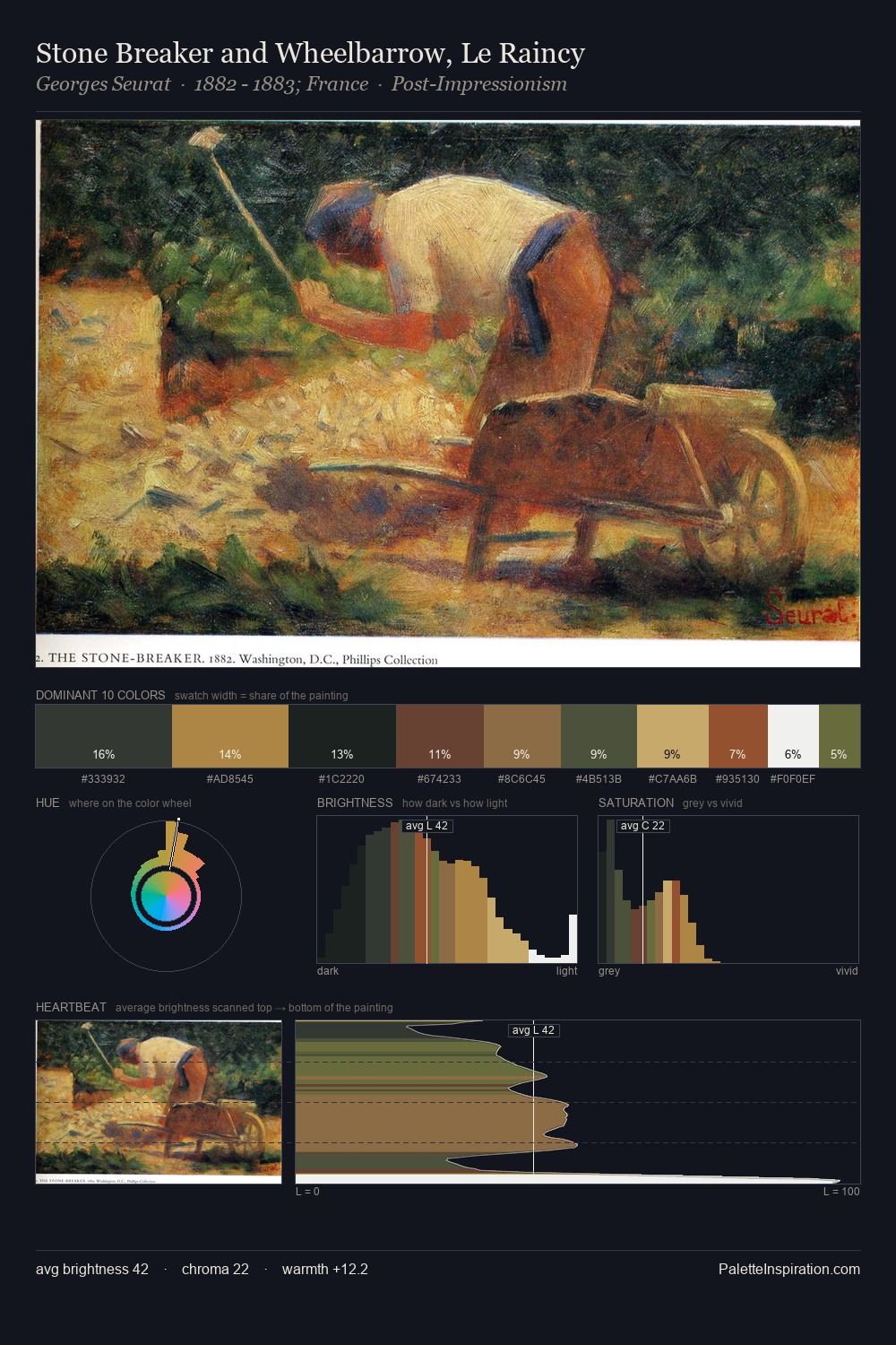
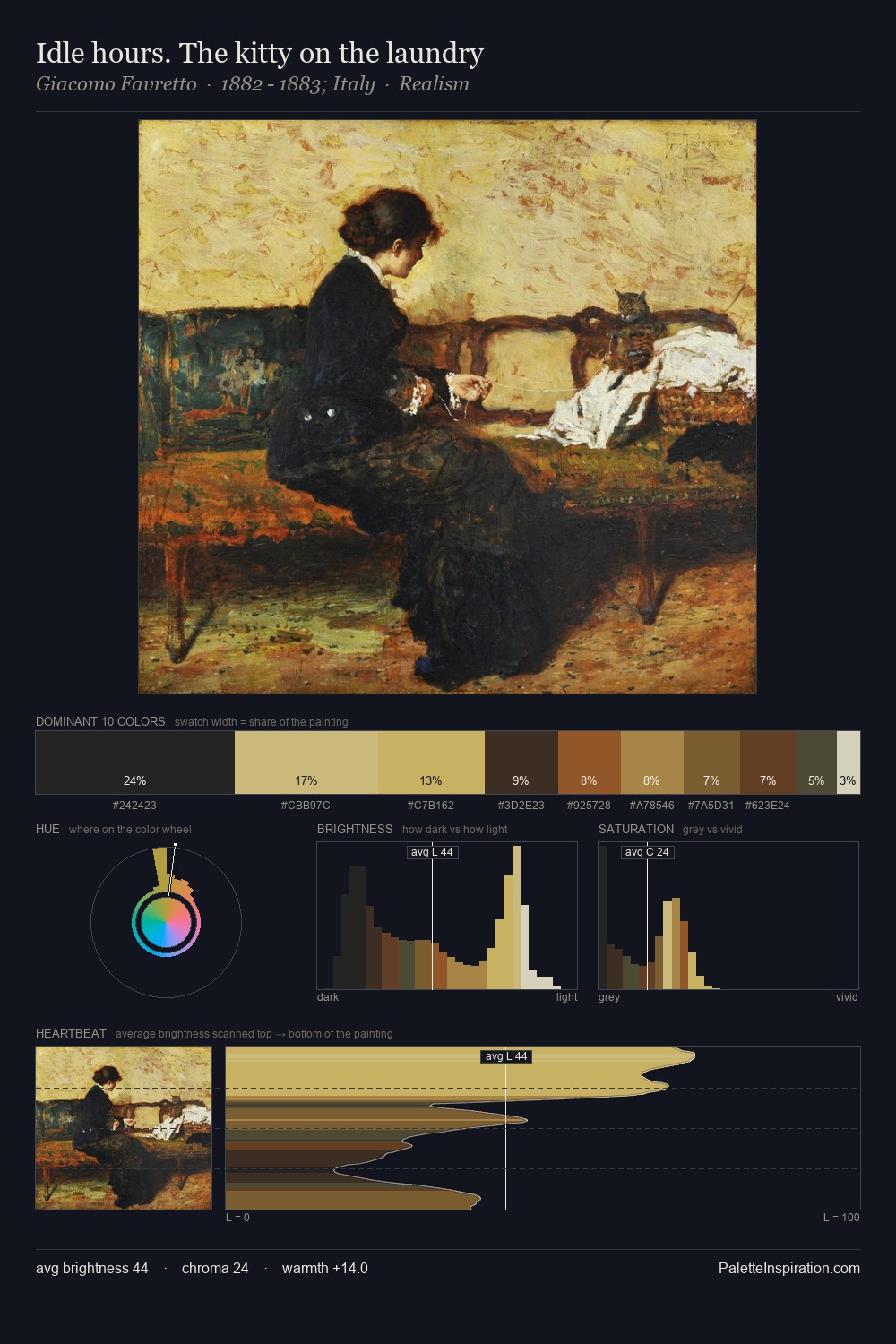
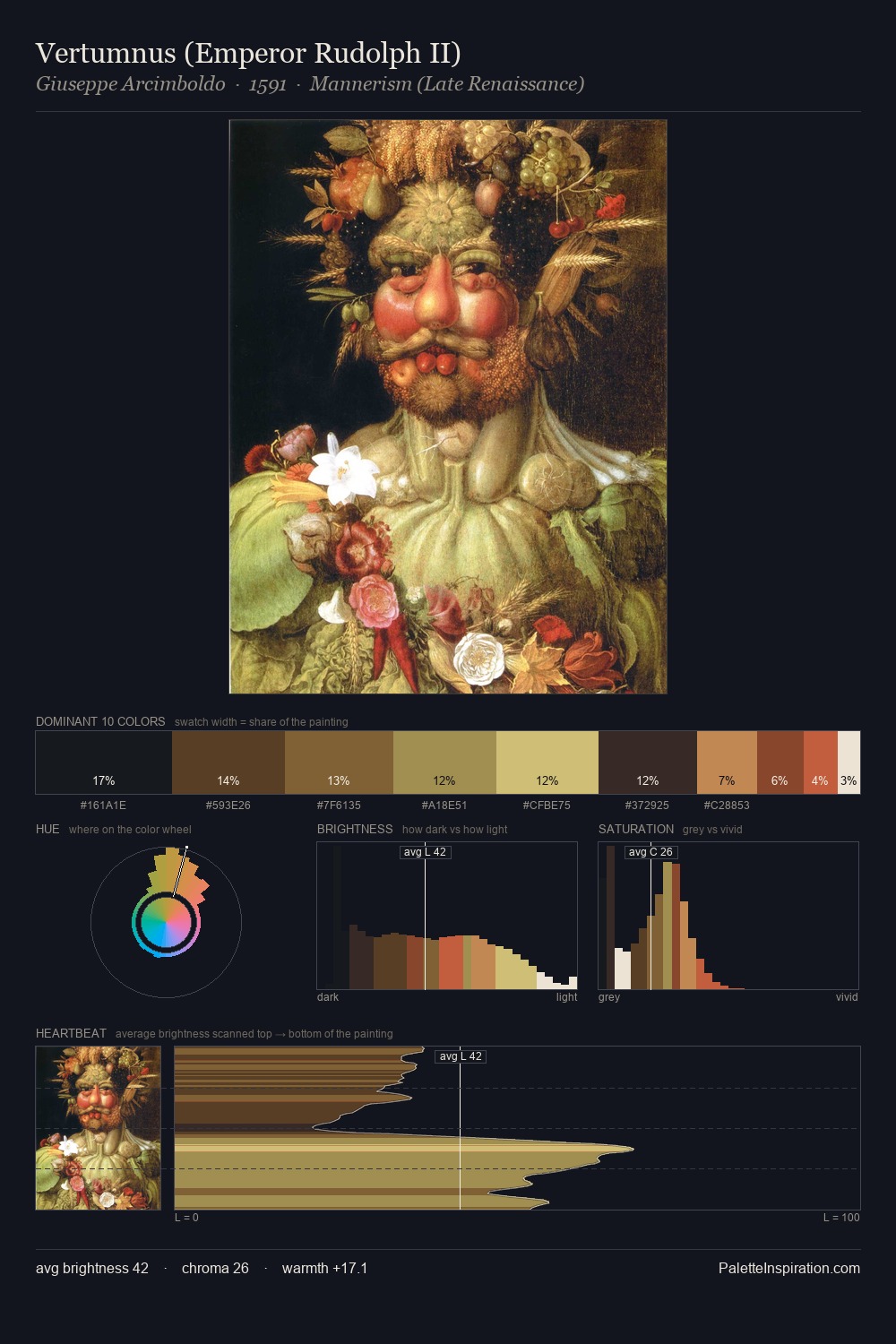
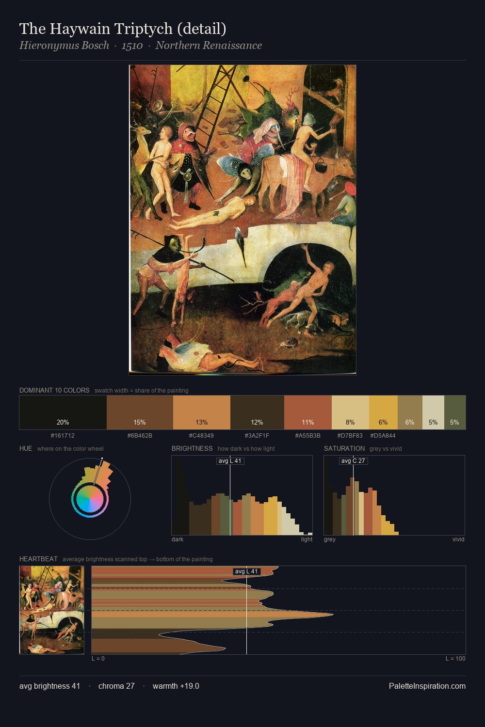
Pierre-Paul Prud'hon distributes its values across the middle register, creating harmony without high contrast. Warm and cool are kept in productive tension, creating the kind of chromatic harmony that sustains the eye. A restrained, mid-chroma palette: every hue is present and legible, but nothing shouts. Pierre-Paul Prud'hon gives 26.2% of the composition to a single #8B6C3A - a decisive chromatic anchor. The most saturated colour, #B78042, is reserved to 4.6% of the surface, where it acts as a focal punctuation. A value spread of 58 units gives the palette both depth and air - shadows are genuinely dark, lights genuinely light. The palette reads as an Impressionist one - light-biased, chromatically direct, and built on temperature contrast rather than value opposition. Palette 8 sits within the larger chromatic argument that Pierre-Paul Prud'hon's complete body of work advances.
Example use cases
- music labels
- luxury hospitality
- editorial photography
- leather goods
- premium streaming
I Love This!
Copy, export, or download for your project