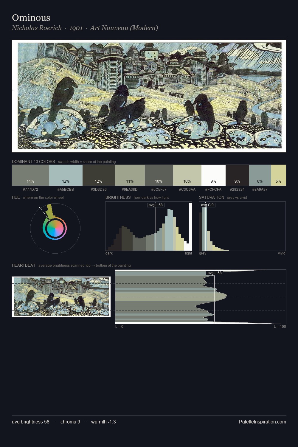
Pierre-Paul Prud'hon Palette 6

Palette Analysis
Pierre-Paul Prud'hon distributes its values across the middle register, creating harmony without high contrast. Cool hues prevail: blues, greens, and greys anchor the palette's emotional temperature. Chroma is kept low across all colours, producing the soft, enveloping quality that characterises tonal painting. The saturated accent, #A8BBC5, registers at 10.8% - sparse enough to feel like a deliberate surprise. At 51 units across the value scale, the palette keeps contrast readable without letting it dominate. The mid-to-high key, cool bias, and moderate chroma point to outdoor observation - sky and diffused daylight as the dominant light source. This is palette 6 of Pierre-Paul Prud'hon's sequence - a single chapter in a chromatic story told across many works.
Example use cases
- exhibition design
- foundation branding
- estate management
- art education
- museums & galleries
I Love This!
Copy, export, or download for your project