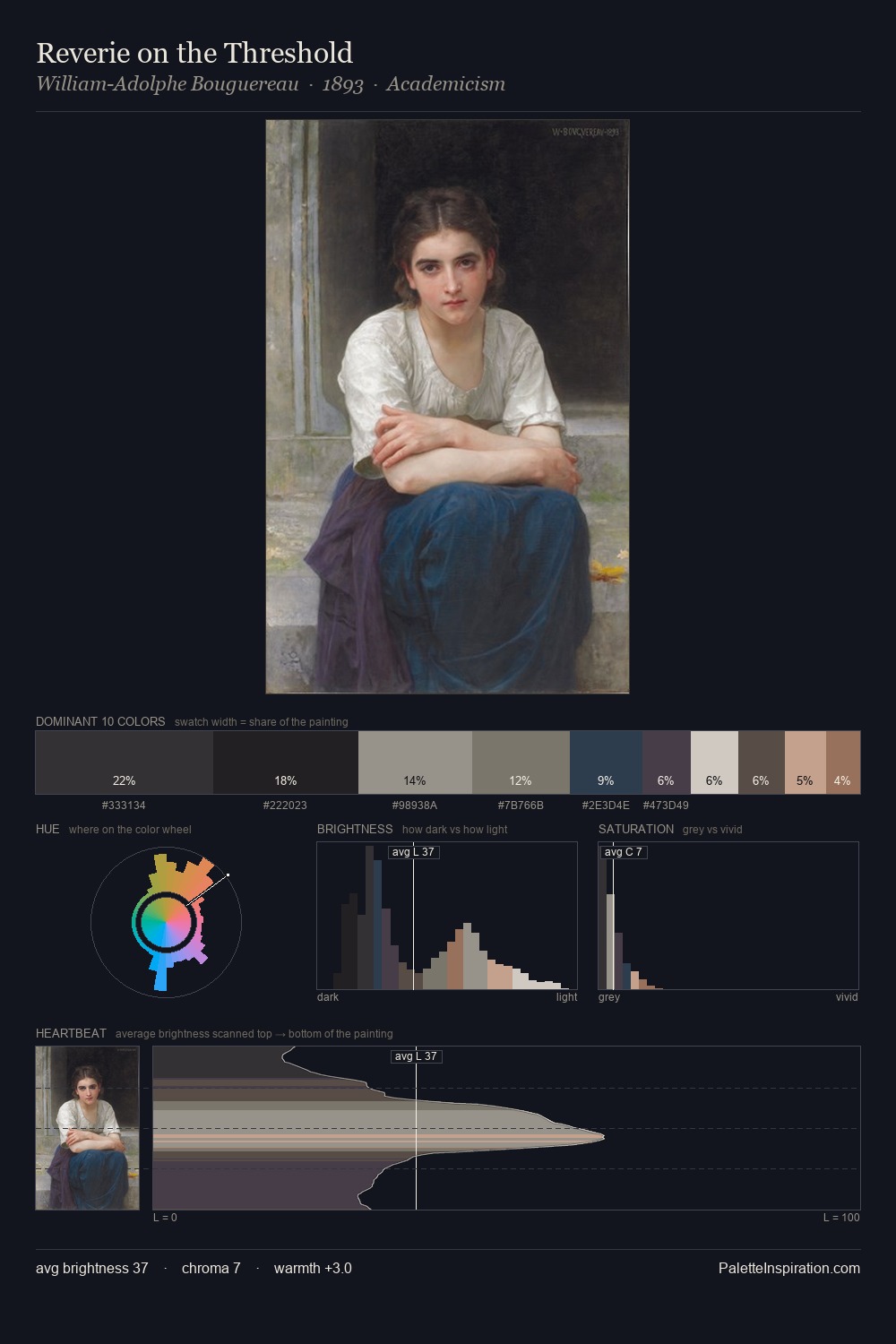
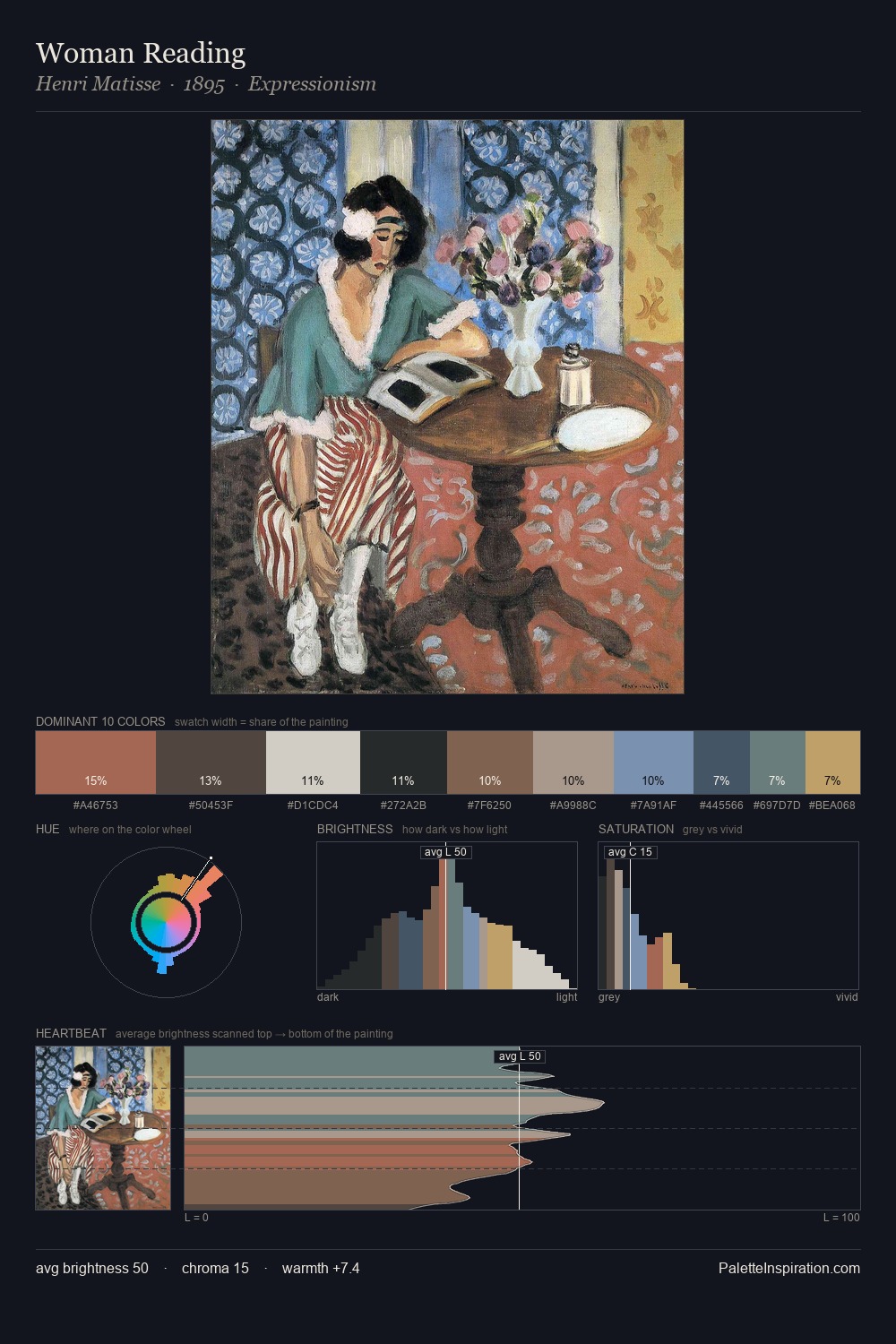
Pierre-Marie Beyle Palette 2

Palette Analysis
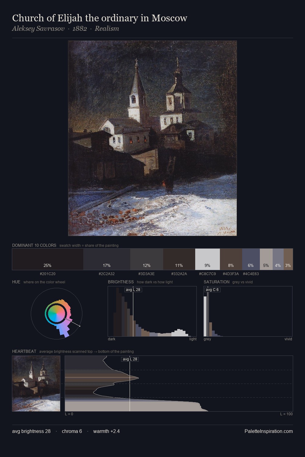
Pierre-Marie Beyle is high in key: pale, luminous, and filled with optical air. Pierre-Marie Beyle builds on cool foundations: the palette favours the blue-cyan-green arc. All colours lean toward grey, building depth through value rather than colour punch. #C3C9D2 at 27.5% of the palette: an overwhelming presence that pulls all other colours into its gravitational field. Only 2.3% is devoted to #38465C, yet that small allocation delivers the palette's entire chromatic tension. At 60 units of value range, the palette has the tonal breadth to sustain complex spatial readings. High luminosity and cool temperature suggest the plein-air condition: unfiltered daylight and open sky. Pierre-Marie Beyle's palette 2 carries its own internal logic while remaining in conversation with the artist's broader colour intelligence.
Example use cases
- florist branding
- event design
- real estate
- jewelry retail
- hospitality branding
I Love This!
Copy, export, or download for your project