Pierre Duval Le Camus Palette 5

Palette Analysis
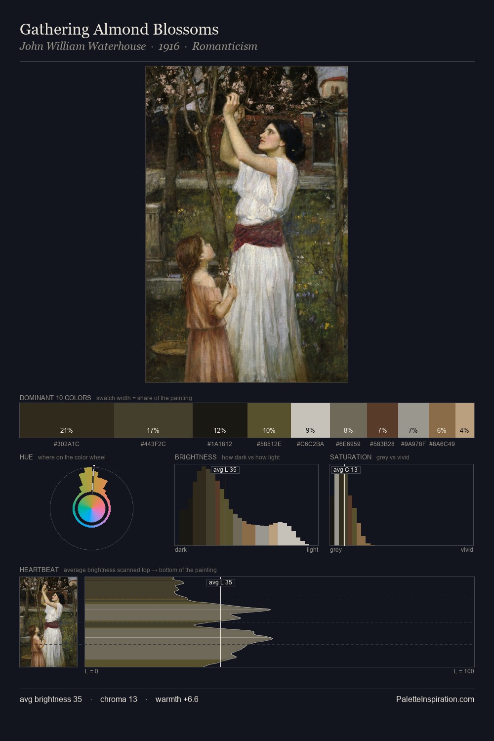
Pierre Duval Le Camus distributes its values across the middle register, creating harmony without high contrast. Temperature is cool-dominant, with blue and green families claiming the largest areas. Muted throughout, the palette achieves its effects through value and temperature rather than chromatic force. The dominant colour, #DDDEDC, takes 35.7% of the total area, establishing the overall mood before any other hue is introduced. The saturated accent, #A08457, registers at 3.8% - sparse enough to feel like a deliberate surprise. 70 units of value range underpin the palette's structural clarity: the eye always knows where light falls. The mid-to-high key, cool bias, and moderate chroma point to outdoor observation - sky and diffused daylight as the dominant light source. Pierre Duval Le Camus's palette 5 carries its own internal logic while remaining in conversation with the artist's broader colour intelligence.
Example use cases
- exhibition design
- foundation branding
- estate management
- art education
- museums & galleries
I Love This!
Copy, export, or download for your project