Piero di Cosimo Palette 2

Palette Analysis
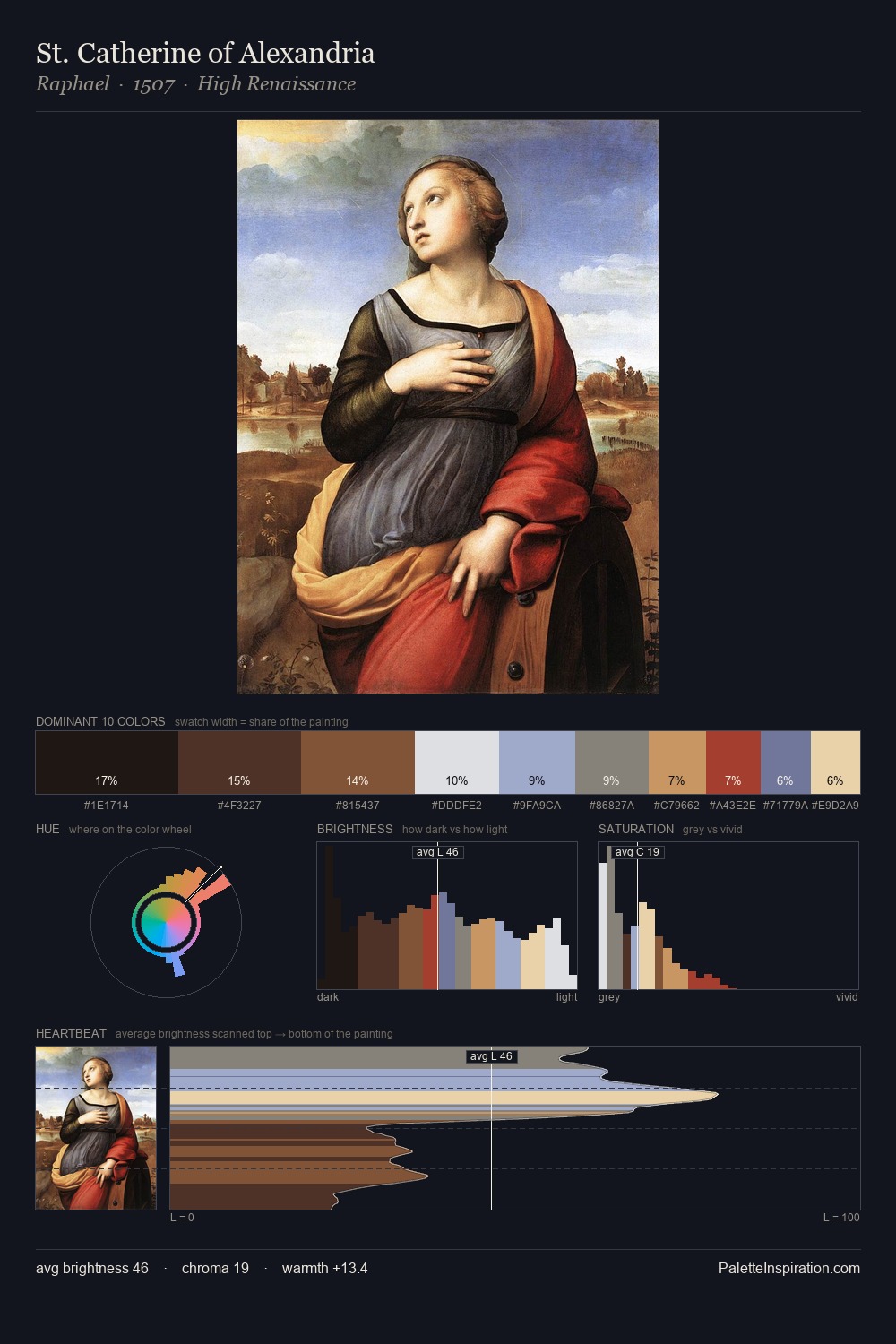
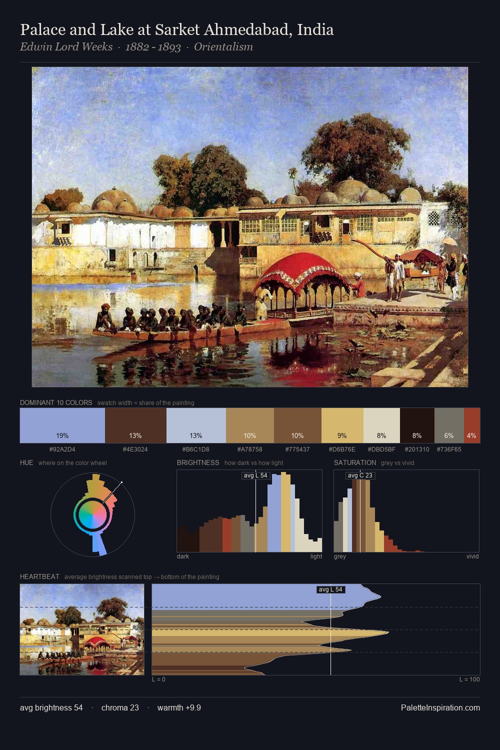
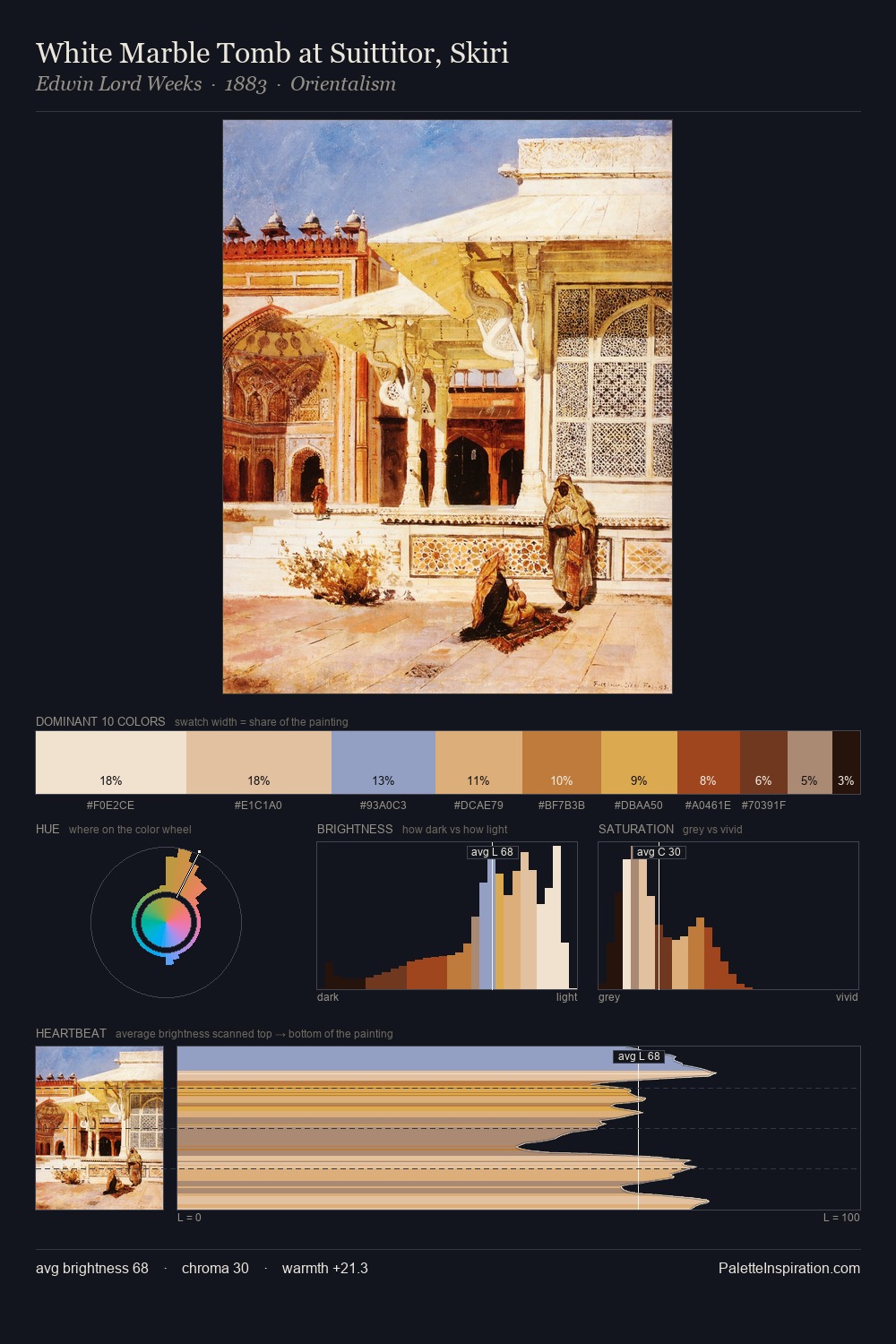
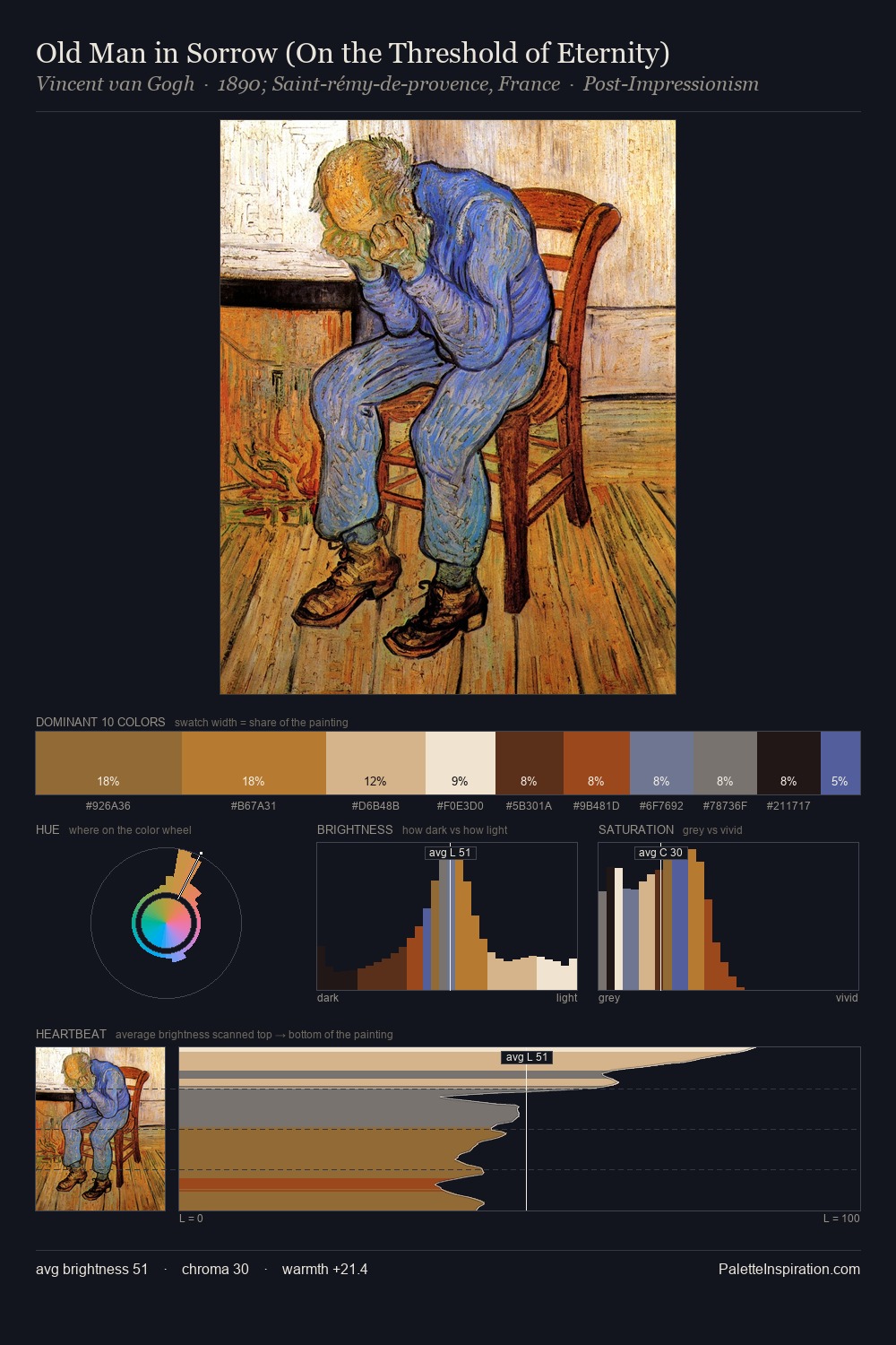
Piero di Cosimo sits in the centre of the value range, lending the palette a sense of even, sustained light. Temperature is cool-dominant, with blue and green families claiming the largest areas. Chroma is moderate: colours carry enough saturation to be read as colour, but the palette stops well short of garish intensity. #EDE0B6 functions as the palette's exclamation mark: highest chroma, lowest percentage (3.8%). From deepest dark to palest light, the palette traverses 74 units of the value scale - a span that creates natural depth. The mid-to-high key, cool bias, and moderate chroma point to outdoor observation - sky and diffused daylight as the dominant light source. Palette 2 sits within the larger chromatic argument that Piero di Cosimo's complete body of work advances.
Example use cases
- theater design
- jewelry brands
- tobacco-adjacent retail
- event branding
- film & entertainment
I Love This!
Copy, export, or download for your project