Piero della Francesca Master Palette
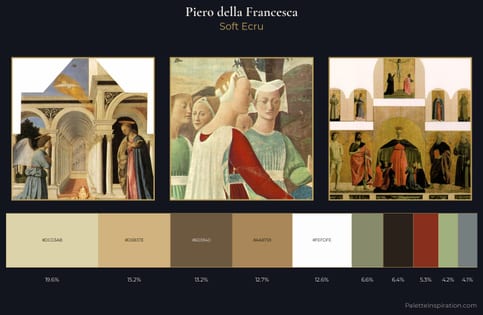
Muted Gamboge
Muted Deliberately desaturated - chroma pulled toward gray, the restraint of tonal painting.
Gamboge Deep golden yellow - a traditional warm pigment, rich amber-gold.
Palette Analysis
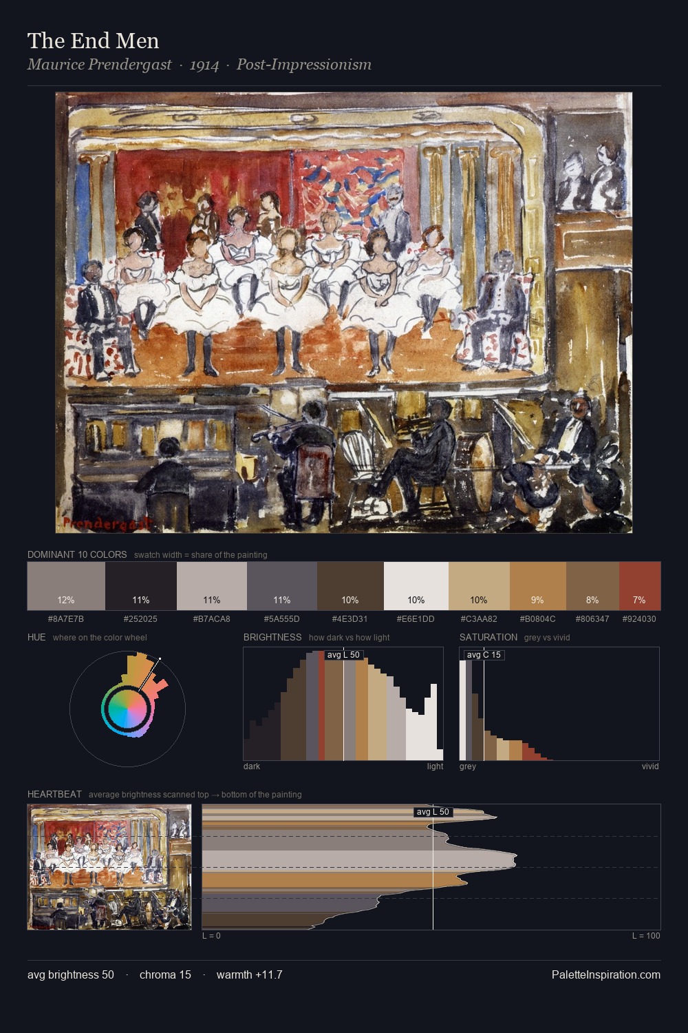
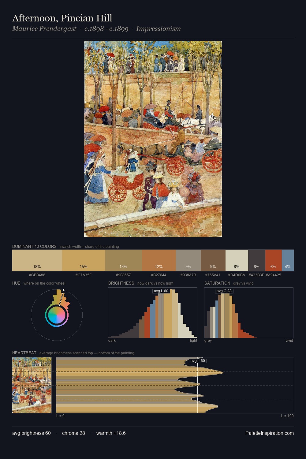
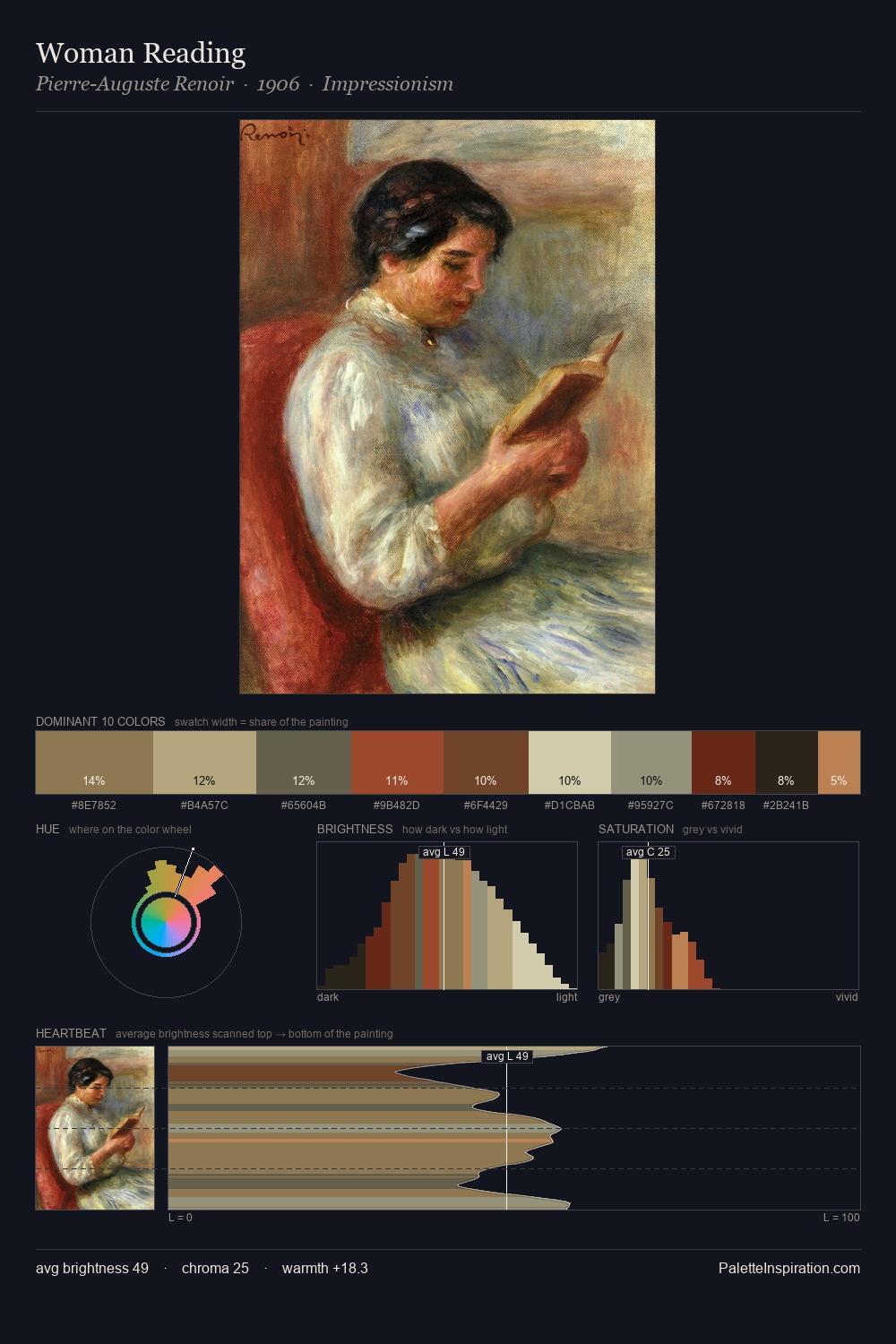
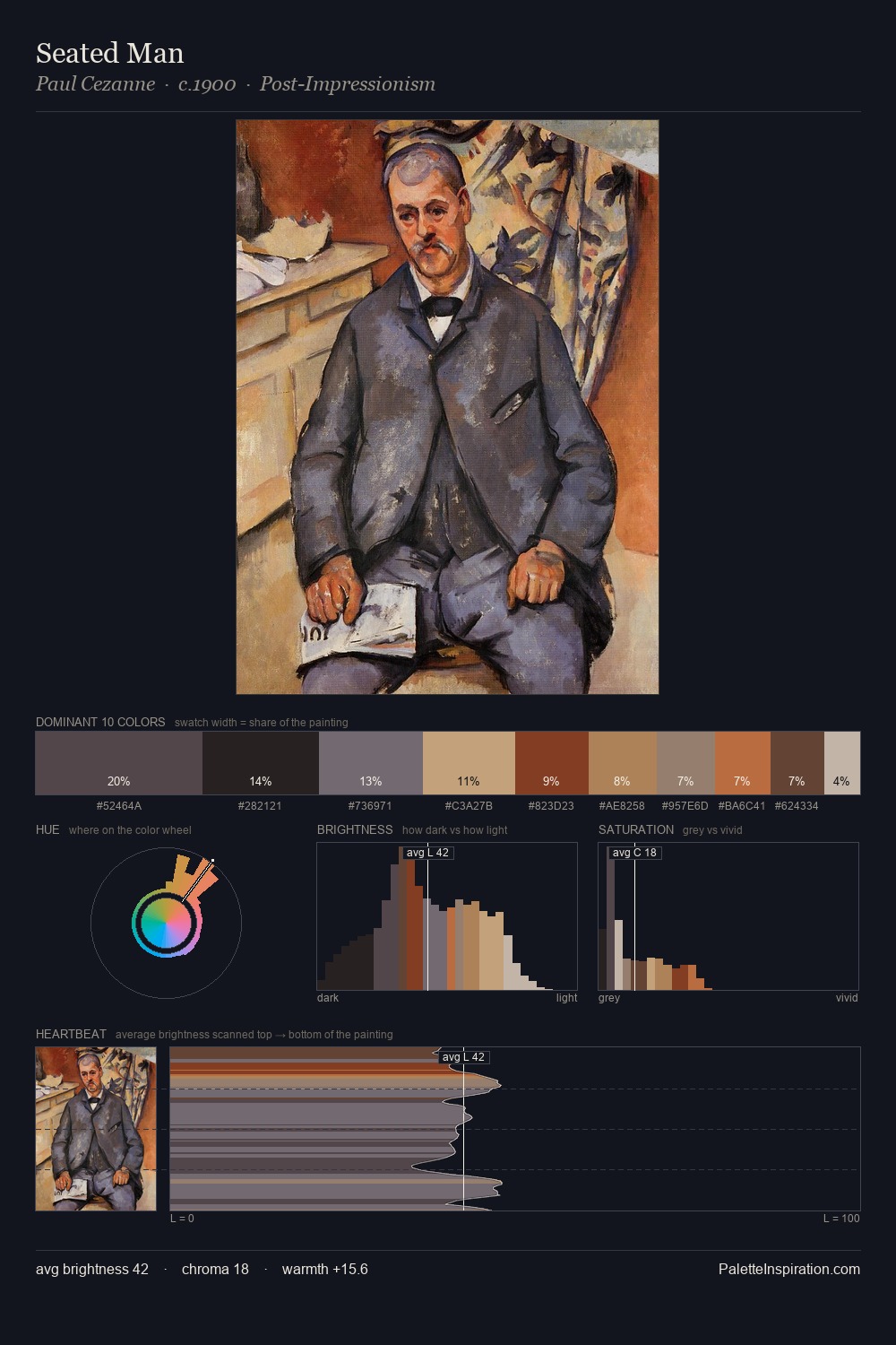
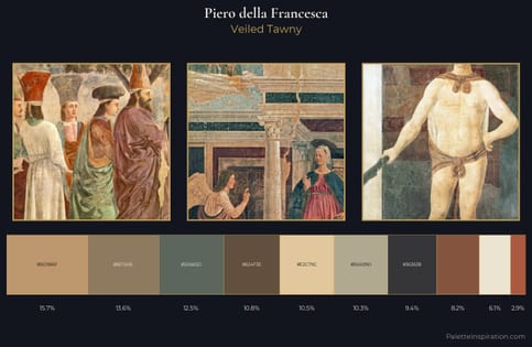
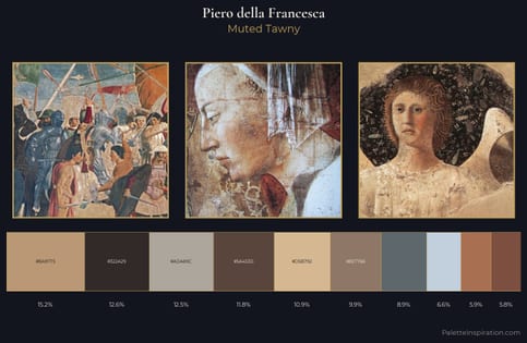
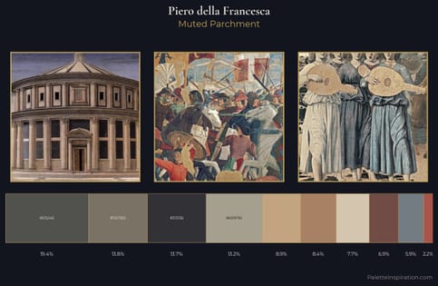
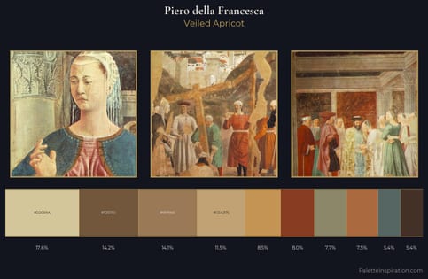
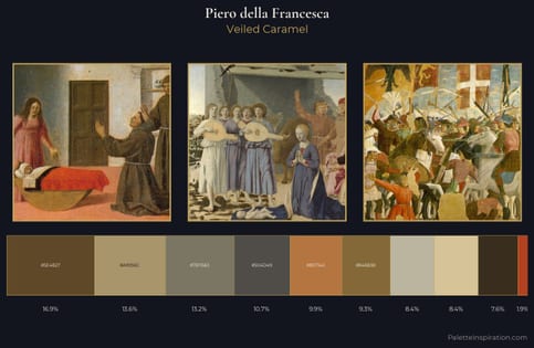
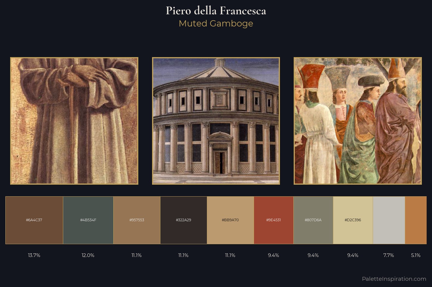
The value structure of Piero della Francesca is mid-key: quiet, controlled, and cohesive. Warmth dominates - the palette of Piero della Francesca leans heavily on the yellow-orange-red arc of the colour wheel. Every colour is desaturated; the palette proceeds through near-neutrals and gently-coloured greys. #D2C396 delivers the chromatic peak at only 9.4% - a small shot of colour with outsized visual impact. 53 units of value spread create a palette that is varied but unified - contrast in the service of harmony. This is the light Piero della Francesca preferred, made measurable.
Example use cases
- ceramics & pottery
- boutique hospitality
- menswear
- heritage food brands
- craft & artisan brands
I Love This!
Use This Palette
Copy, export, or download for your project
Copy, export, or download for your project
Copy:
Download:
Share: