Pier Leone Ghezzi Master Palette

Palette Analysis
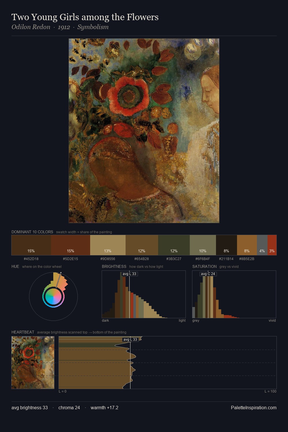
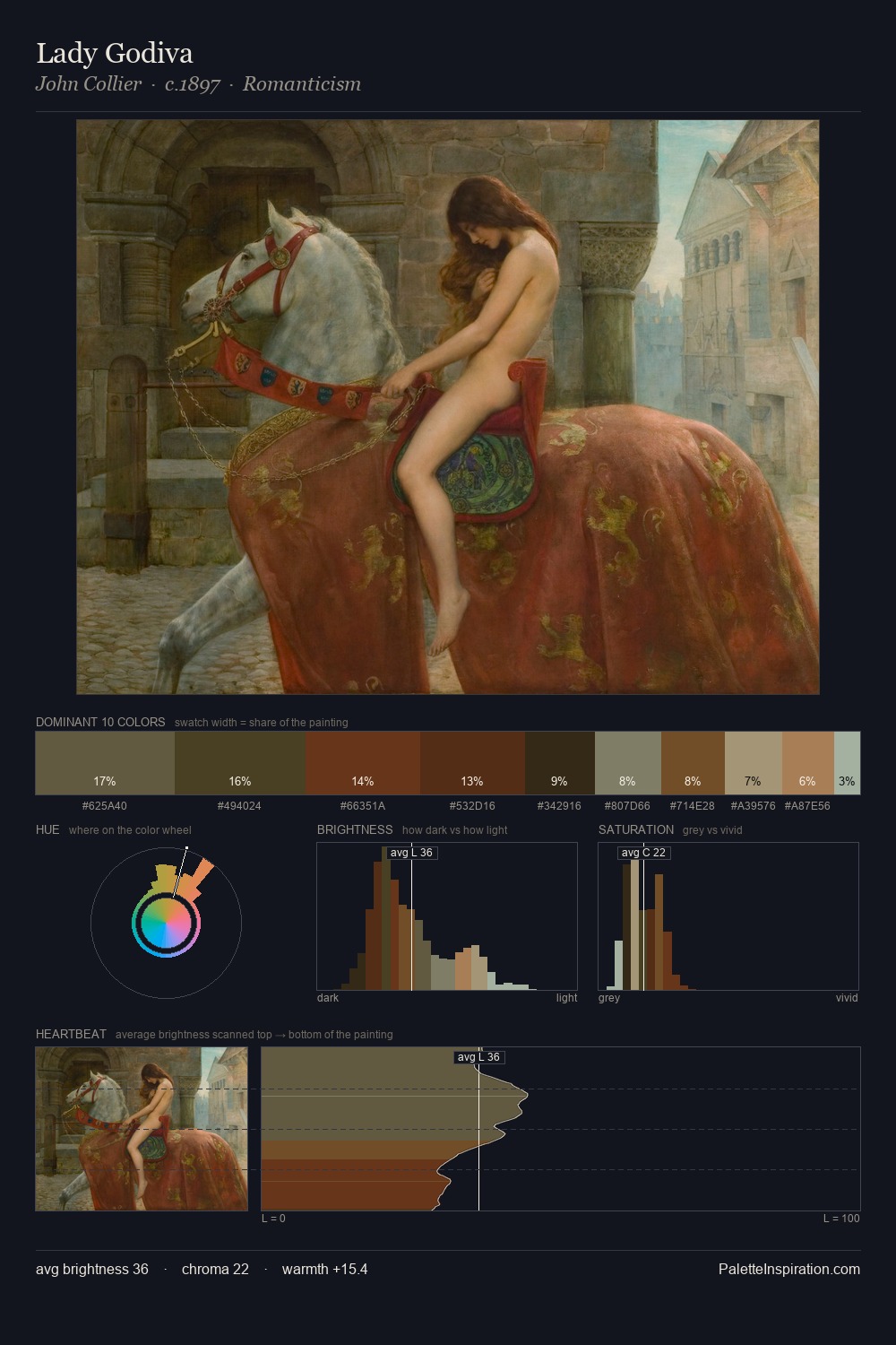
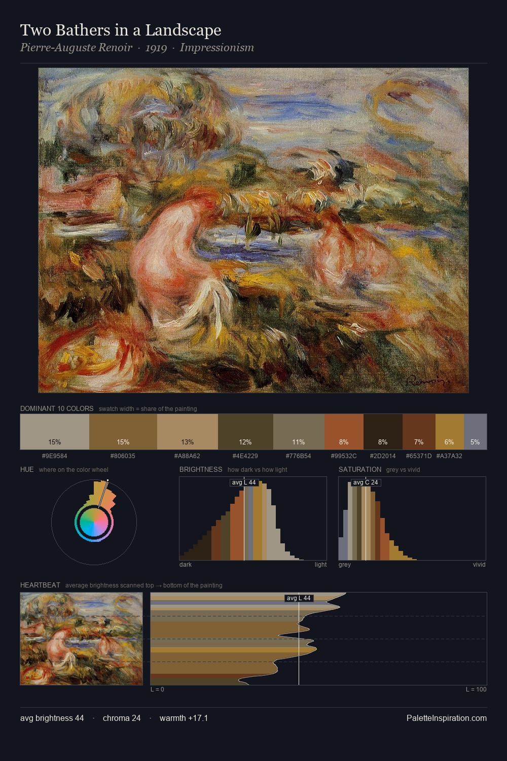
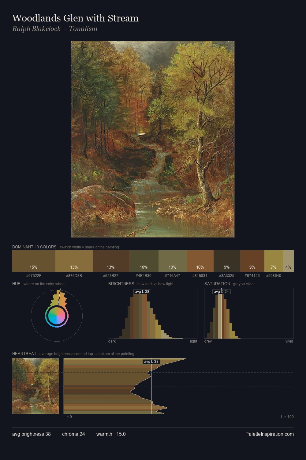
Pier Leone Ghezzi distributes its values across the middle register, creating harmony without high contrast. Pier Leone Ghezzi builds on cool foundations: the palette favours the blue-cyan-green arc. Saturation is deliberately withheld - the beauty here lies in the near-monochromatic gradations rather than colour difference. Only 5.0% is devoted to #612E16, yet that small allocation delivers the palette's entire chromatic tension. At 38 units across the value scale, the palette keeps contrast readable without letting it dominate. High luminosity and cool temperature suggest the plein-air condition: unfiltered daylight and open sky. The palette is recognisably Pier Leone Ghezzi's own: particular in its temperature, chroma, and the economy of its brightest note.
Example use cases
- theater design
- jewelry brands
- tobacco-adjacent retail
- event branding
- film & entertainment
I Love This!
Copy, export, or download for your project