Peter Busch Master Palette

Palette Analysis
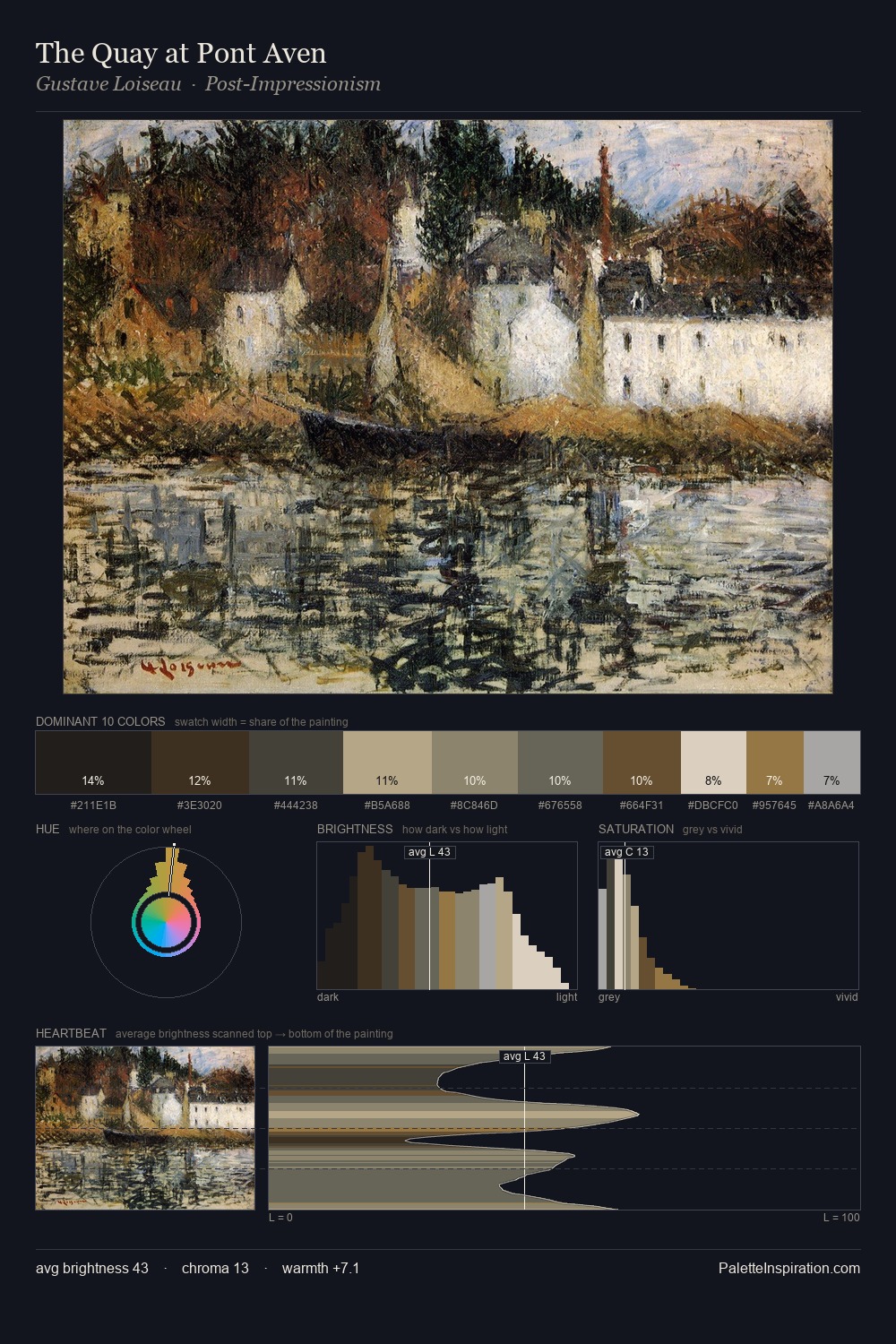
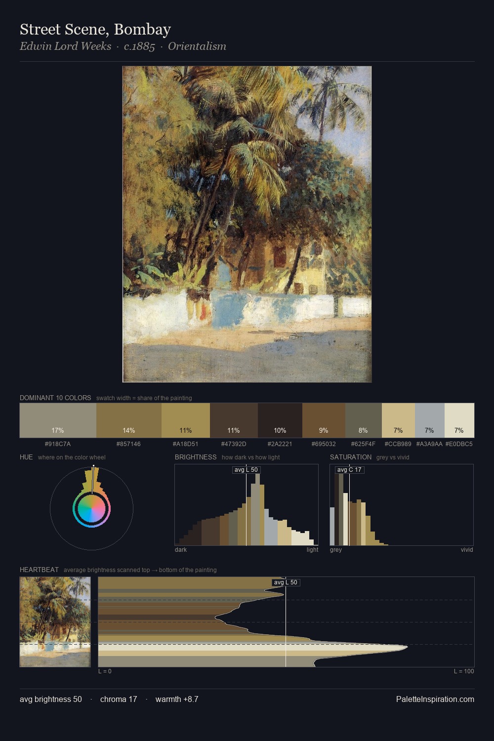
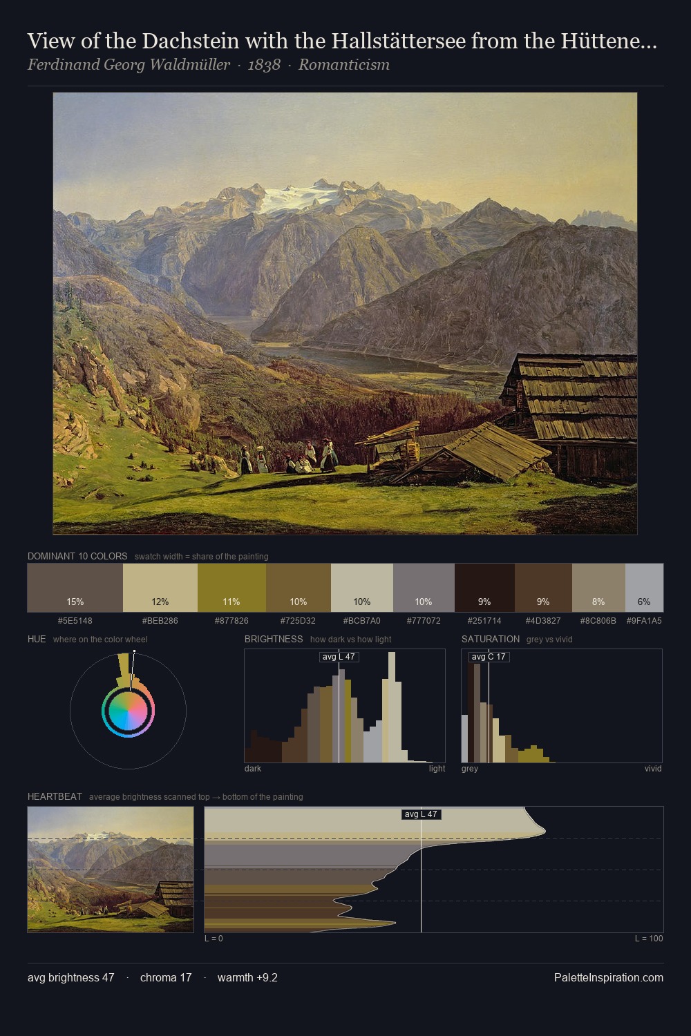
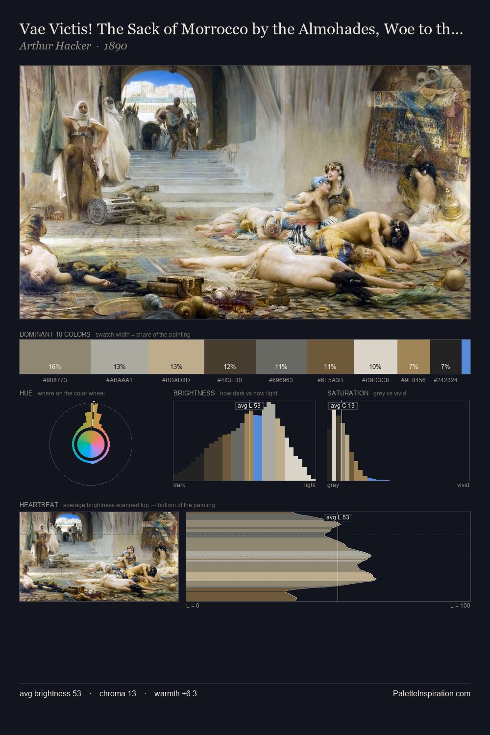
The value structure of Peter Busch is mid-key: quiet, controlled, and cohesive. Cool tones set the register here - the blues and greens easily outweigh any warm accents. All colours lean toward grey, building depth through value rather than colour punch. At 25.0%, #ADB2B1 functions less as a colour accent and more as a complete atmospheric environment. The saturated accent, #AD8E4D, registers at 7.5% - sparse enough to feel like a deliberate surprise. The value range spans 59 units across the palette, providing the full gamut from deep shadow to near-white and ensuring clear tonal hierarchy. The palette has the character of outdoor light: cool, mid-bright, with colour rendered faithfully rather than expressively. Peter Busch arrived at this balance through long practice; the palette carries the weight of that experience.
Example use cases
- museums & galleries
- academic publishing
- heritage brands
- auction houses
- exhibition design
I Love This!
Copy, export, or download for your project