Peter Borseller Palette 2

Palette Analysis
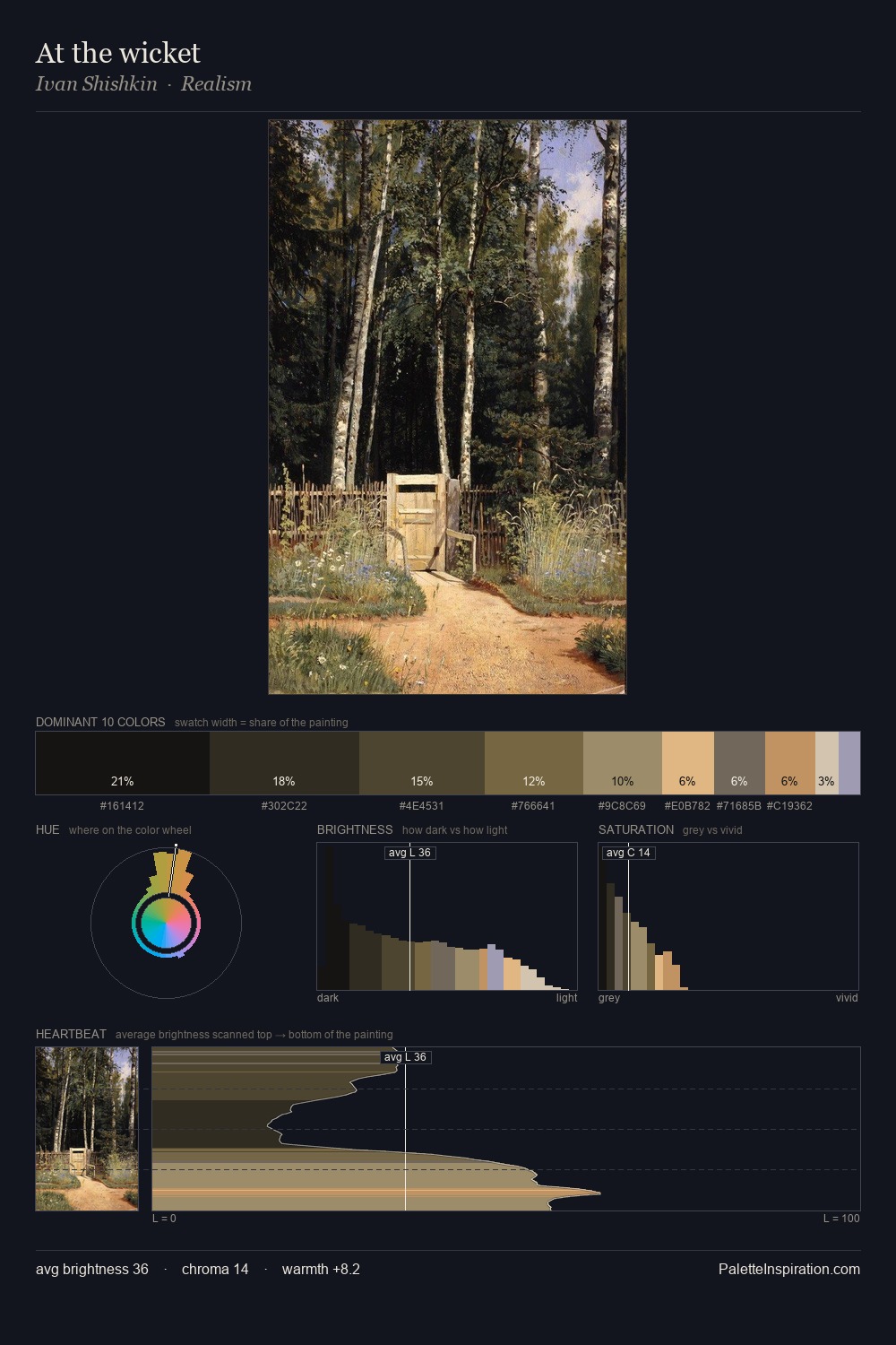
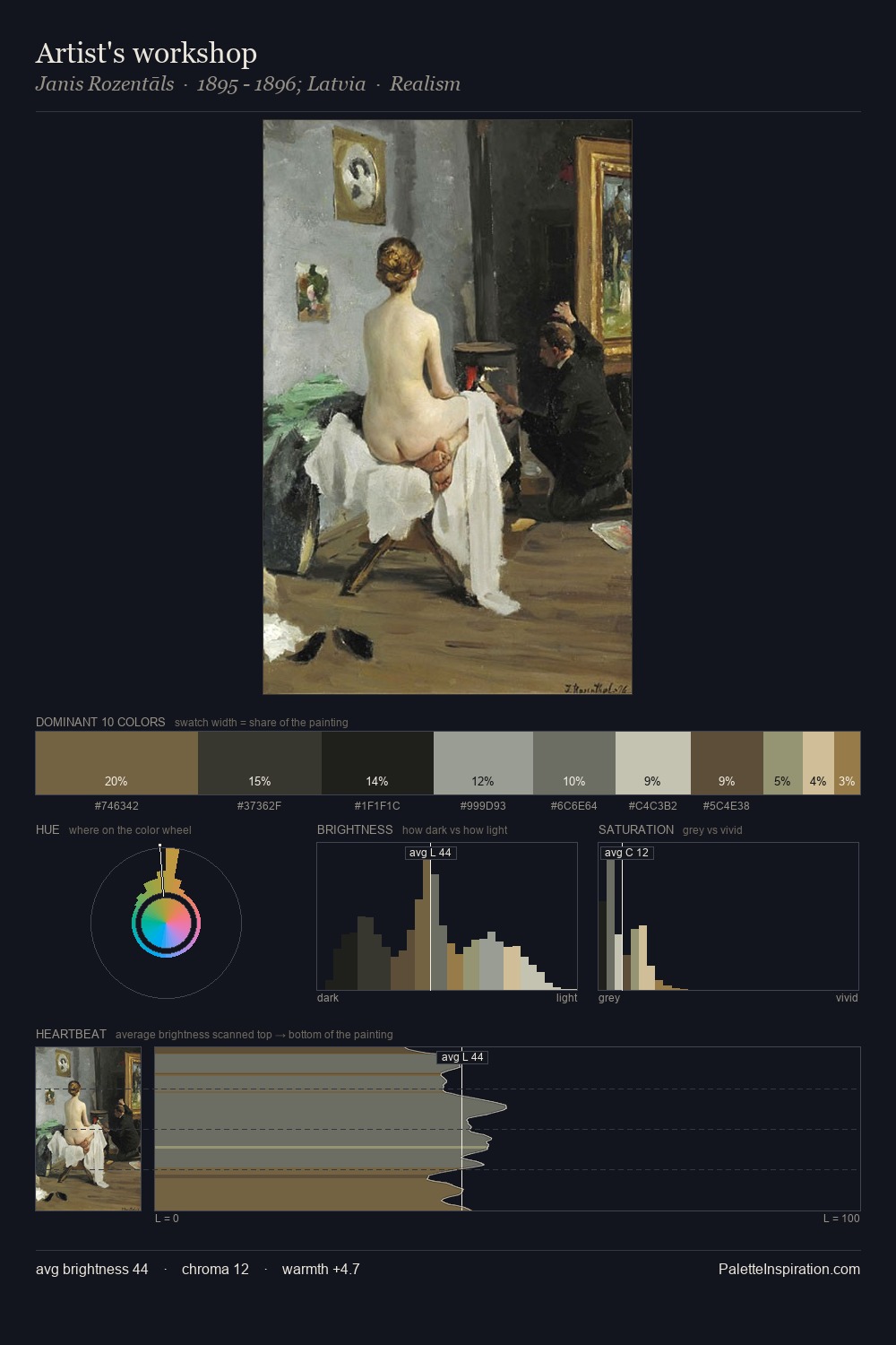
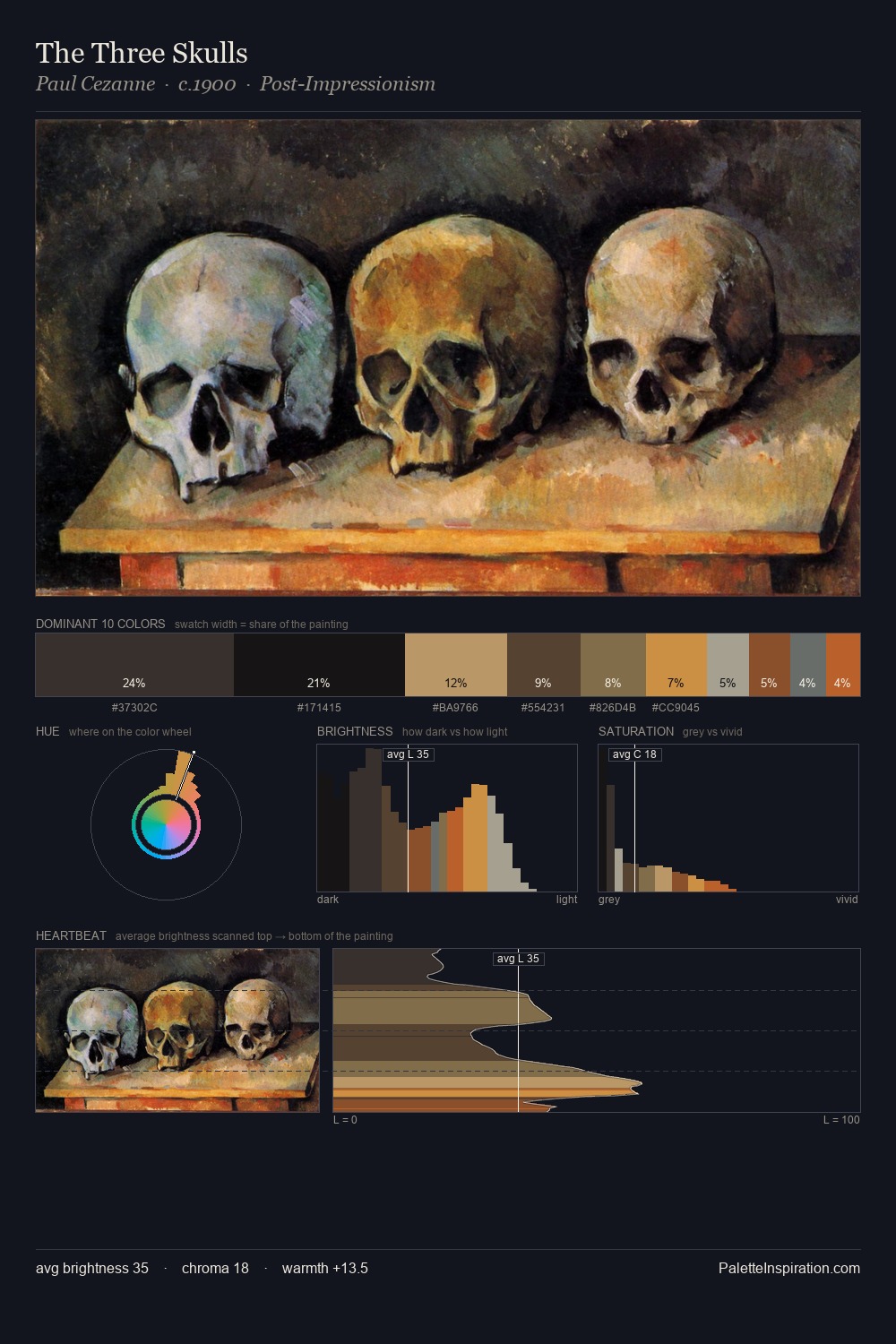
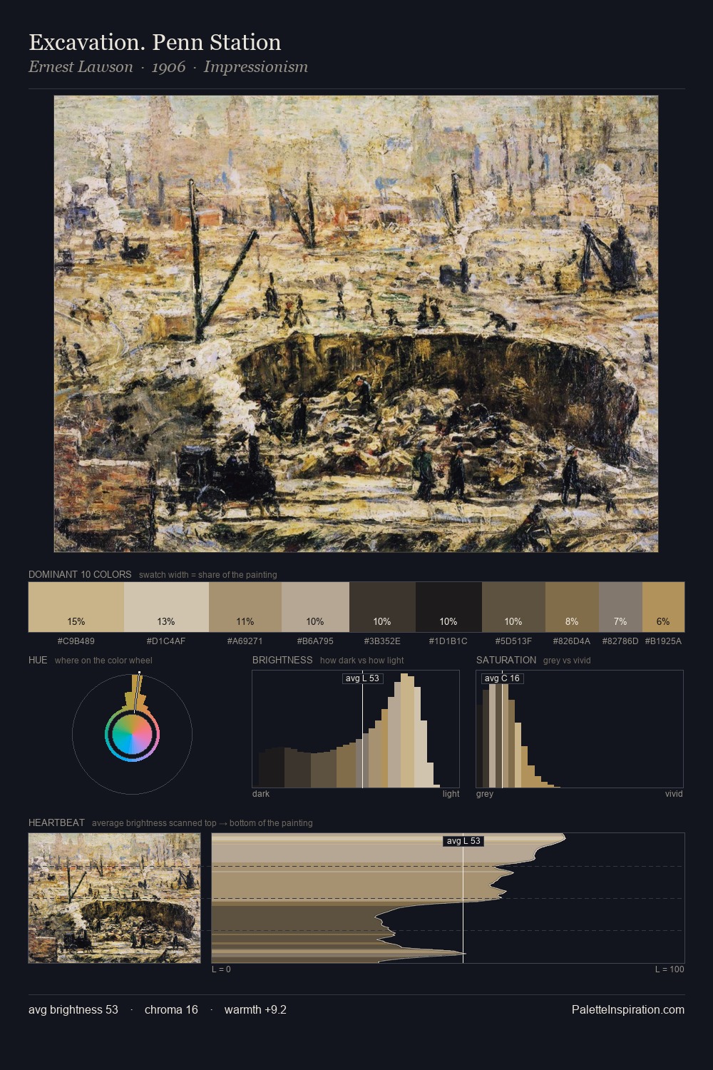
Peter Borseller is built on dark foundations, with values clustered toward shadow. Peter Borseller tilts toward cool - blues and silver-greys carry the structural weight. All colours lean toward grey, building depth through value rather than colour punch. Peter Borseller gives 27.2% of the composition to a single #2E2B27 - a decisive chromatic anchor. The most saturated colour, #816D4A, is reserved to 3.6% of the surface, where it acts as a focal punctuation. The value range spans 62 units across the palette, providing the full gamut from deep shadow to near-white and ensuring clear tonal hierarchy. This tonal restraint is characteristic of the Peter Borseller approach: colour serves light, not the reverse. Peter Borseller's palette 2 carries its own internal logic while remaining in conversation with the artist's broader colour intelligence.
Example use cases
- theater design
- jewelry brands
- tobacco-adjacent retail
- event branding
- film & entertainment
I Love This!
Copy, export, or download for your project