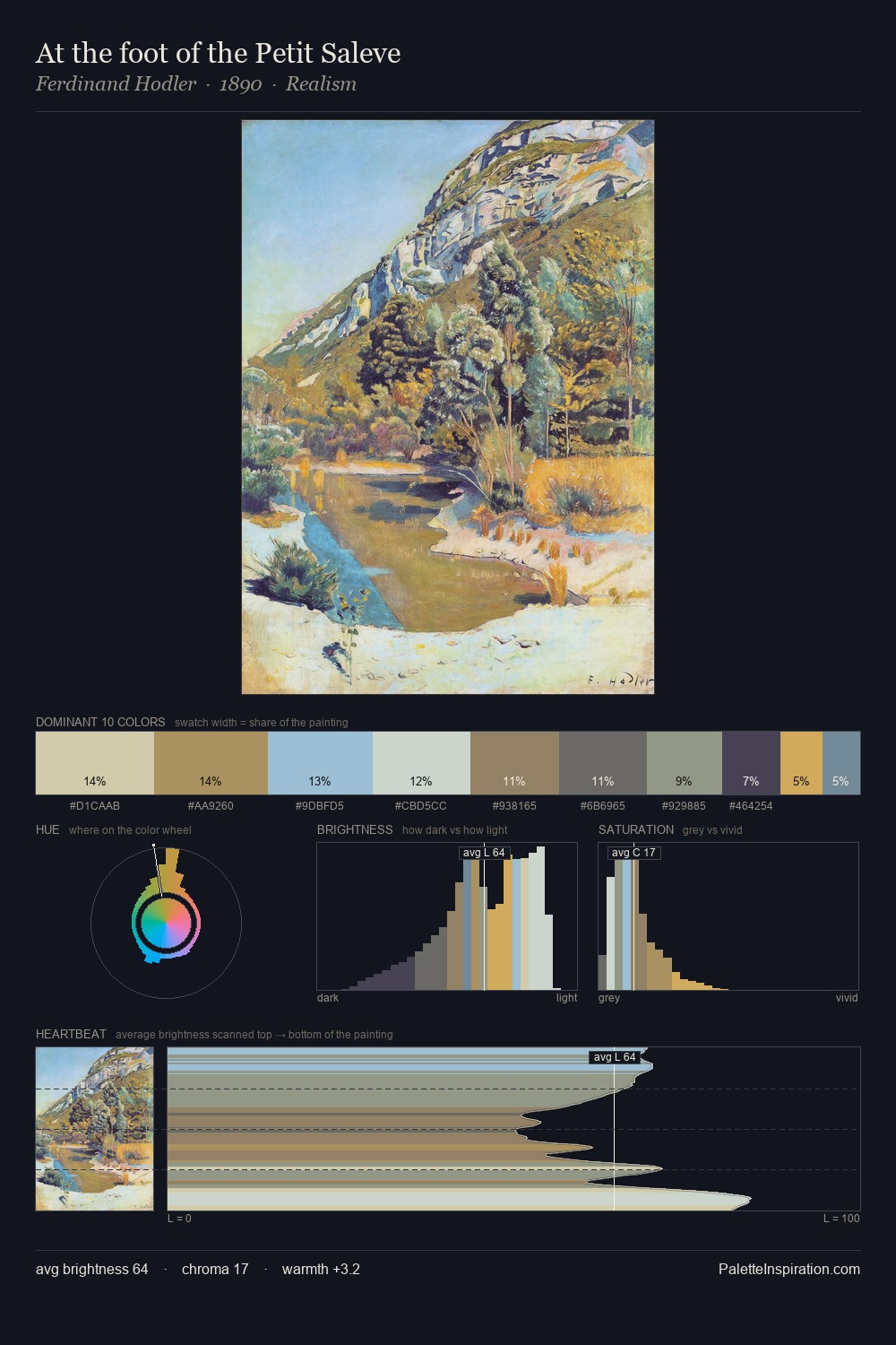
Pericles Pantazis Palette 1
Lustrous Alabaster
Lustrous Sheen without harshness - mid-to-high key, silky, with a pearl-like quality.
Alabaster Warm off-white - creamy stone white, luminous and slightly translucent.

Palette Analysis
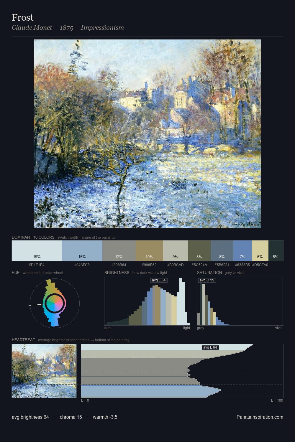
Pericles Pantazis is high in key: pale, luminous, and filled with optical air. Cool tones set the register here - the blues and greens easily outweigh any warm accents. Every colour is desaturated; the palette proceeds through near-neutrals and gently-coloured greys. The most saturated colour, #CEC296, covers 8.6% of the surface: too much to call an accent, too strong to ignore. Spanning 39 units on the value axis, the palette achieves the balance between tonal flatness and fragmentation. High luminosity and cool temperature suggest the plein-air condition: unfiltered daylight and open sky. This is palette 1 of Pericles Pantazis's sequence - a single chapter in a chromatic story told across many works.
Example use cases
- publishing
- corporate identity
- consumer apps
- hospitality
- design agencies
I Love This!
Use This Palette
Copy, export, or download for your project
Copy, export, or download for your project
Copy:
Download:
Share:
![[Unkown] palette card](/cards/0000165.jpg)