Paulus Moreelse Palette 2

Palette Analysis
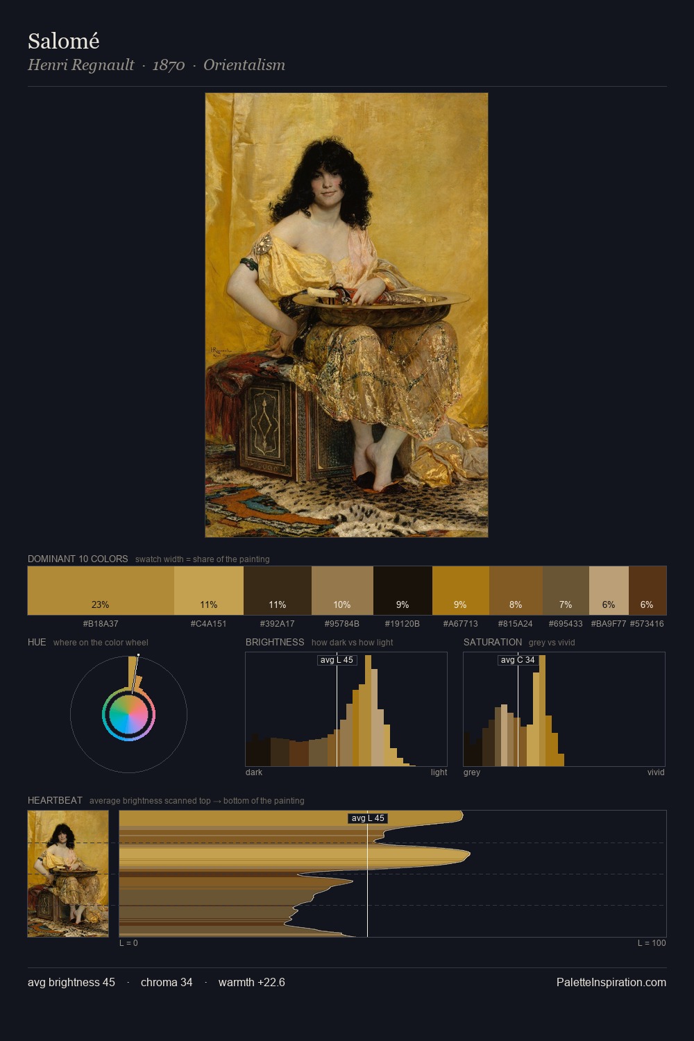
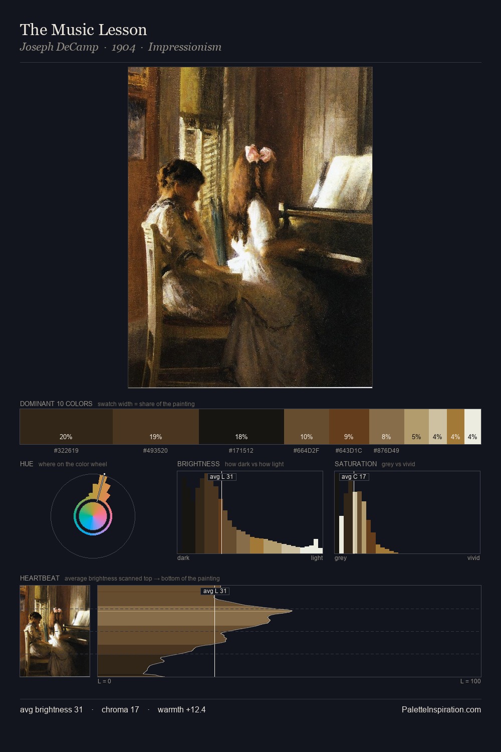
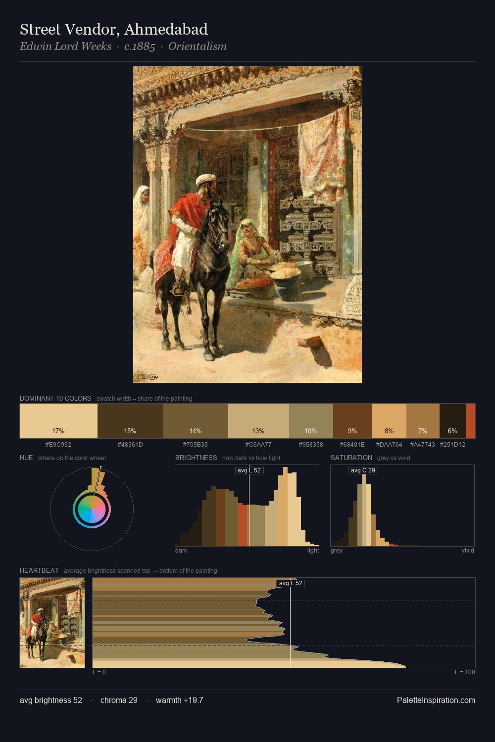
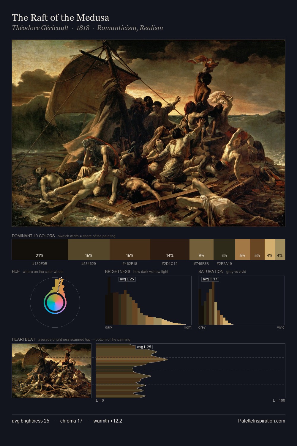
Paulus Moreelse keeps values measured and balanced, a hallmark of tonal restraint. Paulus Moreelse tilts toward cool - blues and silver-greys carry the structural weight. The absence of saturated colour is itself an expressive choice: this is a palette of restraint and atmosphere. Paulus Moreelse gives 25.3% of the composition to a single #644B29 - a decisive chromatic anchor. At 9.1%, #2E2413 carries the palette's sharpest chromatic charge: an accent that earns its place precisely because it is withheld. The value range spans 58 units across the palette, providing the full gamut from deep shadow to near-white and ensuring clear tonal hierarchy. High luminosity and cool temperature suggest the plein-air condition: unfiltered daylight and open sky. Palette 2 sits within the larger chromatic argument that Paulus Moreelse's complete body of work advances.
Example use cases
- music labels
- luxury hospitality
- editorial photography
- leather goods
- premium streaming
I Love This!
Copy, export, or download for your project