Paul Thumann Palette 1
Palette Analysis
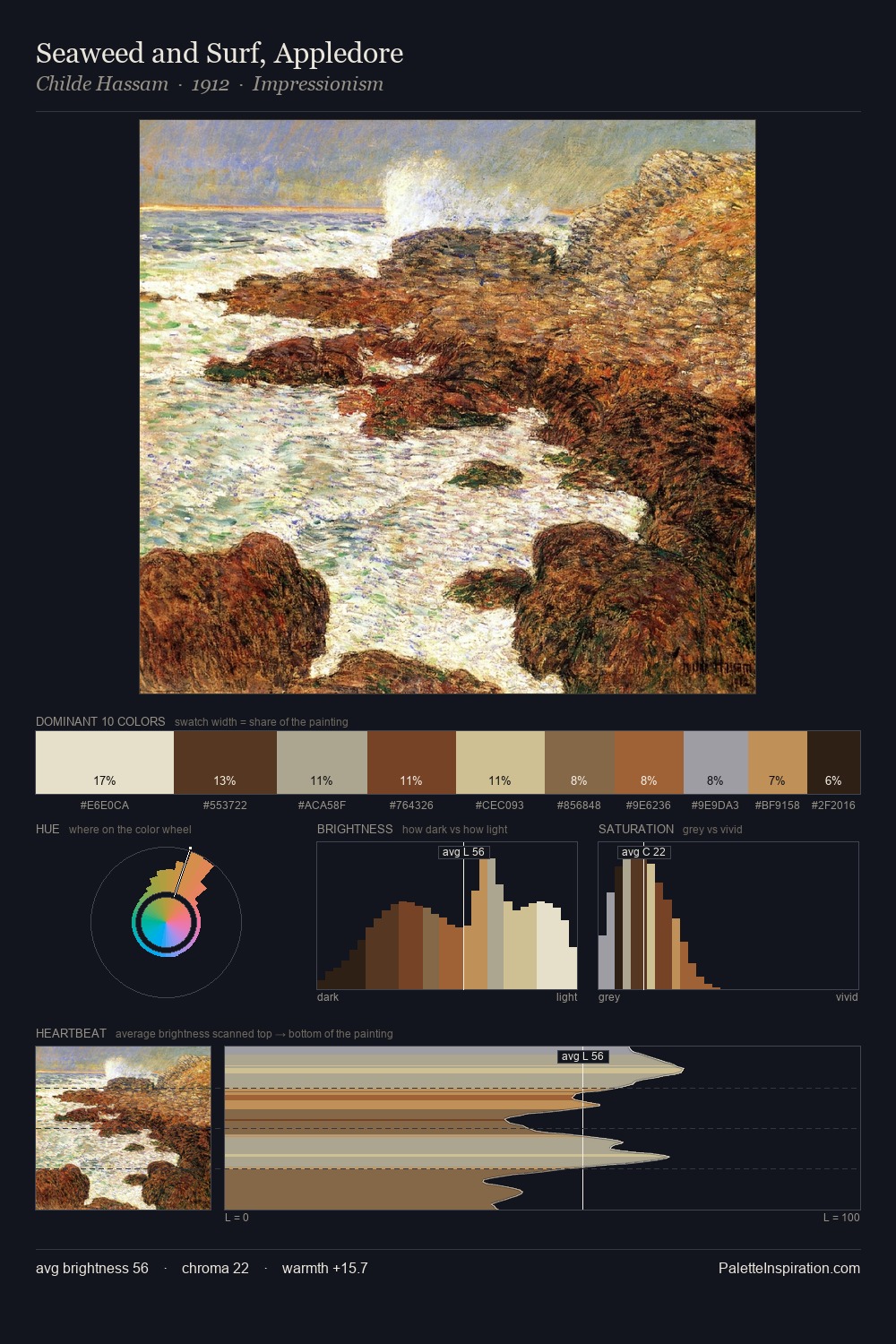
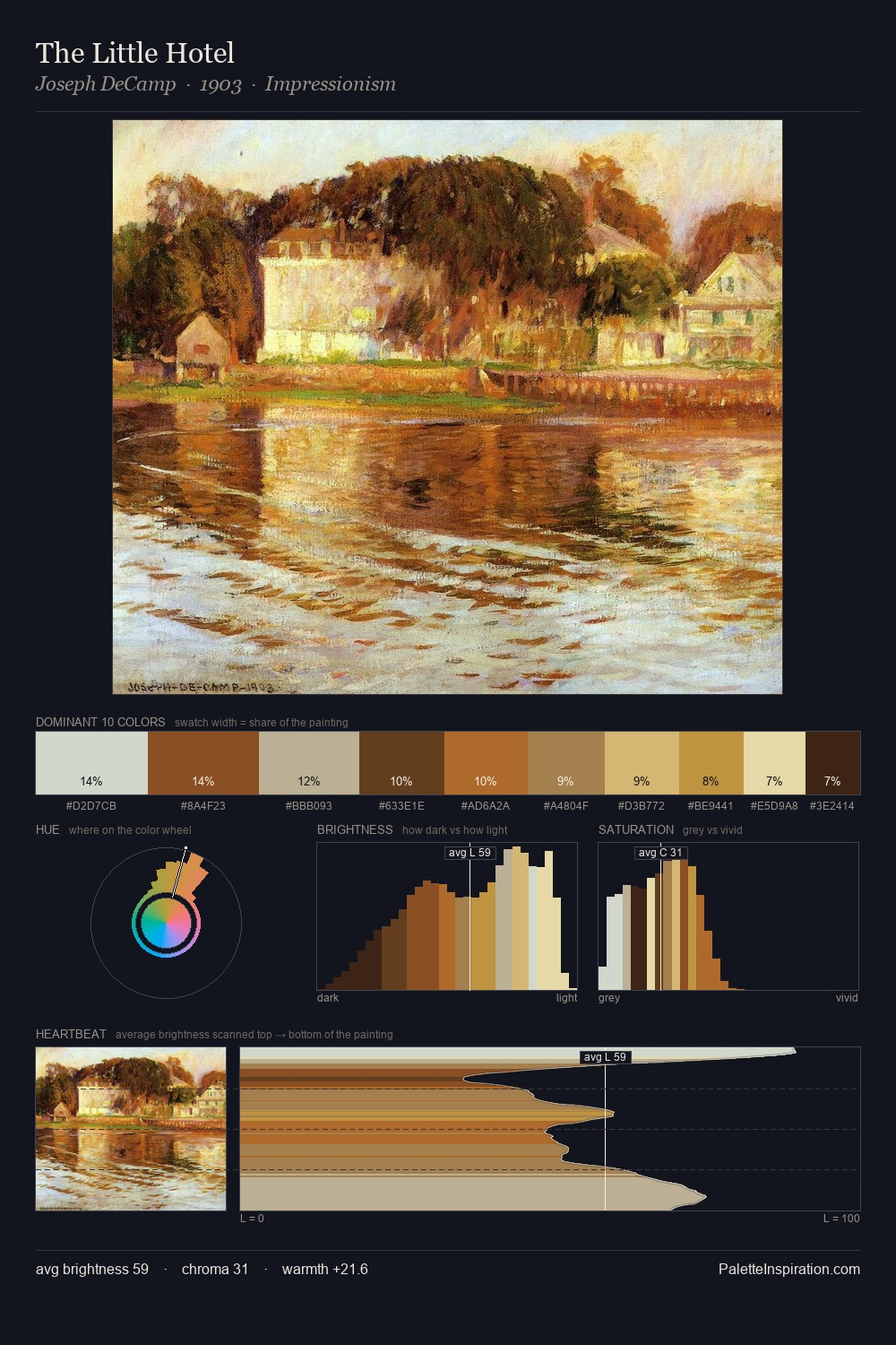
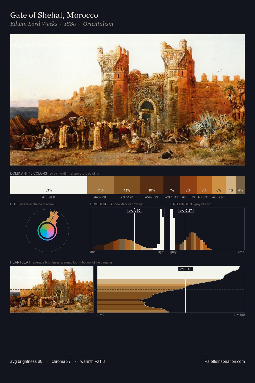
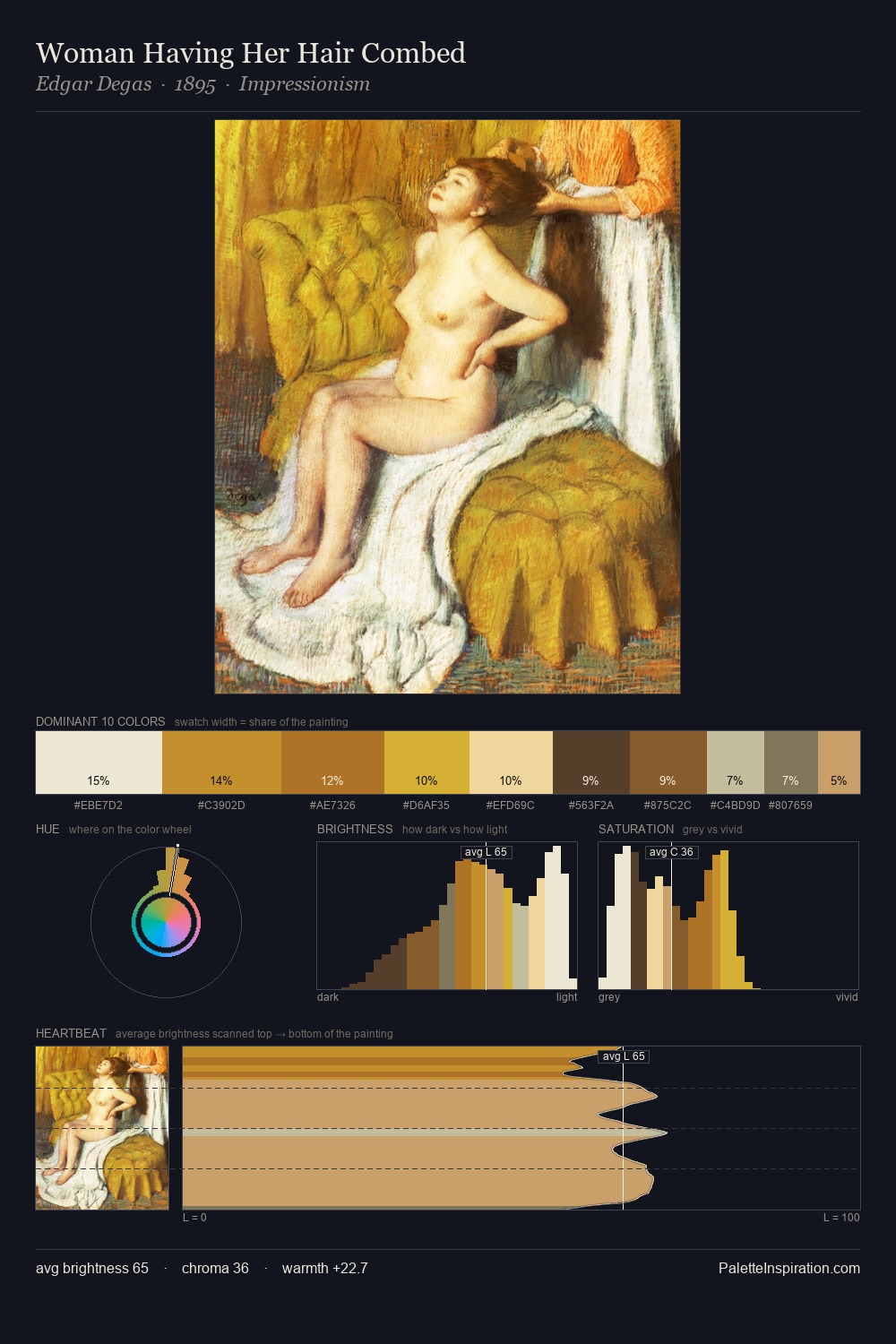
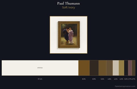
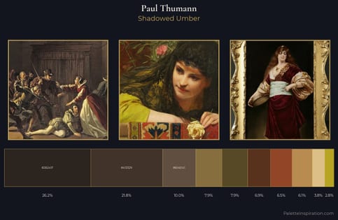
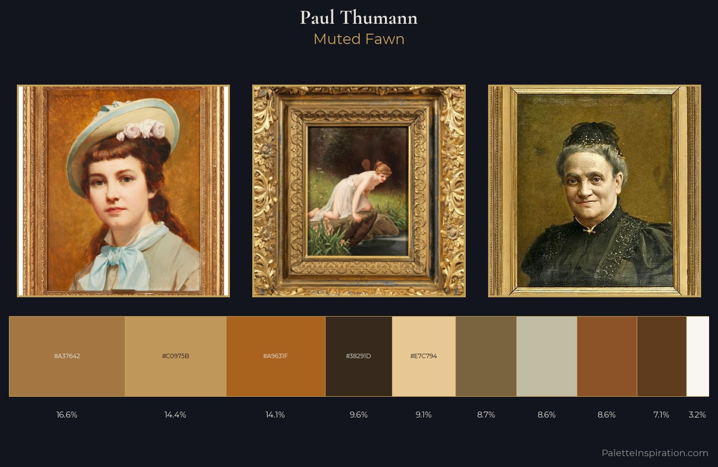
Paul Thumann keeps values measured and balanced, a hallmark of tonal restraint. Warm and cool are kept in productive tension, creating the kind of chromatic harmony that sustains the eye. Chroma is held at a comfortable level - distinct colours, but no single hue is allowed to overwhelm. The most saturated colour, #8B5327, is reserved to 8.6% of the surface, where it acts as a focal punctuation. At 68 units of value range, the palette has the tonal breadth to sustain complex spatial readings. The palette reads as an Impressionist one - light-biased, chromatically direct, and built on temperature contrast rather than value opposition. This is palette 1 of Paul Thumann's sequence - a single chapter in a chromatic story told across many works.
Example use cases
- publishing
- corporate identity
- consumer apps
- hospitality
- design agencies
I Love This!
Copy, export, or download for your project