Paul Revere Palette 2
Soft Ecru
Soft Low-contrast, gentle chroma - mid-key values and low saturation, approachable and calm.
Ecru Unbleached linen - warm mid-neutral, slightly grayed, raw and natural.

Palette Analysis
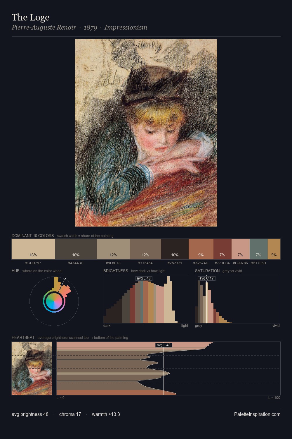
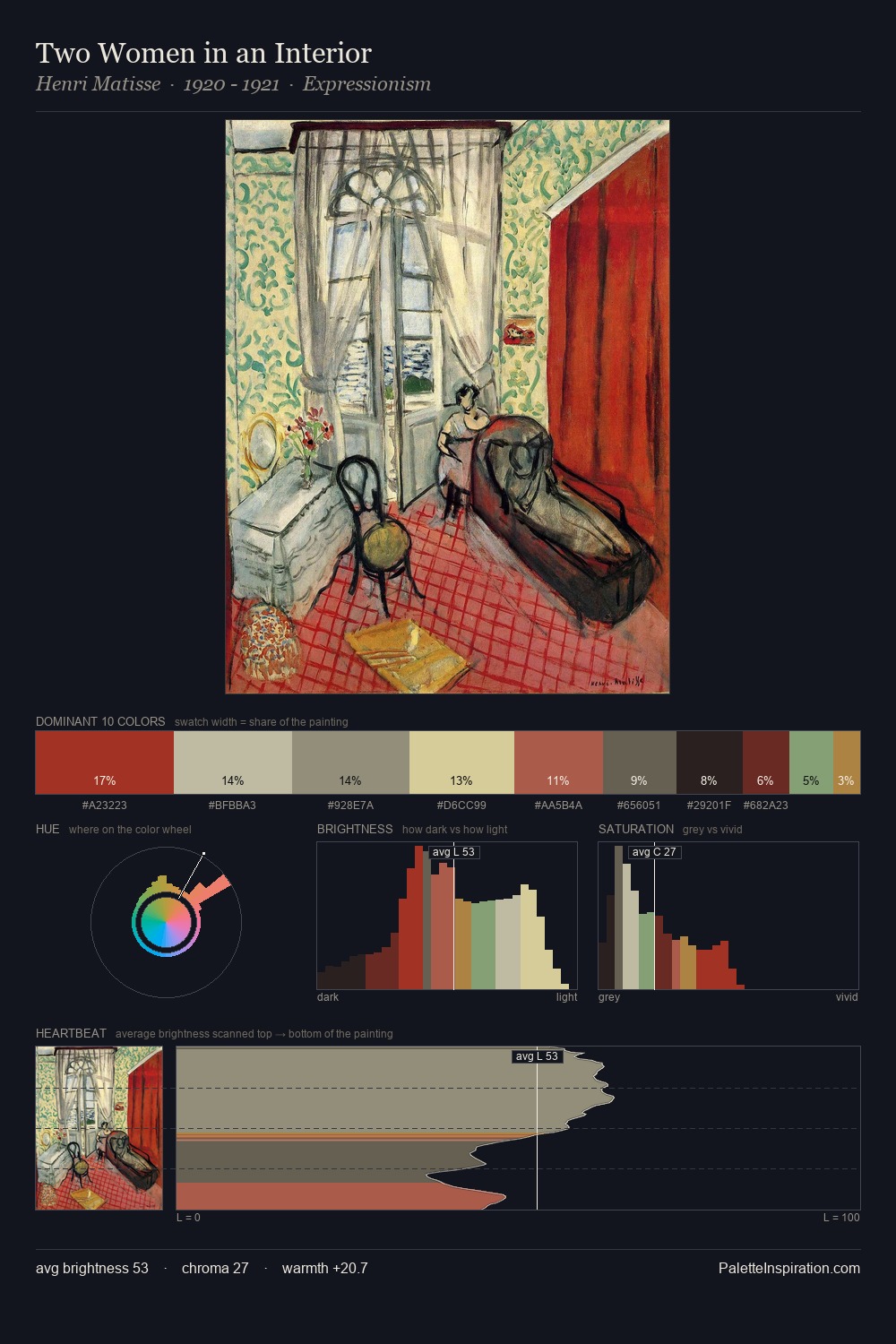
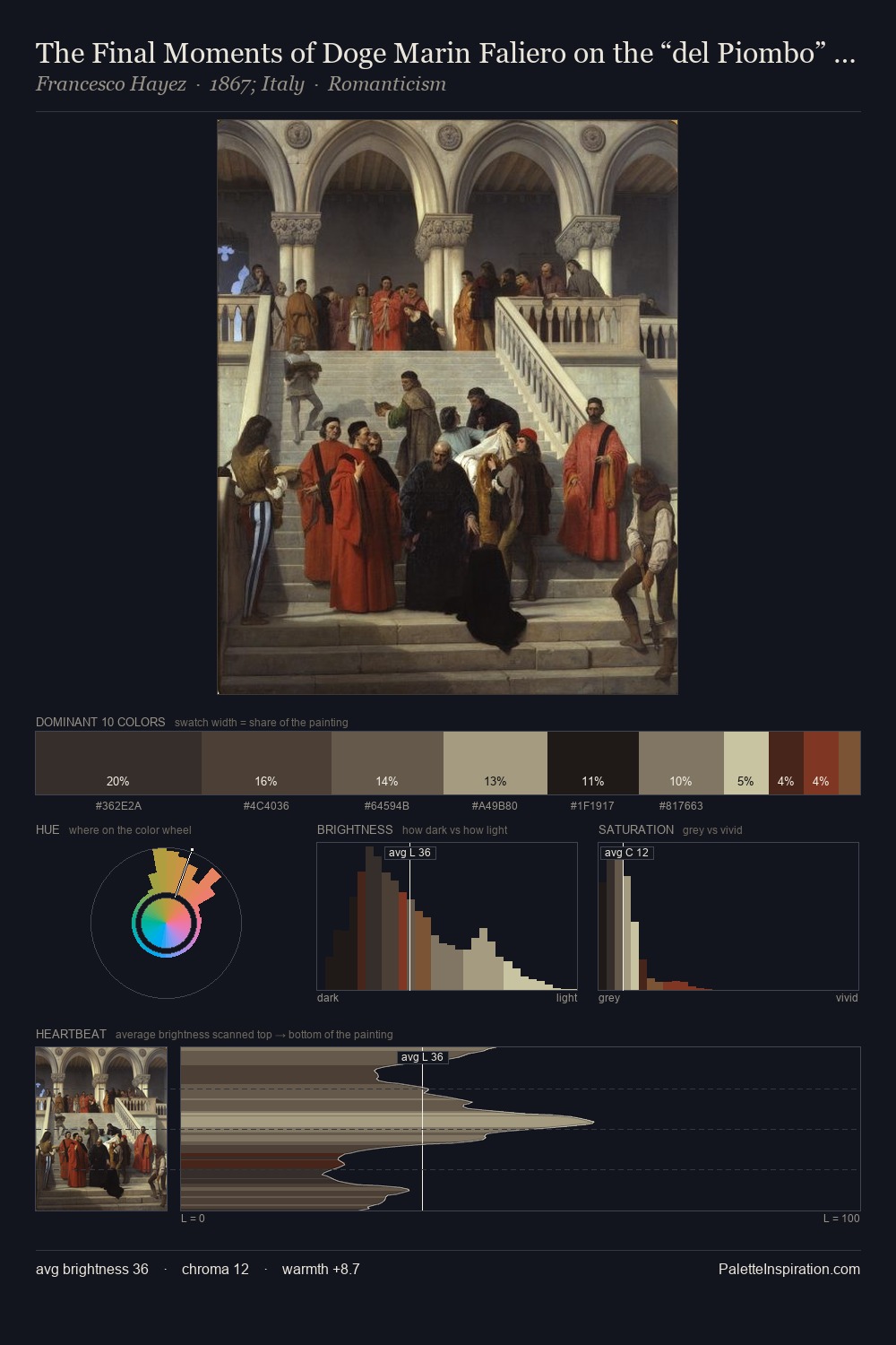
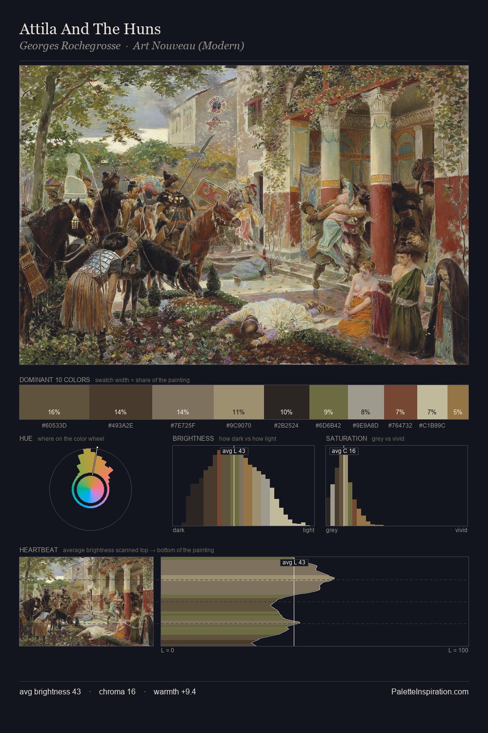
Paul Revere works in the upper reaches of the value scale, creating an atmosphere of brightness and expansiveness. Heat pervades this palette; warm chromatic identities outweigh cool ones at almost every weight. Muted throughout, the palette achieves its effects through value and temperature rather than chromatic force. Only 11.3% is devoted to #CABE93, yet that small allocation delivers the palette's entire chromatic tension. The value range spans 58 units across the palette, providing the full gamut from deep shadow to near-white and ensuring clear tonal hierarchy. Palette 2 sits within the larger chromatic argument that Paul Revere's complete body of work advances.
Example use cases
- ceramics & pottery
- boutique hospitality
- menswear
- heritage food brands
- craft & artisan brands
I Love This!
Use This Palette
Copy, export, or download for your project
Copy, export, or download for your project
Copy:
Download:
Share: