Paul Kane Palette 3

Palette Analysis
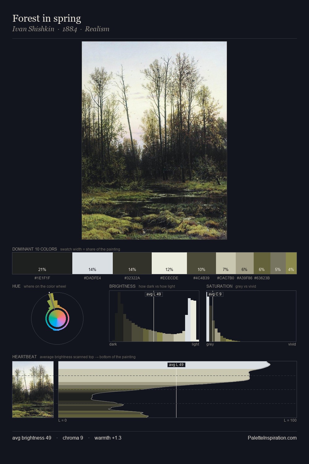
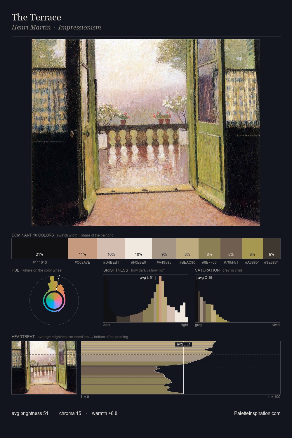
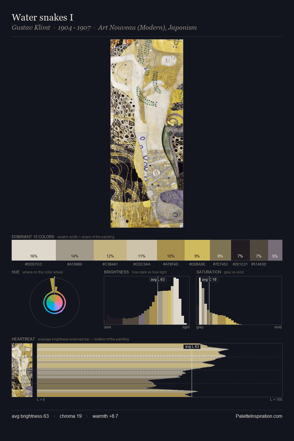
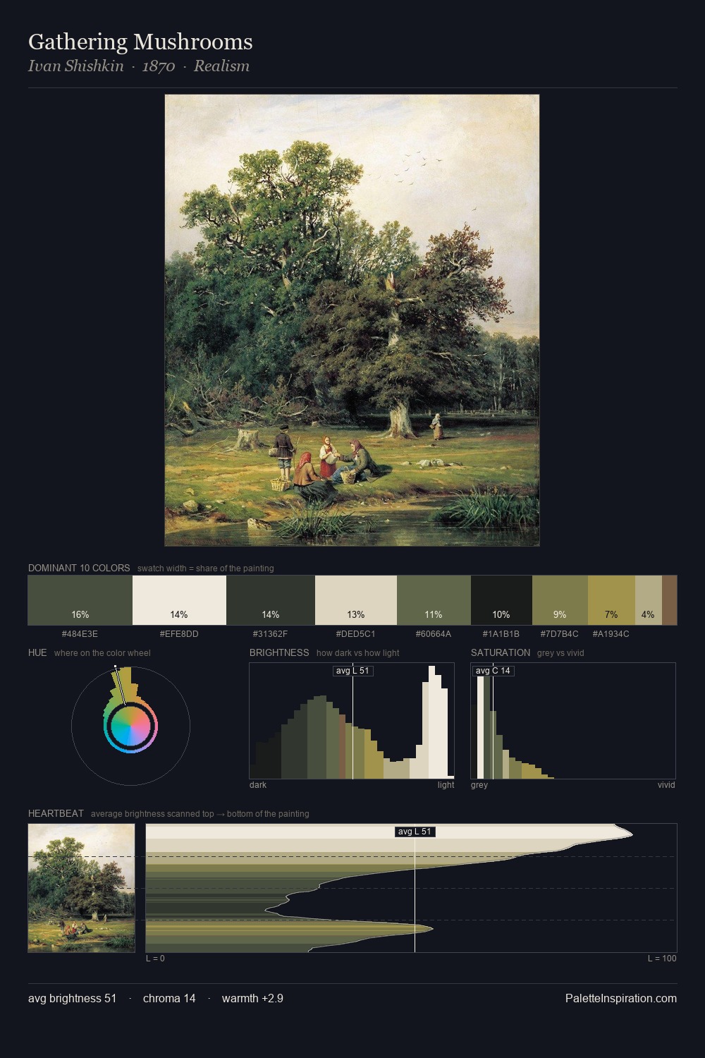
Paul Kane is high-key - luminous, open, and weighted toward light. Cool hues prevail: blues, greens, and greys anchor the palette's emotional temperature. Saturation is deliberately withheld - the beauty here lies in the near-monochromatic gradations rather than colour difference. #F5E7D6 at 32.3% of the palette: an overwhelming presence that pulls all other colours into its gravitational field. The most saturated colour, #ACA775, is reserved to 7.9% of the surface, where it acts as a focal punctuation. A value spread of 75 units gives the palette both depth and air - shadows are genuinely dark, lights genuinely light. High luminosity and cool temperature suggest the plein-air condition: unfiltered daylight and open sky. Palette 3 sits within the larger chromatic argument that Paul Kane's complete body of work advances.
Example use cases
- ceramics & pottery
- boutique hospitality
- menswear
- heritage food brands
- craft & artisan brands
I Love This!
Copy, export, or download for your project