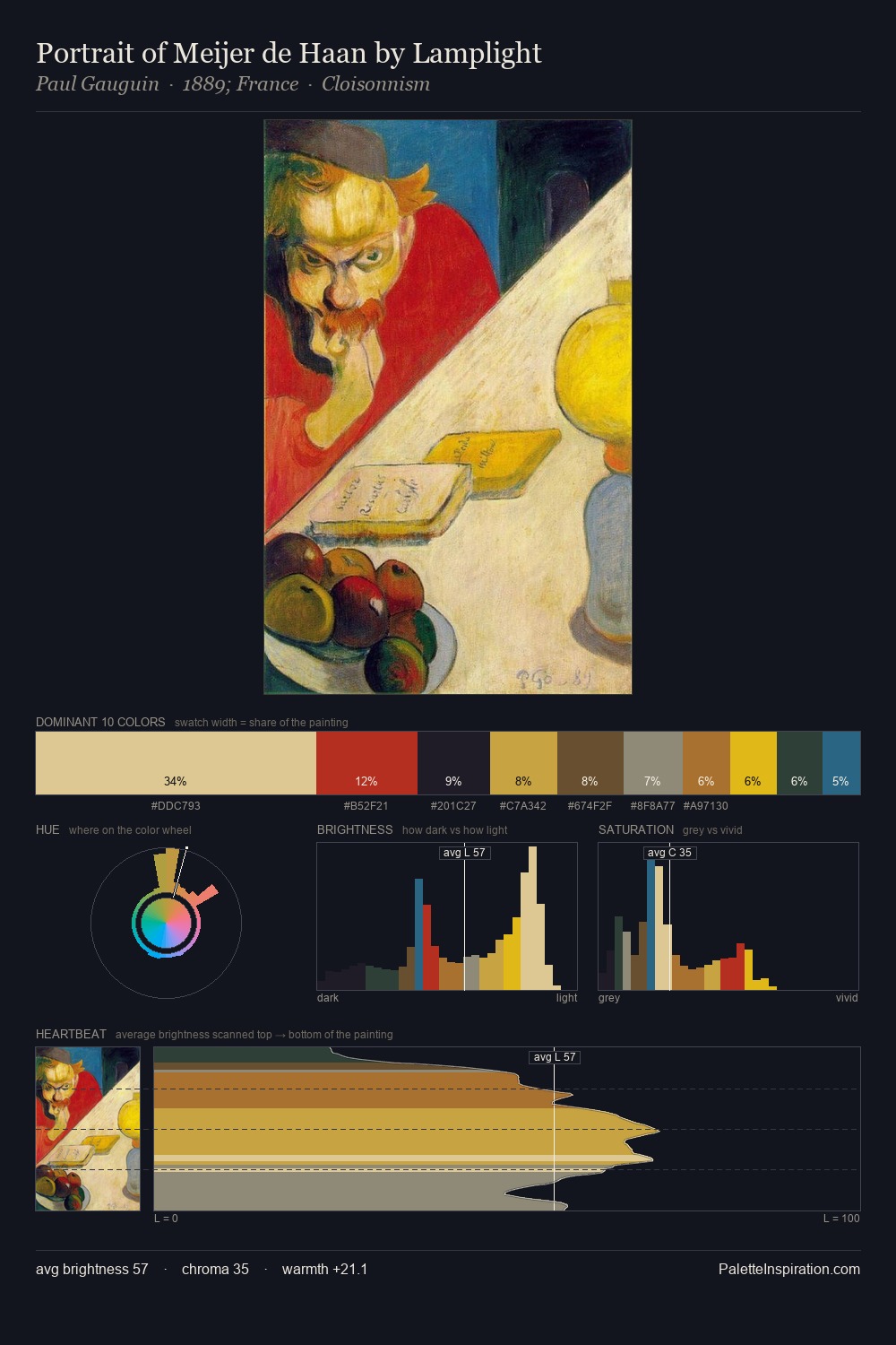
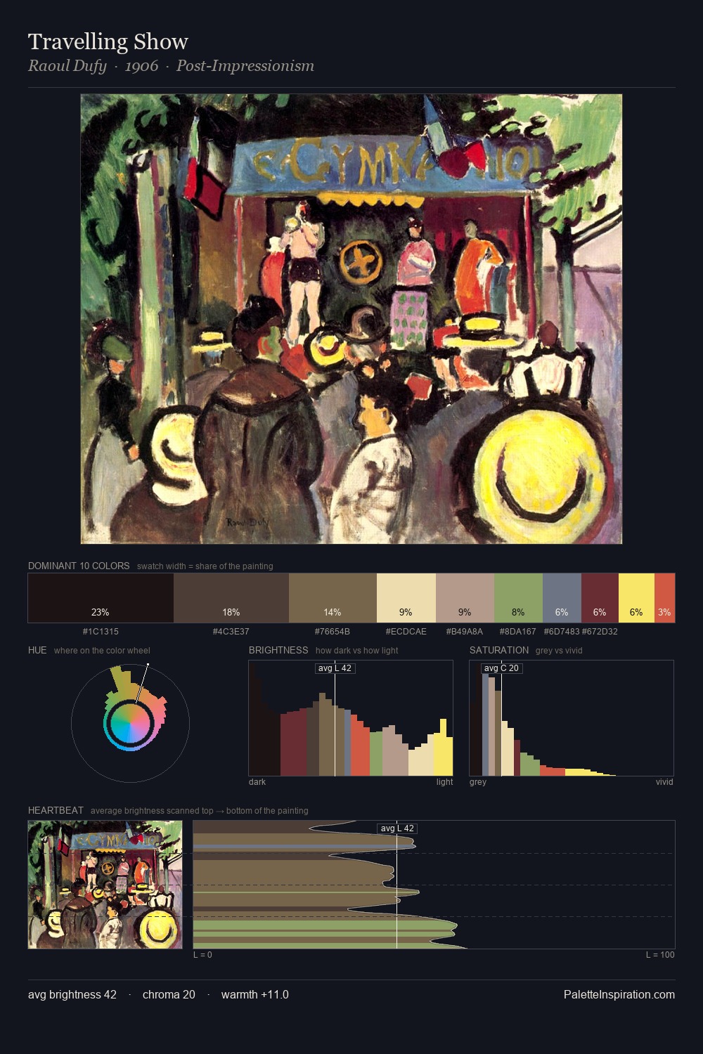
Paul Jacoulet Palette 13

Palette Analysis
Paul Jacoulet works in the upper reaches of the value scale, creating an atmosphere of brightness and expansiveness. Blues and teal-greys govern the palette, lending it an aquatic or atmospheric quality. Colours are neither washed out nor blazing; they occupy the productive middle ground of the chroma scale. At 26.3%, #FCF25C functions less as a colour accent and more as a complete atmospheric environment. The most saturated colour, #B44B52, covers 3.1% of the surface: too much to call an accent, too strong to ignore. A value spread of 75 units gives the palette both depth and air - shadows are genuinely dark, lights genuinely light. The mid-to-high key, cool bias, and moderate chroma point to outdoor observation - sky and diffused daylight as the dominant light source. Paul Jacoulet's palette 13 carries its own internal logic while remaining in conversation with the artist's broader colour intelligence.
Example use cases
- publishing
- corporate identity
- consumer apps
- hospitality
- design agencies
I Love This!
Copy, export, or download for your project