Paul Hoecker (Höcker) Palette 2
Palette Analysis
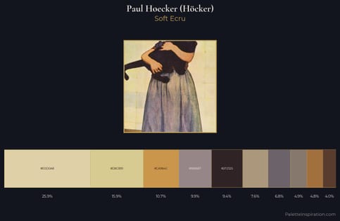
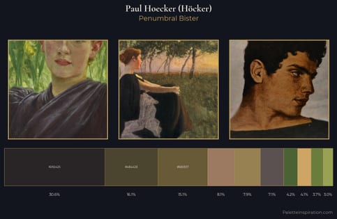
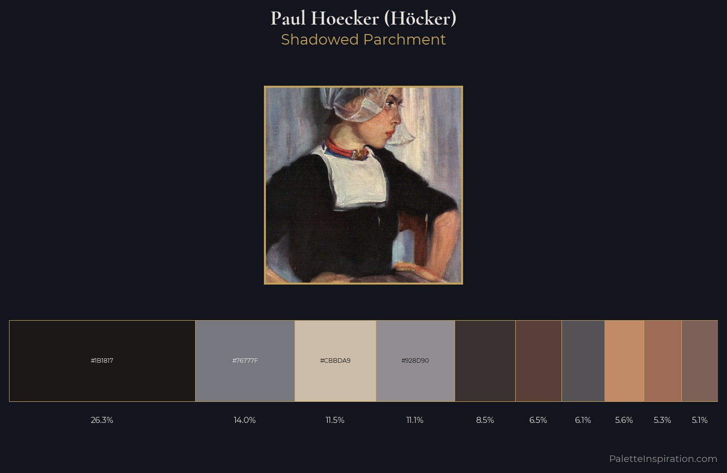
Paul Hoecker (Höcker) occupies the comfortable middle of the value scale, avoiding both extremes to hold the eye in a sustained middle grey. Yellow, ochre, sienna: warm hues that Paul Hoecker (Höcker) deploys as the palette's primary energy. All colours lean toward grey, building depth through value rather than colour punch. #1B1817 at 26.3% of the palette: an overwhelming presence that pulls all other colours into its gravitational field. The highest-chroma note - #9E6C54 - appears at just 5.3%, deployed as a precision accent against the quieter ground. A value spread of 59 units gives the palette both depth and air - shadows are genuinely dark, lights genuinely light. Palette 2 sits within the larger chromatic argument that Paul Hoecker (Höcker)'s complete body of work advances.
Example use cases
- theater design
- jewelry brands
- tobacco-adjacent retail
- event branding
- film & entertainment
I Love This!
Copy, export, or download for your project