Paul Hocker Master Palette

Palette Analysis
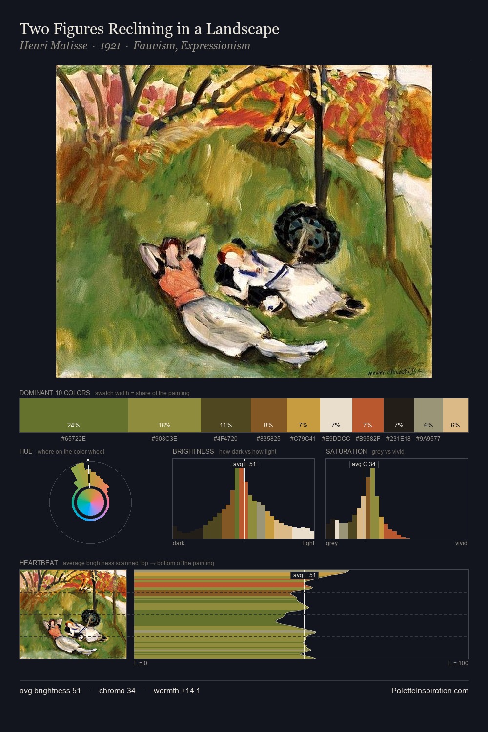
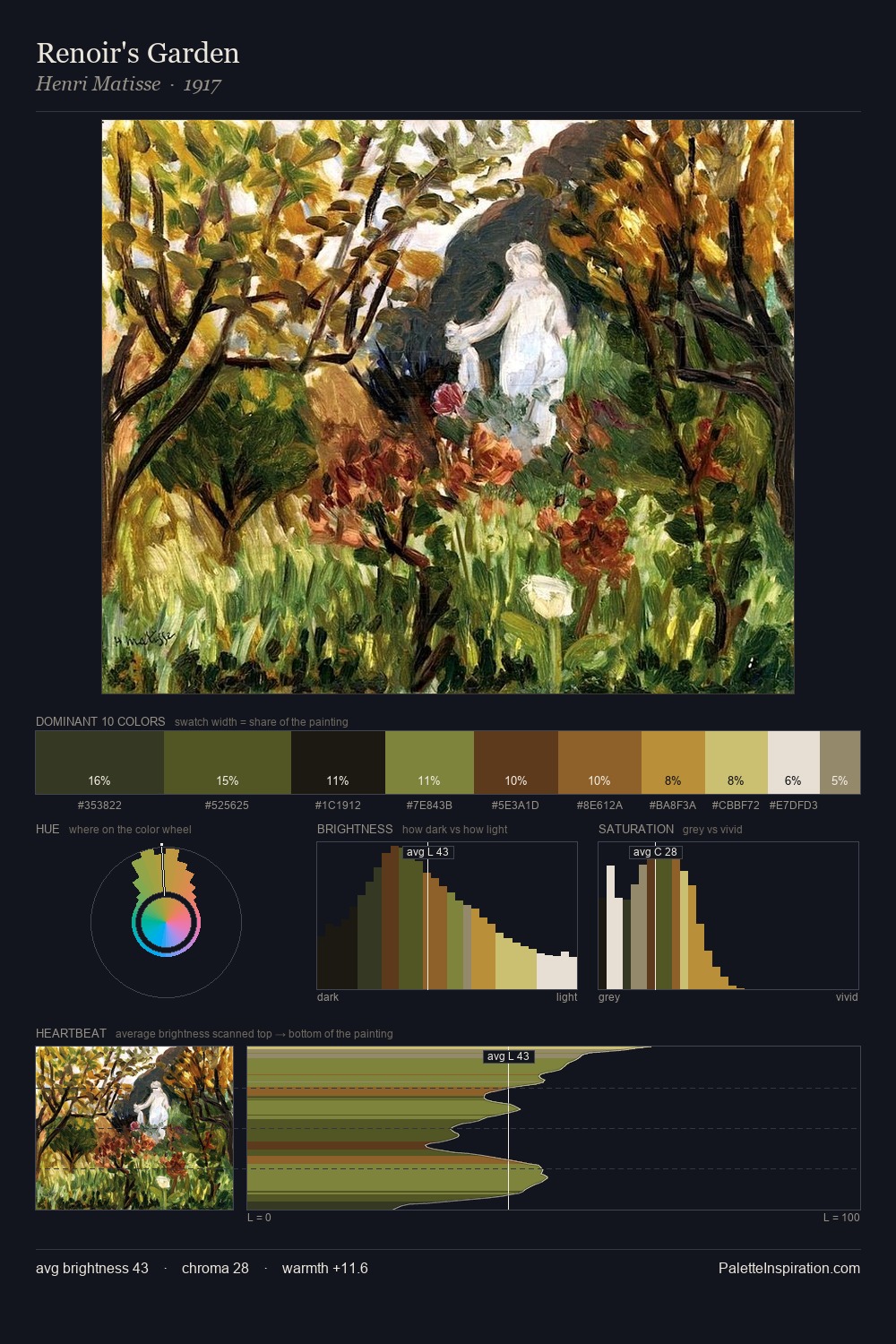
Paul Hocker keeps values measured and balanced, a hallmark of tonal restraint. Paul Hocker balances warm and cool with remarkable evenness, giving the composition its characteristic vibrancy. Chroma is held at a comfortable level - distinct colours, but no single hue is allowed to overwhelm. #926334 claims 25.0% of the surface, functioning as the work's tonal foundation. The most saturated colour, #6D732A, is reserved to 10.0% of the surface, where it acts as a focal punctuation. From deepest dark to palest light, the palette traverses 79 units of the value scale - a span that creates natural depth. The combination of mid-to-high key, balanced temperature, and elevated chroma is characteristic of Impressionist observation: light broken into its component hues. The palette is recognisably Paul Hocker's own: particular in its temperature, chroma, and the economy of its brightest note.
Example use cases
- theater design
- jewelry brands
- tobacco-adjacent retail
- event branding
- film & entertainment
I Love This!
Copy, export, or download for your project