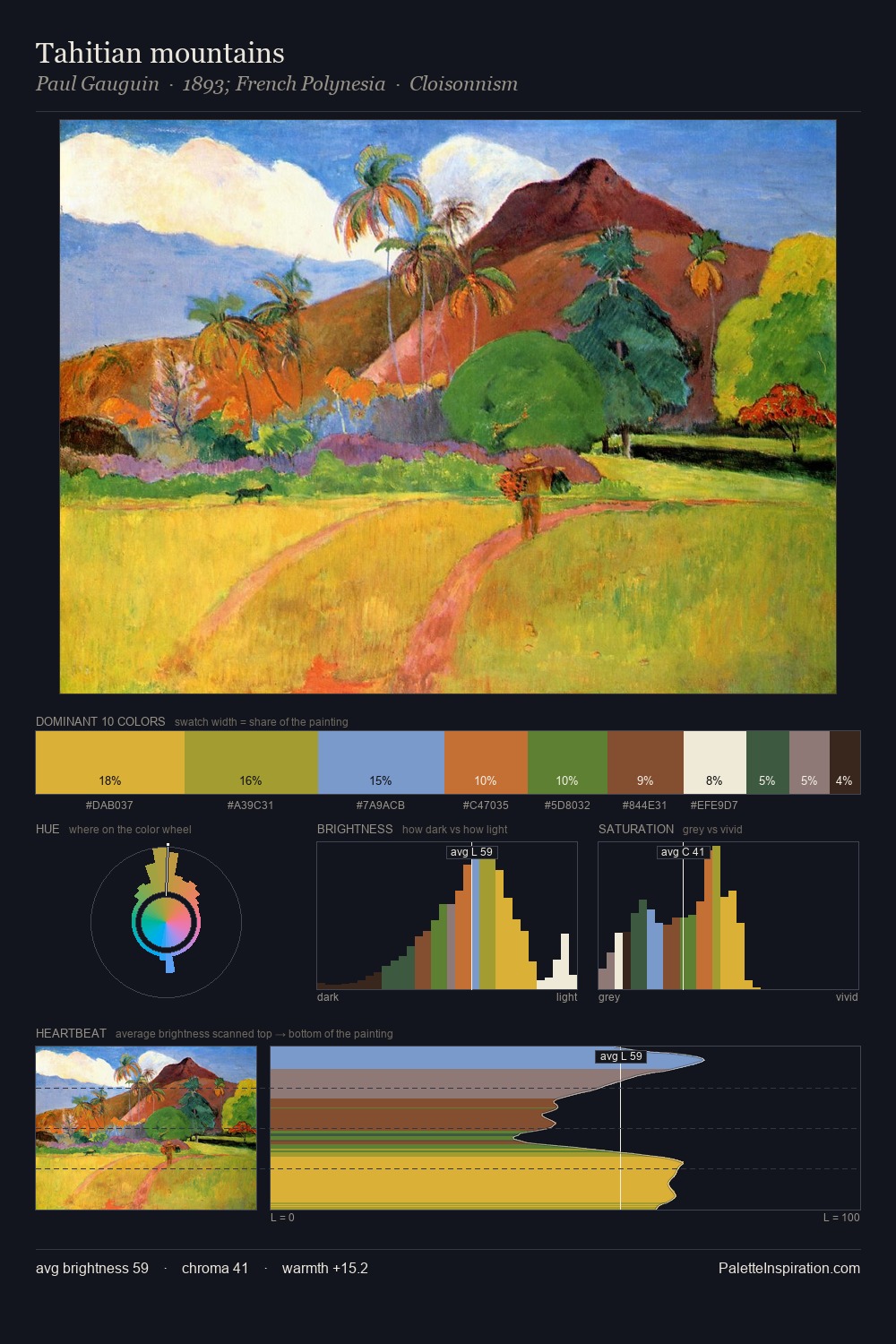
Paul Gauguin Palette 3
Soft Vermillion
Soft Low-contrast, gentle chroma - mid-key values and low saturation, approachable and calm.
Vermillion Brilliant red-orange - the classic mercury sulfide pigment, vivid and warm.

Palette Analysis
Values in Paul Gauguin tilt decisively toward white, giving the palette its luminous character. Paul Gauguin tilts toward cool - blues and silver-greys carry the structural weight. Mid-range chroma keeps the palette grounded - colourful but not strident. The most saturated colour, #EAB322, covers 32.9% of the surface: too much to call an accent, too strong to ignore. At 55 units of value range, the palette has the tonal breadth to sustain complex spatial readings. The mid-to-high key, cool bias, and moderate chroma point to outdoor observation - sky and diffused daylight as the dominant light source. Paul Gauguin's palette 3 carries its own internal logic while remaining in conversation with the artist's broader colour intelligence.
Example use cases
- design agencies
- product brands
- e-commerce
- editorial sites
- publishing
I Love This!
Use This Palette
Copy, export, or download for your project
Copy, export, or download for your project
Copy:
Download:
Share: