Paul Bril Palette 7
Penumbral Bister
Penumbral Partial shadow - the transitional zone between light and full dark, soft-edged.
Bister Dark warm brown - a traditional ink and wash pigment made from wood soot.

Palette Analysis
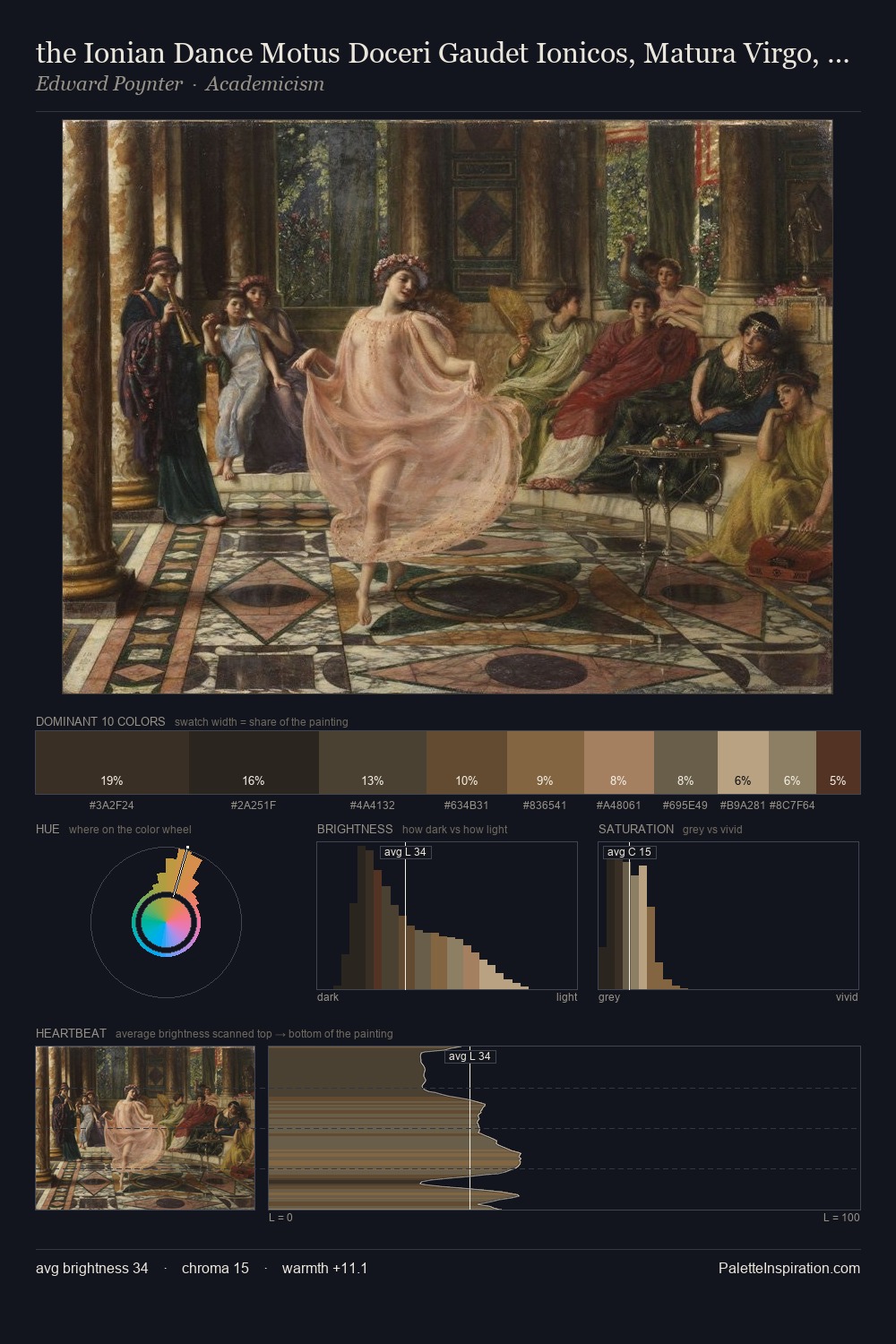
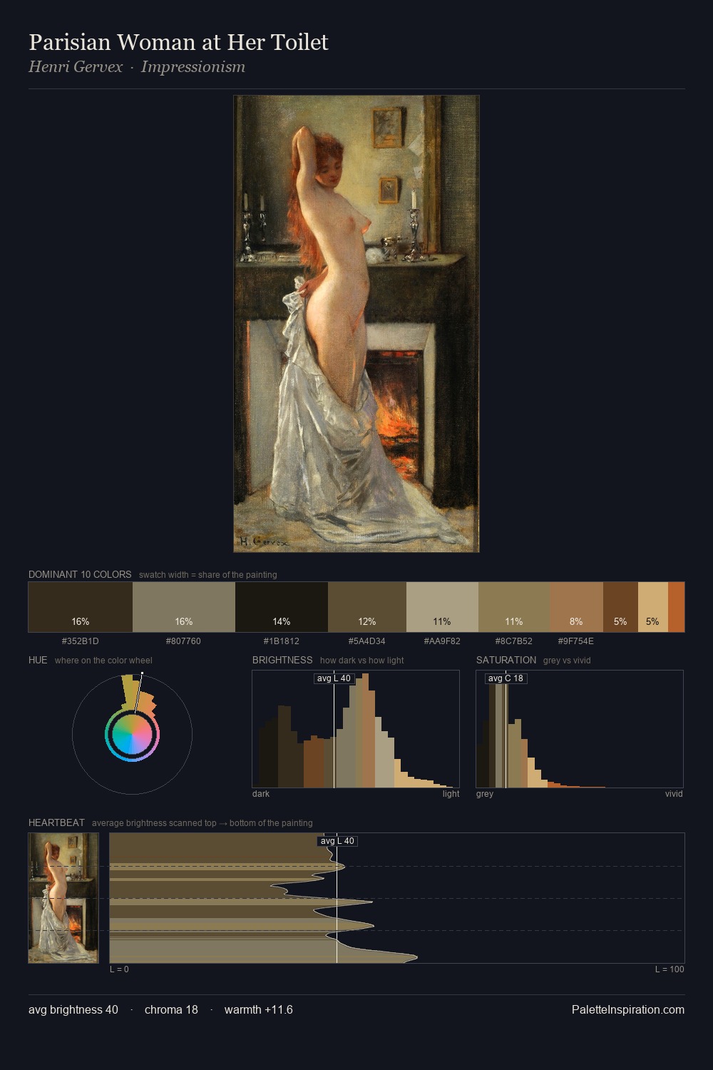
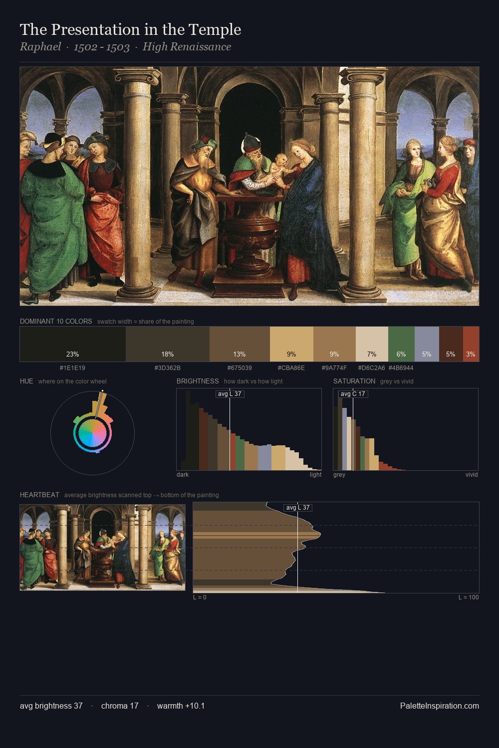
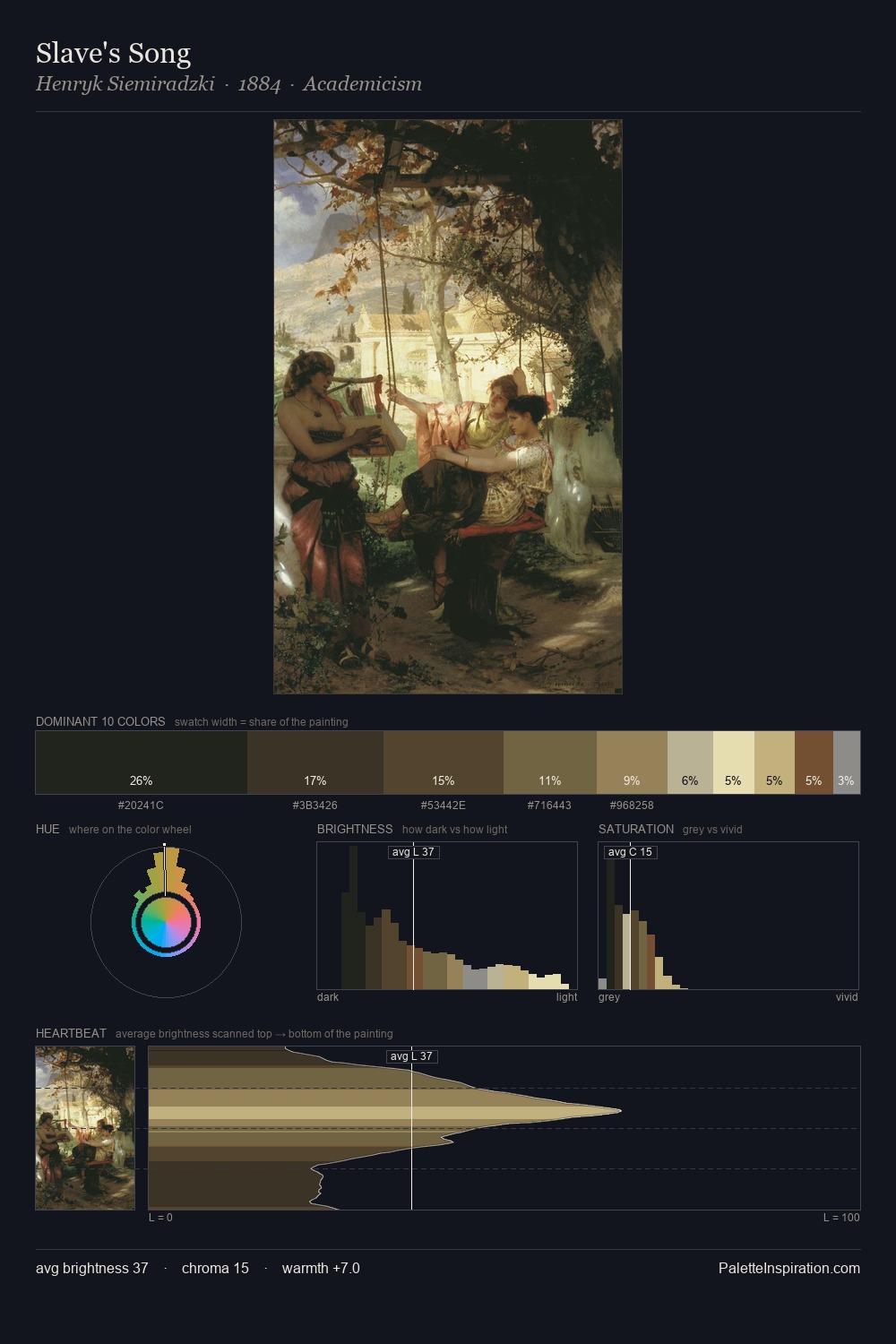
Paul Bril occupies the comfortable middle of the value scale, avoiding both extremes to hold the eye in a sustained middle grey. Warm and cool are kept in productive tension, creating the kind of chromatic harmony that sustains the eye. Every colour is desaturated; the palette proceeds through near-neutrals and gently-coloured greys. Only 9.7% is devoted to #8D6440, yet that small allocation delivers the palette's entire chromatic tension. 54 units of value spread create a palette that is varied but unified - contrast in the service of harmony. Palette 7 sits within the larger chromatic argument that Paul Bril's complete body of work advances.
Example use cases
- theater design
- jewelry brands
- tobacco-adjacent retail
- event branding
- film & entertainment
I Love This!
Use This Palette
Copy, export, or download for your project
Copy, export, or download for your project
Copy:
Download:
Share: