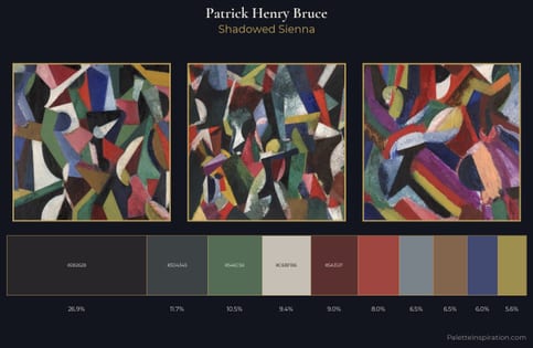
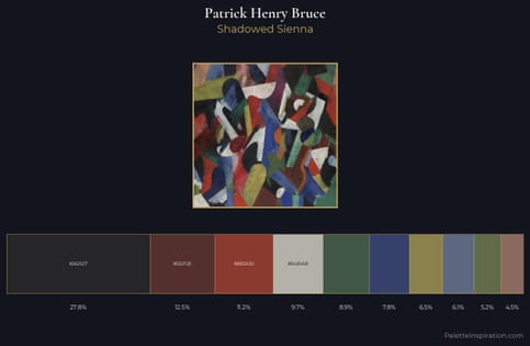
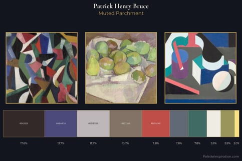
Patrick Henry Bruce Palette 1
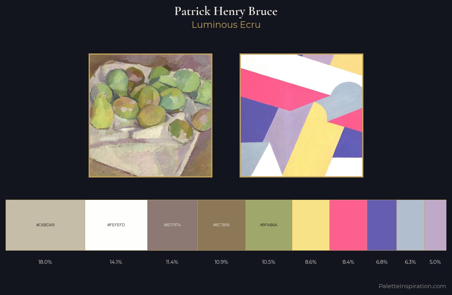
Palette Analysis
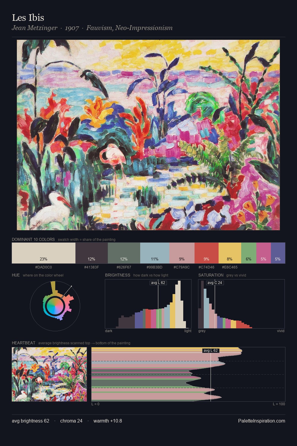
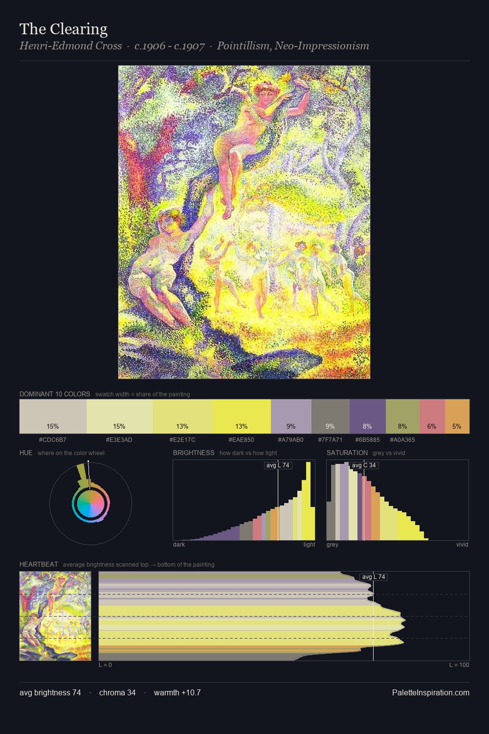
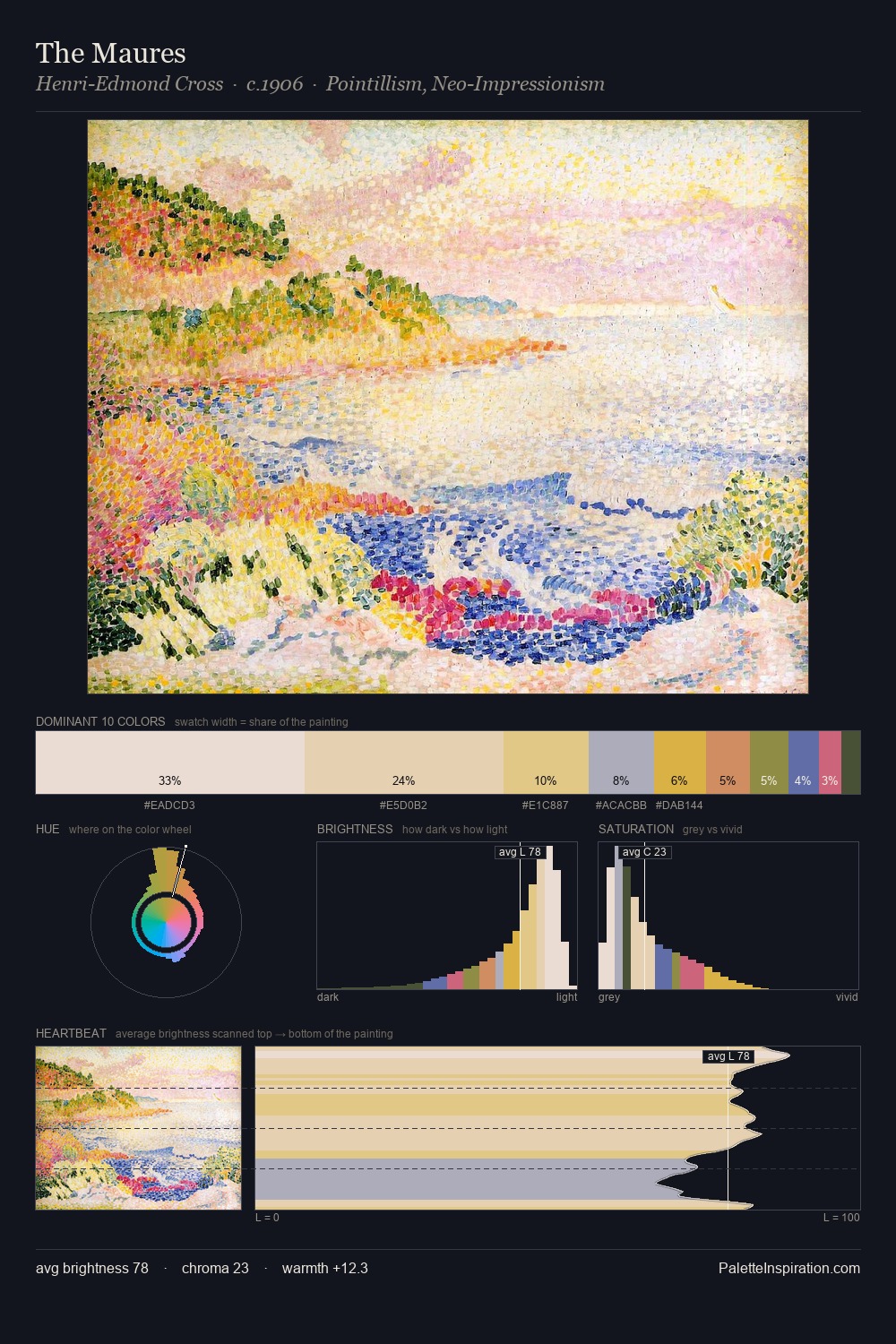
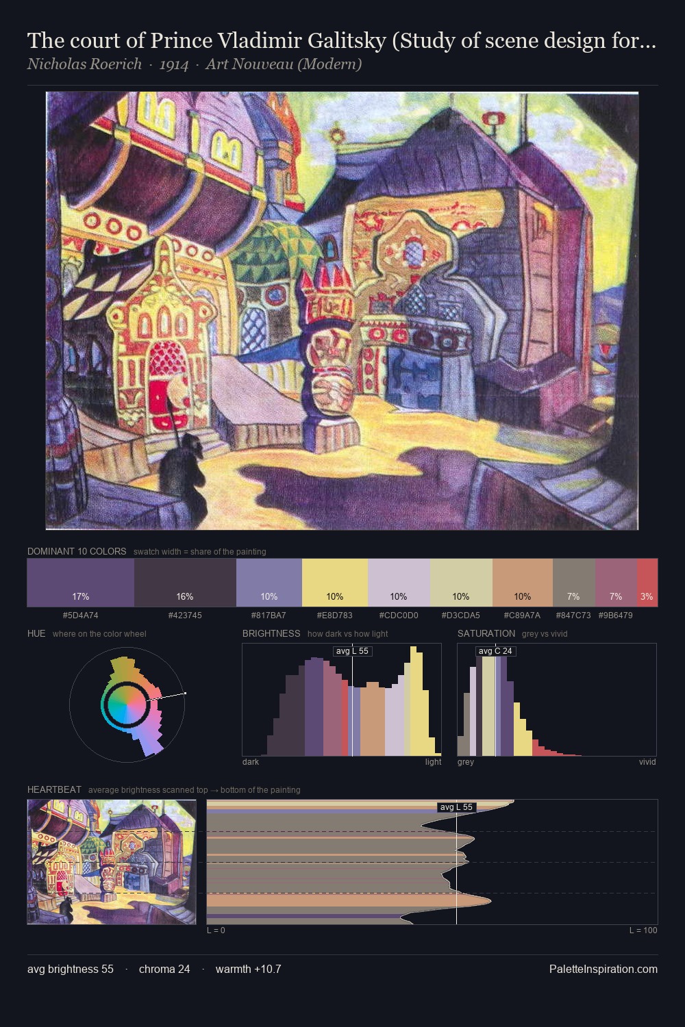
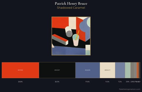
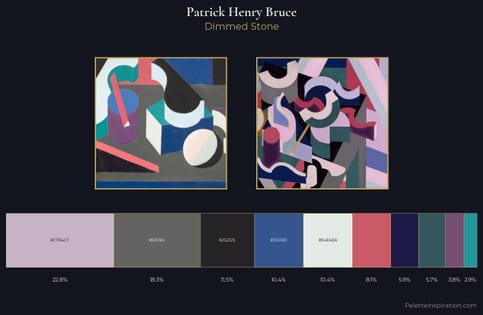
Values in Patrick Henry Bruce tilt decisively toward white, giving the palette its luminous character. Cool tones set the register here - the blues and greens easily outweigh any warm accents. Mid-saturation across the board: the palette has colour character without chromatic excess. #655EB0 delivers the chromatic peak at only 6.8% - a small shot of colour with outsized visual impact. Spanning 47 units on the value axis, the palette achieves the balance between tonal flatness and fragmentation. The mid-to-high key, cool bias, and moderate chroma point to outdoor observation - sky and diffused daylight as the dominant light source. In the context of Patrick Henry Bruce's full range of palettes, group 1 represents one movement in an ongoing chromatic dialogue.
Example use cases
- design agencies
- product brands
- e-commerce
- editorial sites
- publishing
I Love This!
Copy, export, or download for your project