Paolo Veneziano Palette 1
Soft Apricot
Soft Low-contrast, gentle chroma - mid-key values and low saturation, approachable and calm.
Apricot Soft warm orange - peach-adjacent, the color of ripe stone fruit.

Palette Analysis
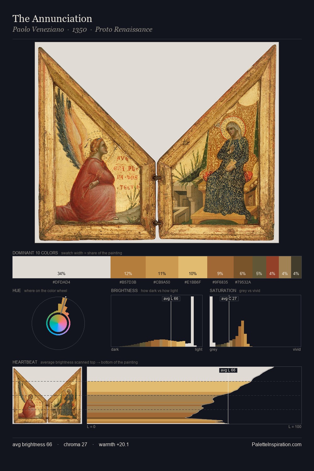
Paolo Veneziano is high in key: pale, luminous, and filled with optical air. Temperature reads distinctly warm: the reds and earth tones from Paolo Veneziano carry the compositional weight. Mid-saturation across the board: the palette has colour character without chromatic excess. 31.2% of the palette belongs to #E0DBD5, a concentration that makes it the unmistakable visual centre. Only 5.9% is devoted to #914229, yet that small allocation delivers the palette's entire chromatic tension. 51 units of value spread create a palette that is varied but unified - contrast in the service of harmony. This is palette 1 of Paolo Veneziano's sequence - a single chapter in a chromatic story told across many works.
Example use cases
- ceramics & pottery
- boutique hospitality
- menswear
- heritage food brands
- craft & artisan brands
I Love This!
Use This Palette
Copy, export, or download for your project
Copy, export, or download for your project
Copy:
Download:
Share: