Outsider Art Palette 2

Palette Analysis
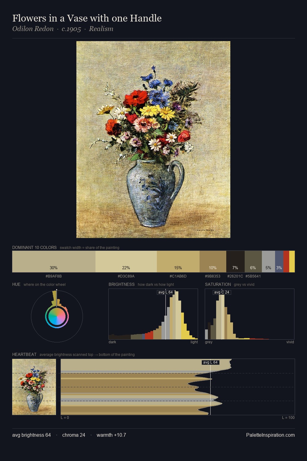
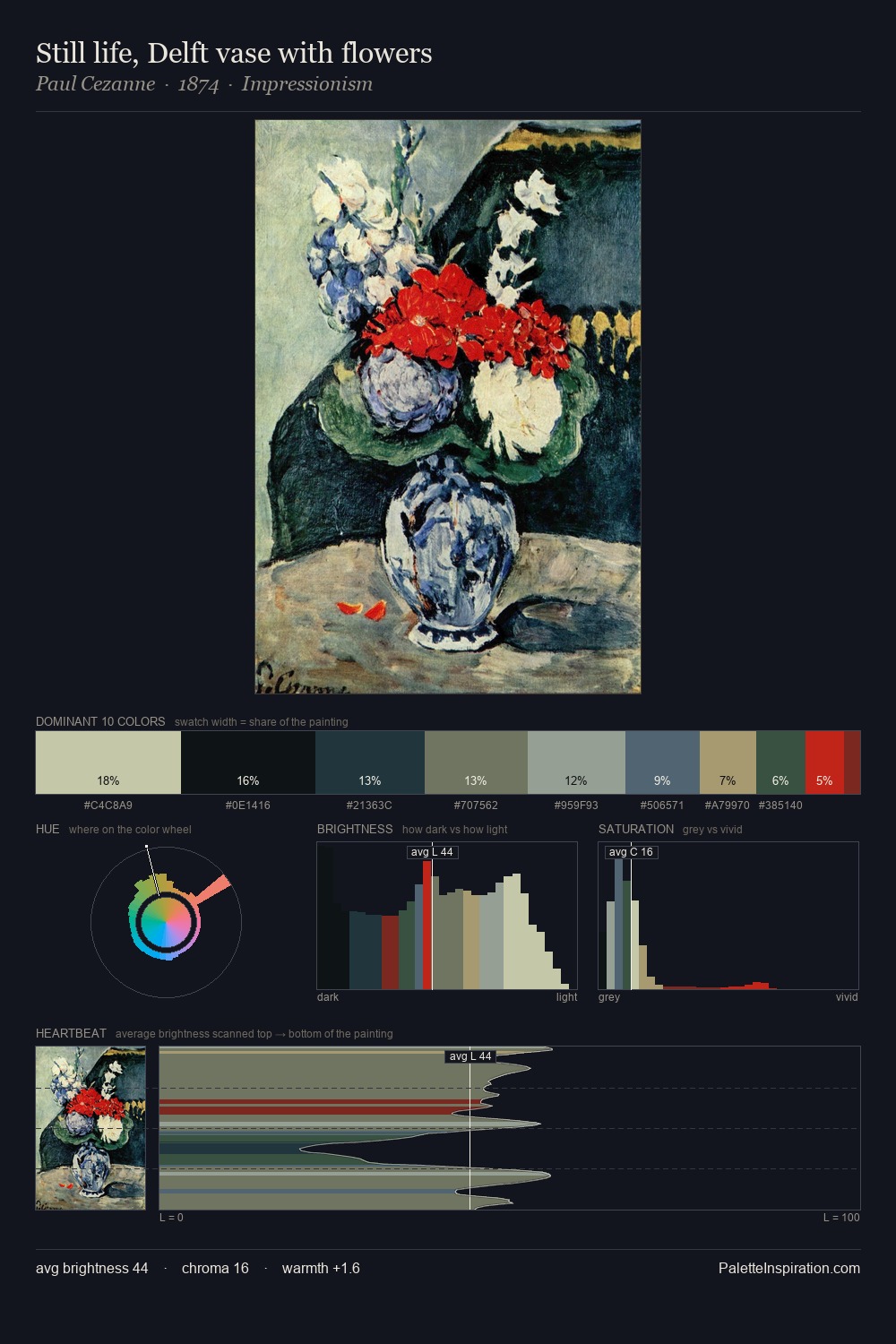
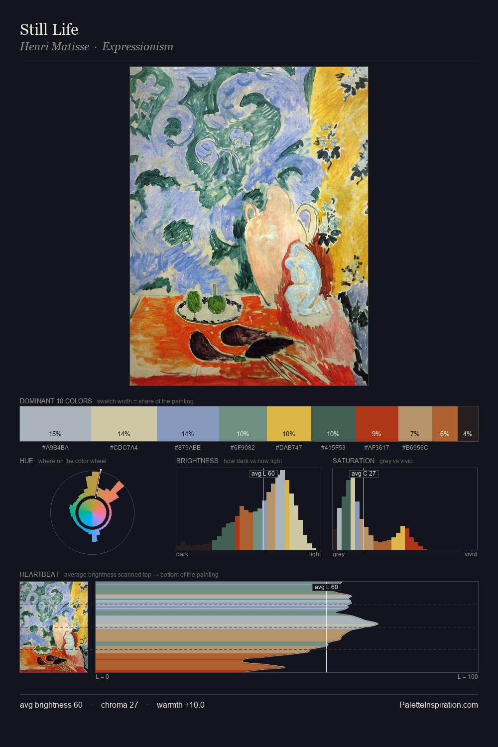
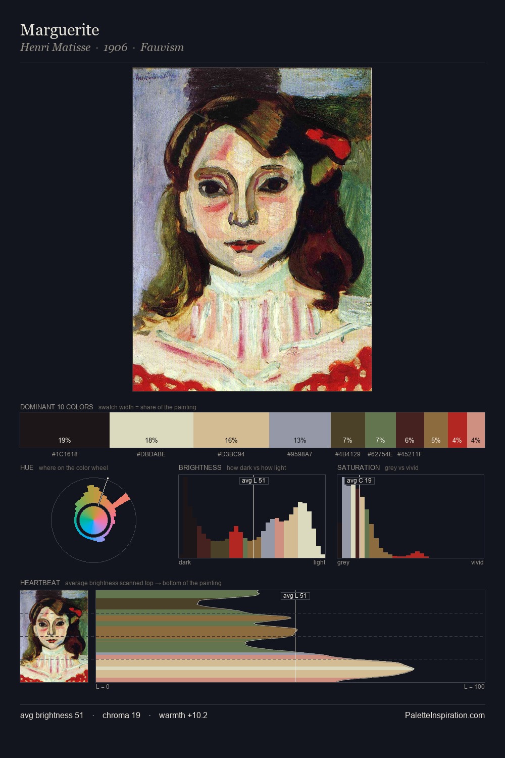
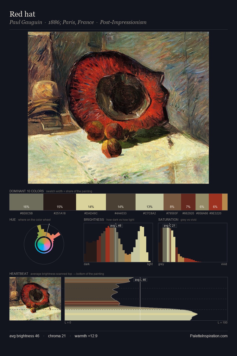
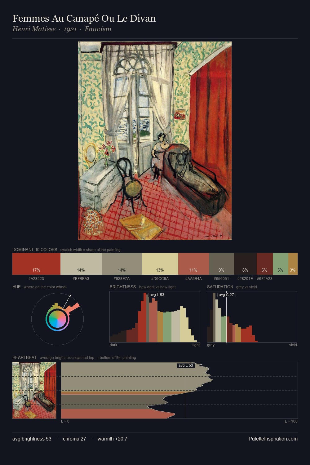
Outsider art works in the upper reaches of the value scale, creating an atmosphere of brightness and expansiveness. Temperature is cool-dominant, with blue and green families claiming the largest areas. Chroma is kept low across all colours, producing the soft, enveloping quality that characterises tonal painting. At 28.2%, #DDDCC3 functions less as a colour accent and more as a complete atmospheric environment. Only 2.9% is devoted to #AC845C, yet that small allocation delivers the palette's entire chromatic tension. The full value range is 69 units: broad enough to build convincing three-dimensional form. The mid-to-high key, cool bias, and moderate chroma point to outdoor observation - sky and diffused daylight as the dominant light source.
Example use cases
- publishing
- corporate identity
- consumer apps
- hospitality
- design agencies
I Love This!
Copy, export, or download for your project