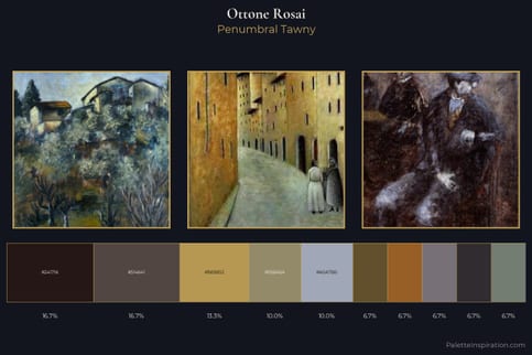
Ottone Rosai Palette 2
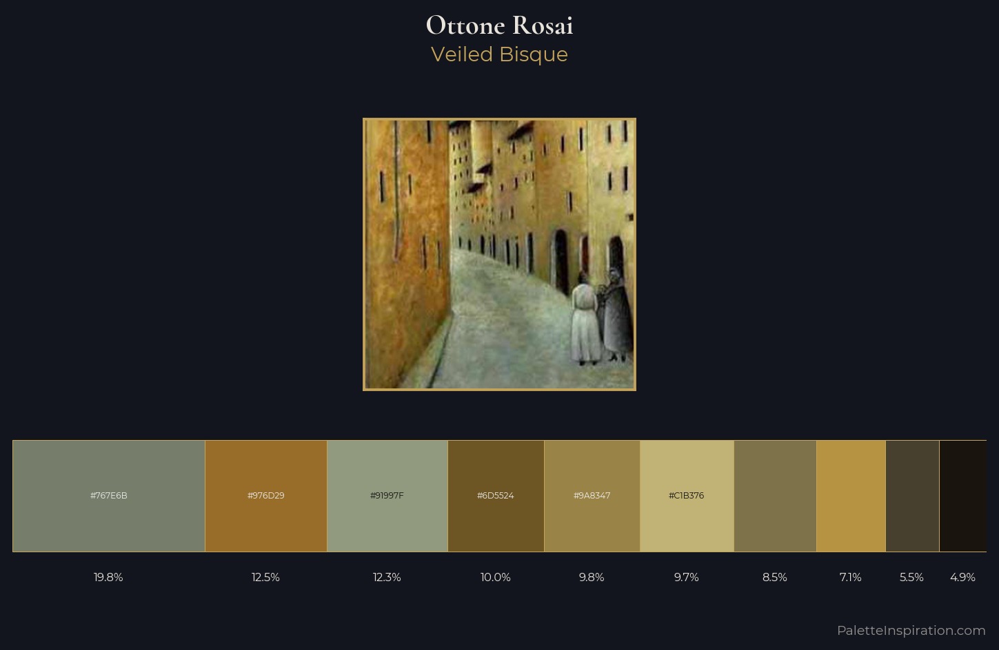
Palette Analysis
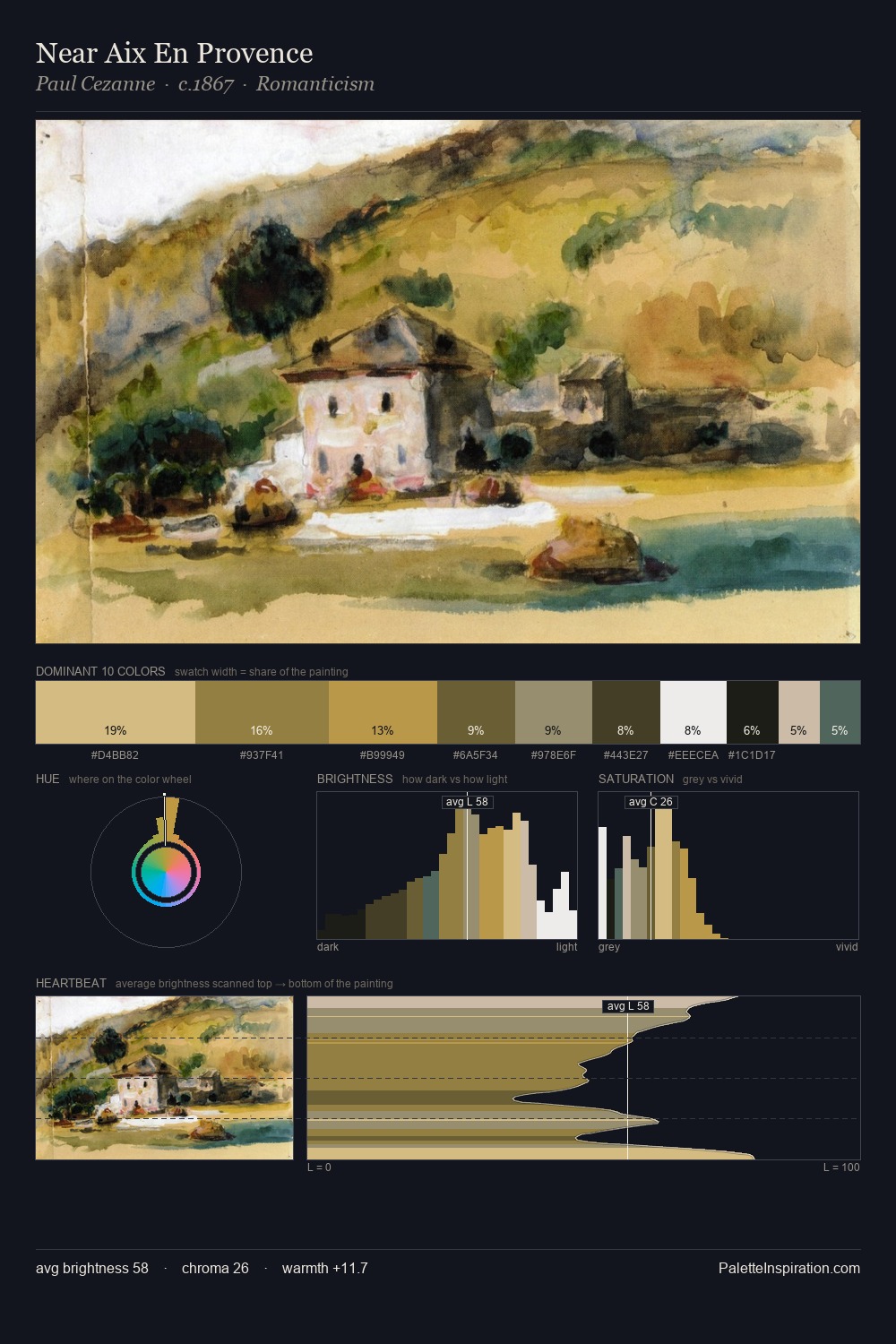
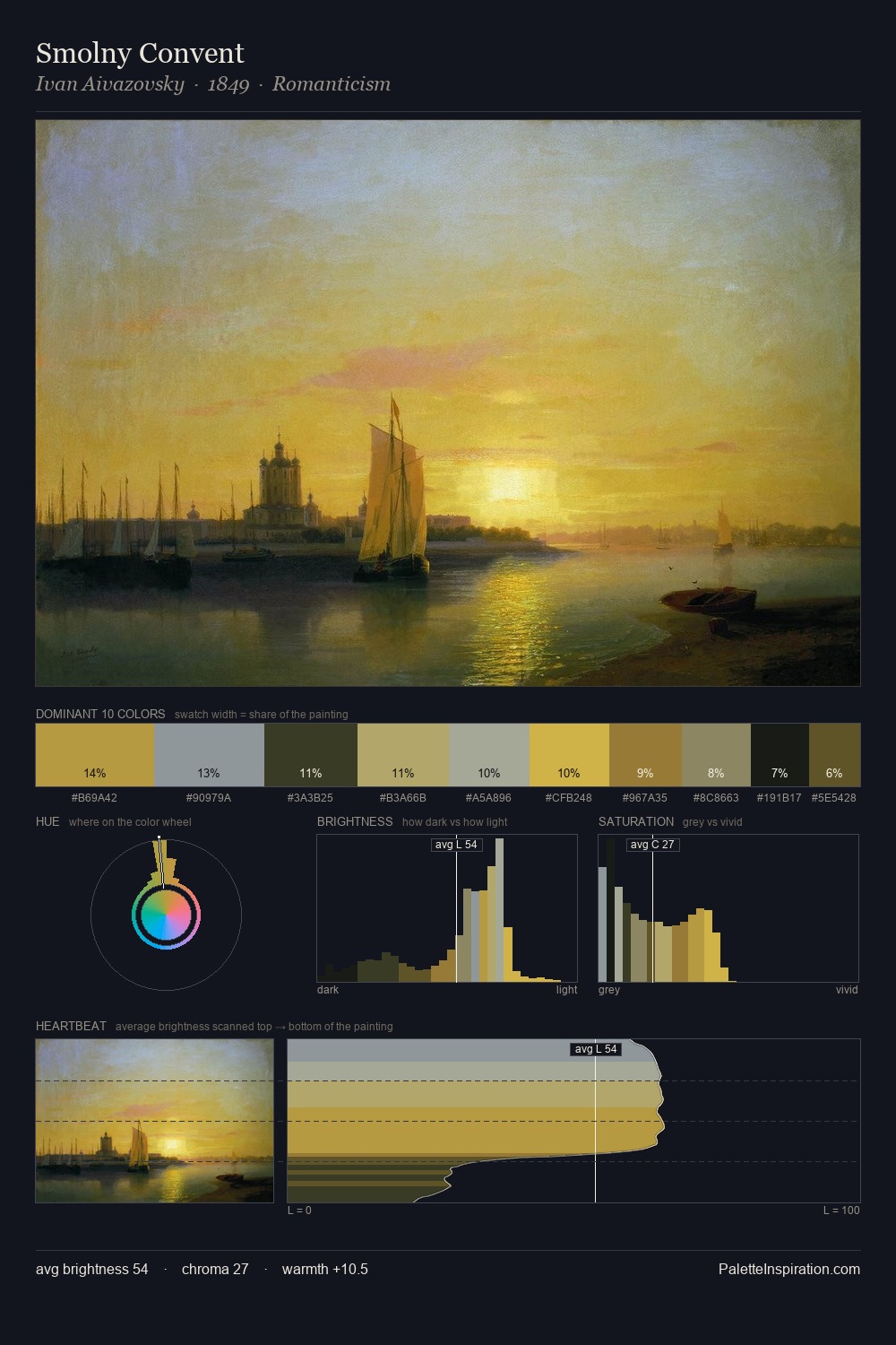
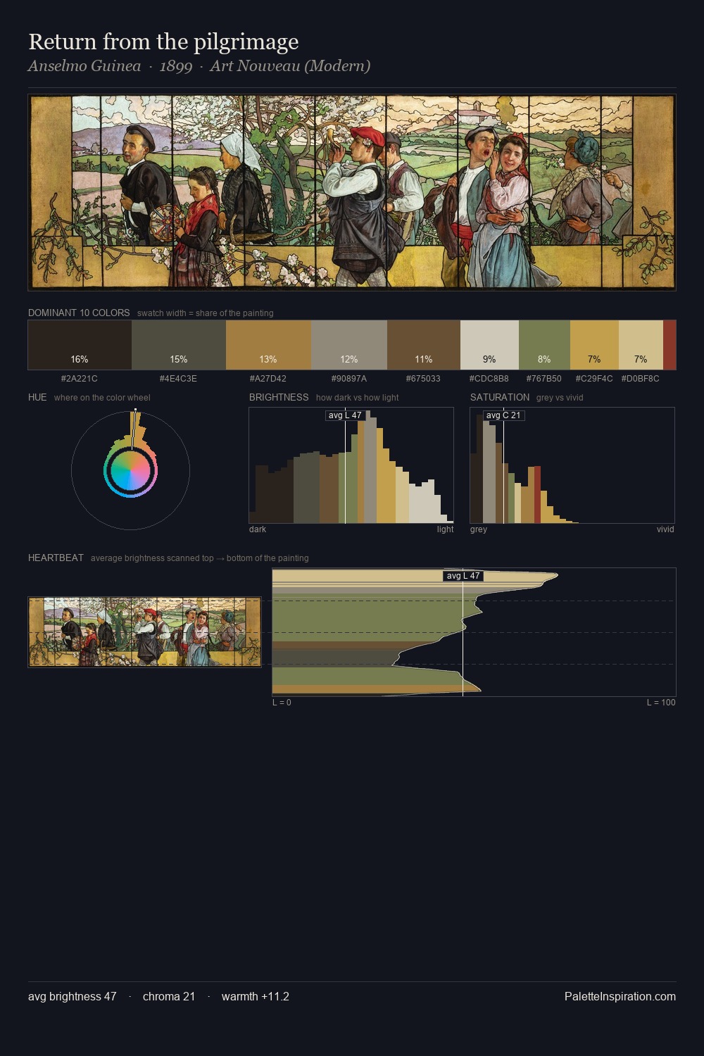
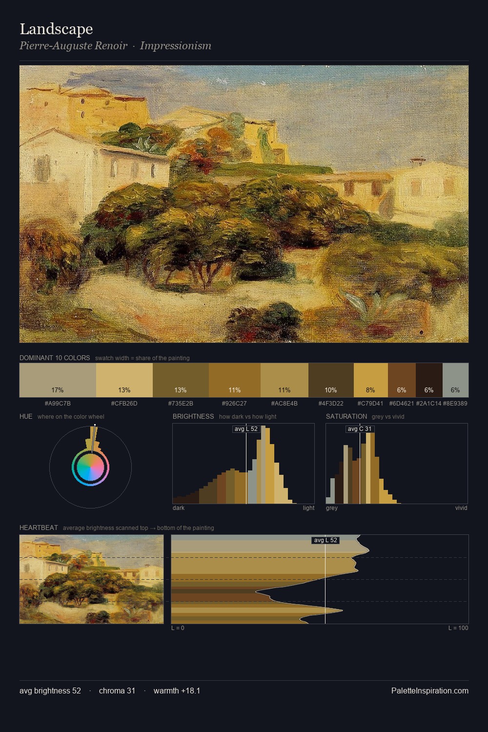
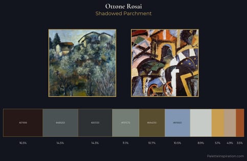
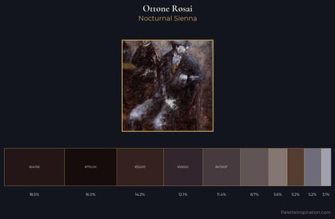
Values in Ottone Rosai rest in the mid-range - neither dramatically lit nor steeped in shadow. Cool tones set the register here - the blues and greens easily outweigh any warm accents. Saturation is measured and controlled, giving the palette presence without visual aggression. At 9.7%, #C1B376 carries the palette's sharpest chromatic charge: an accent that earns its place precisely because it is withheld. A value spread of 56 units gives the palette both depth and air - shadows are genuinely dark, lights genuinely light. The palette has the character of outdoor light: cool, mid-bright, with colour rendered faithfully rather than expressively. Palette 2 sits within the larger chromatic argument that Ottone Rosai's complete body of work advances.
Example use cases
- food packaging
- leather accessories
- travel & outdoor
- natural cosmetics
- interior design
I Love This!
Copy, export, or download for your project