Othon Friesz Palette 1

Palette Analysis
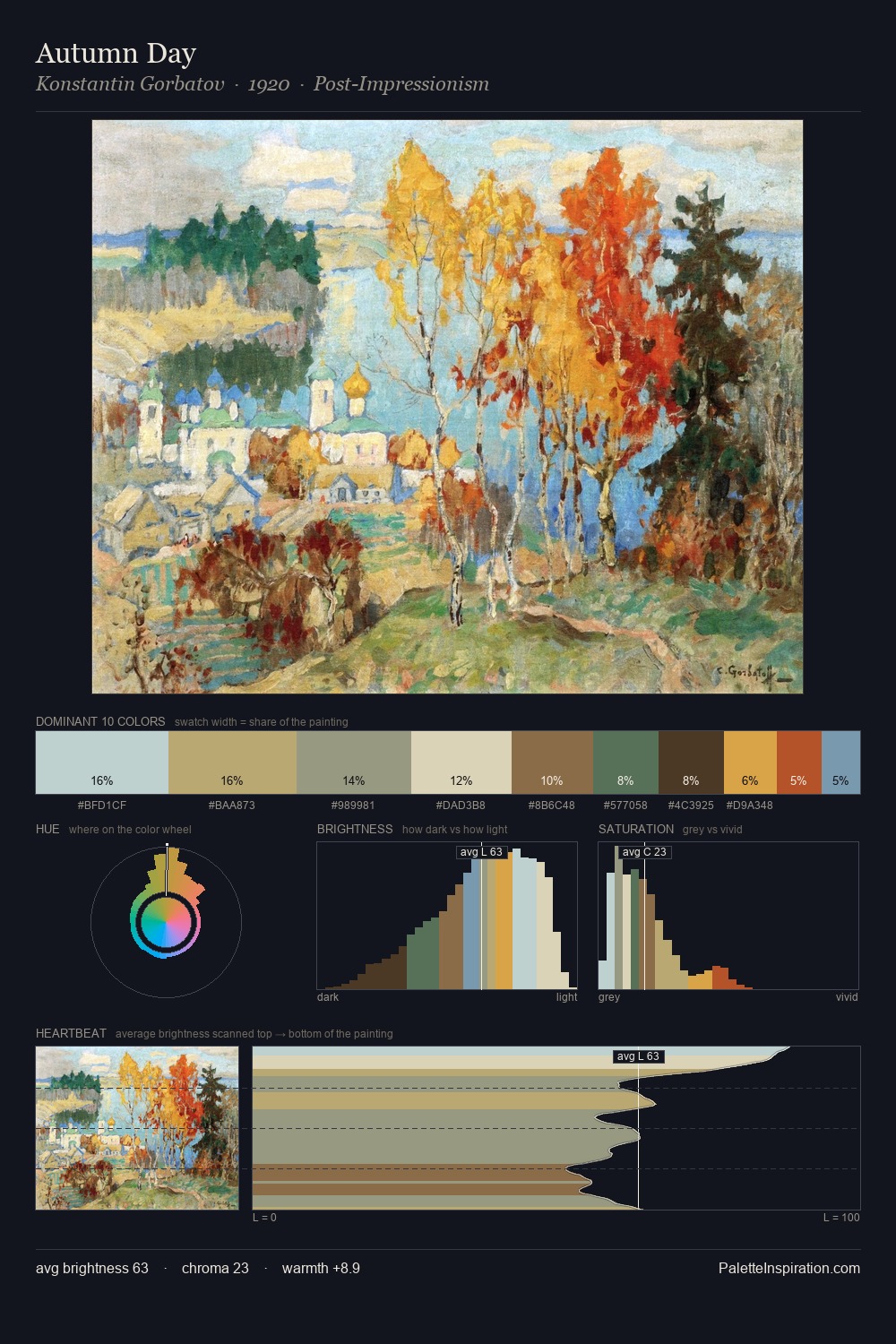
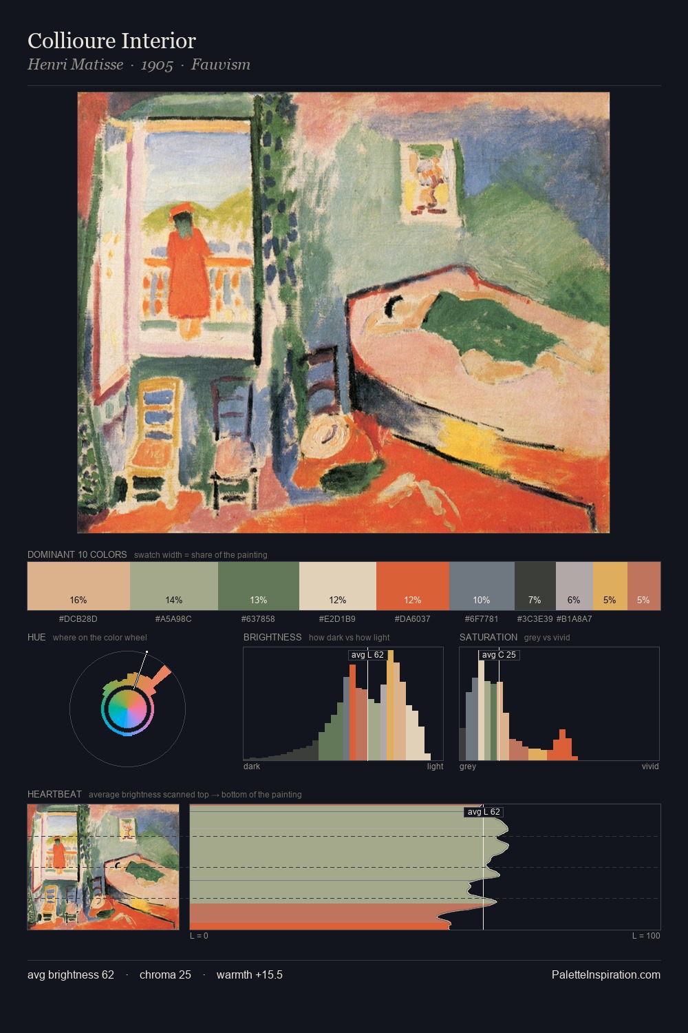
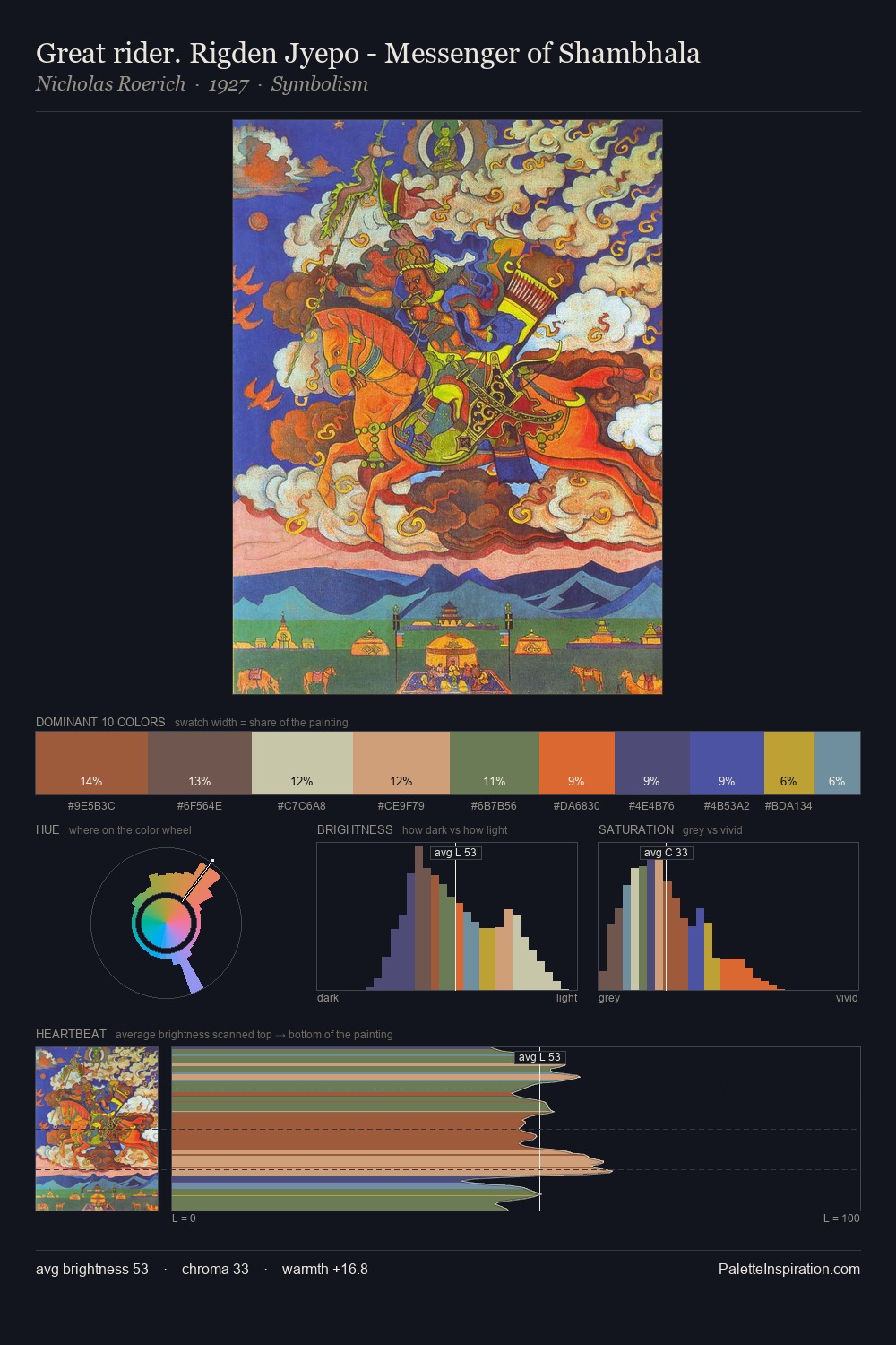
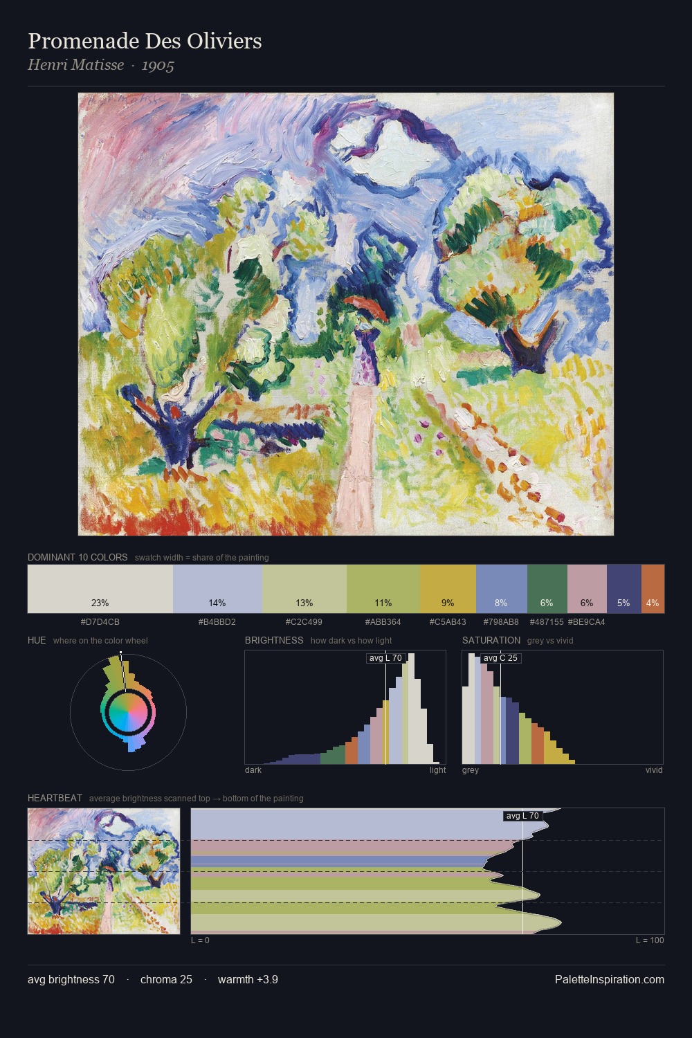
The high-key values of Othon Friesz give it an effulgent, almost bleached quality. Cool tones set the register here - the blues and greens easily outweigh any warm accents. Chroma is kept low across all colours, producing the soft, enveloping quality that characterises tonal painting. The dominant colour, #DDD2B7, takes 37.5% of the total area, establishing the overall mood before any other hue is introduced. The highest-chroma note - #D9BA4B - appears at just 7.1%, deployed as a precision accent against the quieter ground. At 47 units across the value scale, the palette keeps contrast readable without letting it dominate. The palette has the character of outdoor light: cool, mid-bright, with colour rendered faithfully rather than expressively. Othon Friesz's palette 1 carries its own internal logic while remaining in conversation with the artist's broader colour intelligence.
Example use cases
- ceramics & pottery
- boutique hospitality
- menswear
- heritage food brands
- craft & artisan brands
I Love This!
Copy, export, or download for your project