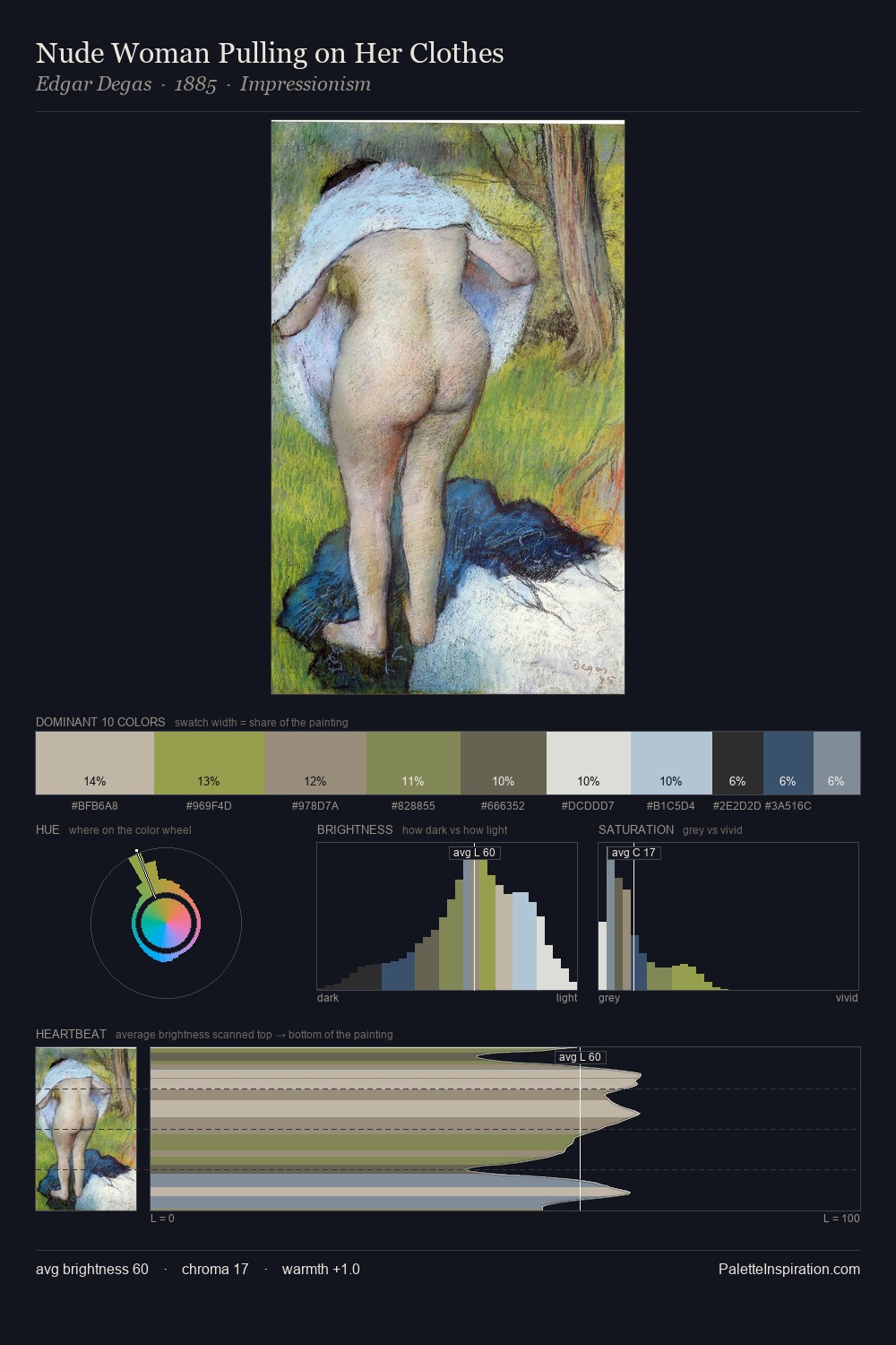
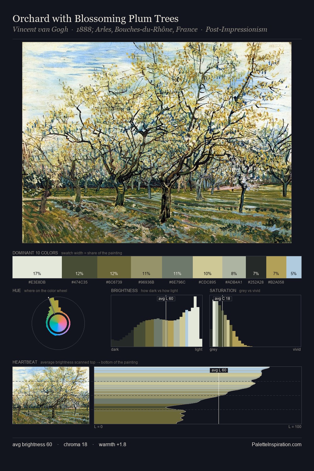
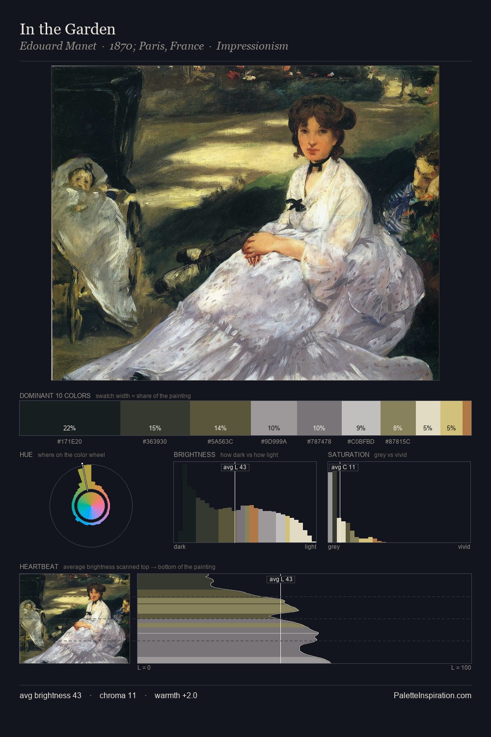
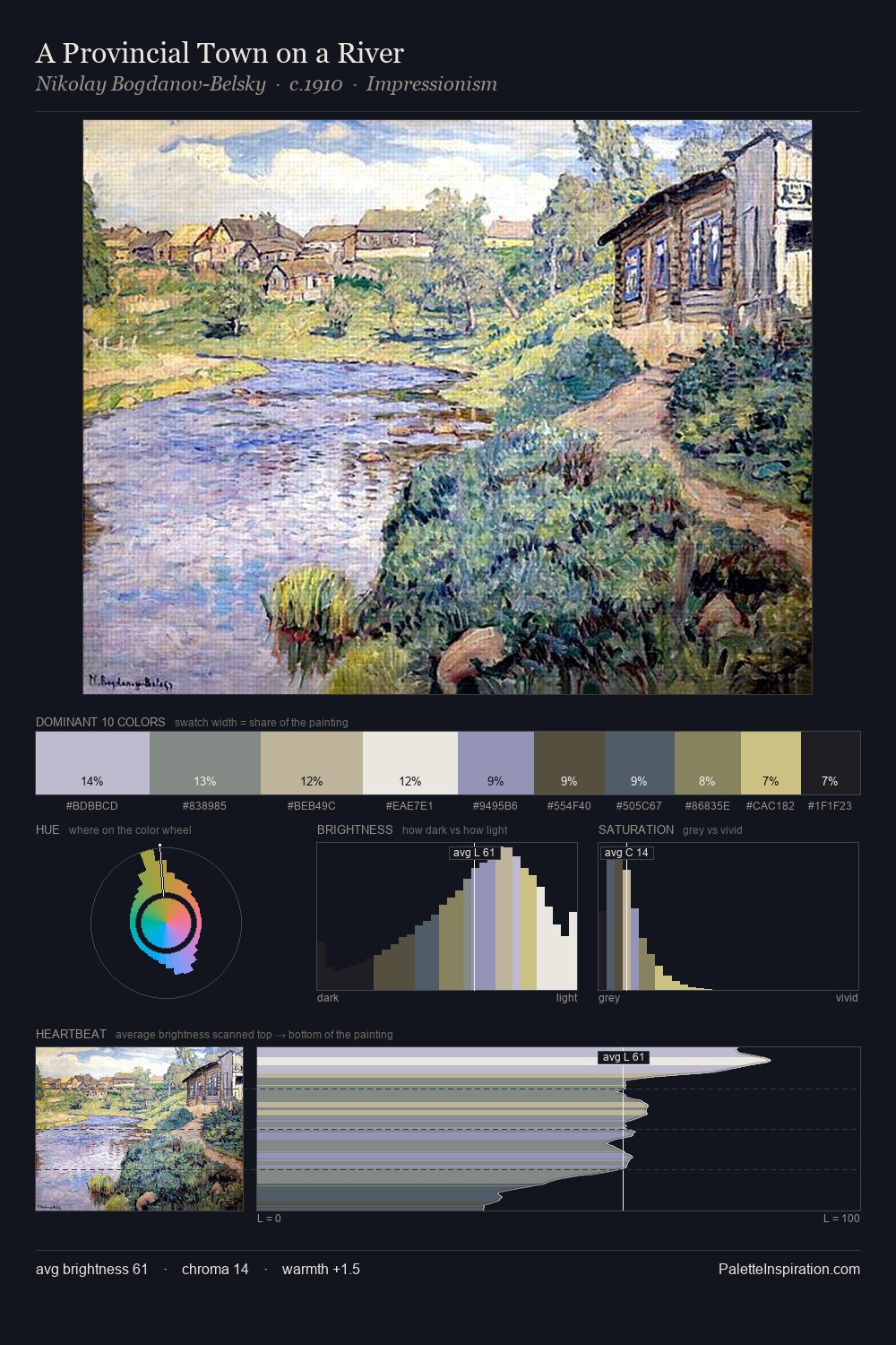
Ossip Zadkine Palette 2

Palette Analysis
Ossip Zadkine is strongly light-biased - shadow is suggested rather than declared. Cool tones set the register here - the blues and greens easily outweigh any warm accents. All colours lean toward grey, building depth through value rather than colour punch. At 41.8%, #EBE9DC functions less as a colour accent and more as a complete atmospheric environment. The highest-chroma note - #B7C1D2 - appears at just 5.4%, deployed as a precision accent against the quieter ground. At 70 units of value range, the palette has the tonal breadth to sustain complex spatial readings. The palette has the character of outdoor light: cool, mid-bright, with colour rendered faithfully rather than expressively. Ossip Zadkine's palette 2 carries its own internal logic while remaining in conversation with the artist's broader colour intelligence.
Example use cases
- florist branding
- event design
- real estate
- jewelry retail
- hospitality branding
I Love This!
Copy, export, or download for your project