Orientalism Palette 5
Soft Ecru
Soft Low-contrast, gentle chroma - mid-key values and low saturation, approachable and calm.
Ecru Unbleached linen - warm mid-neutral, slightly grayed, raw and natural.

Palette Analysis
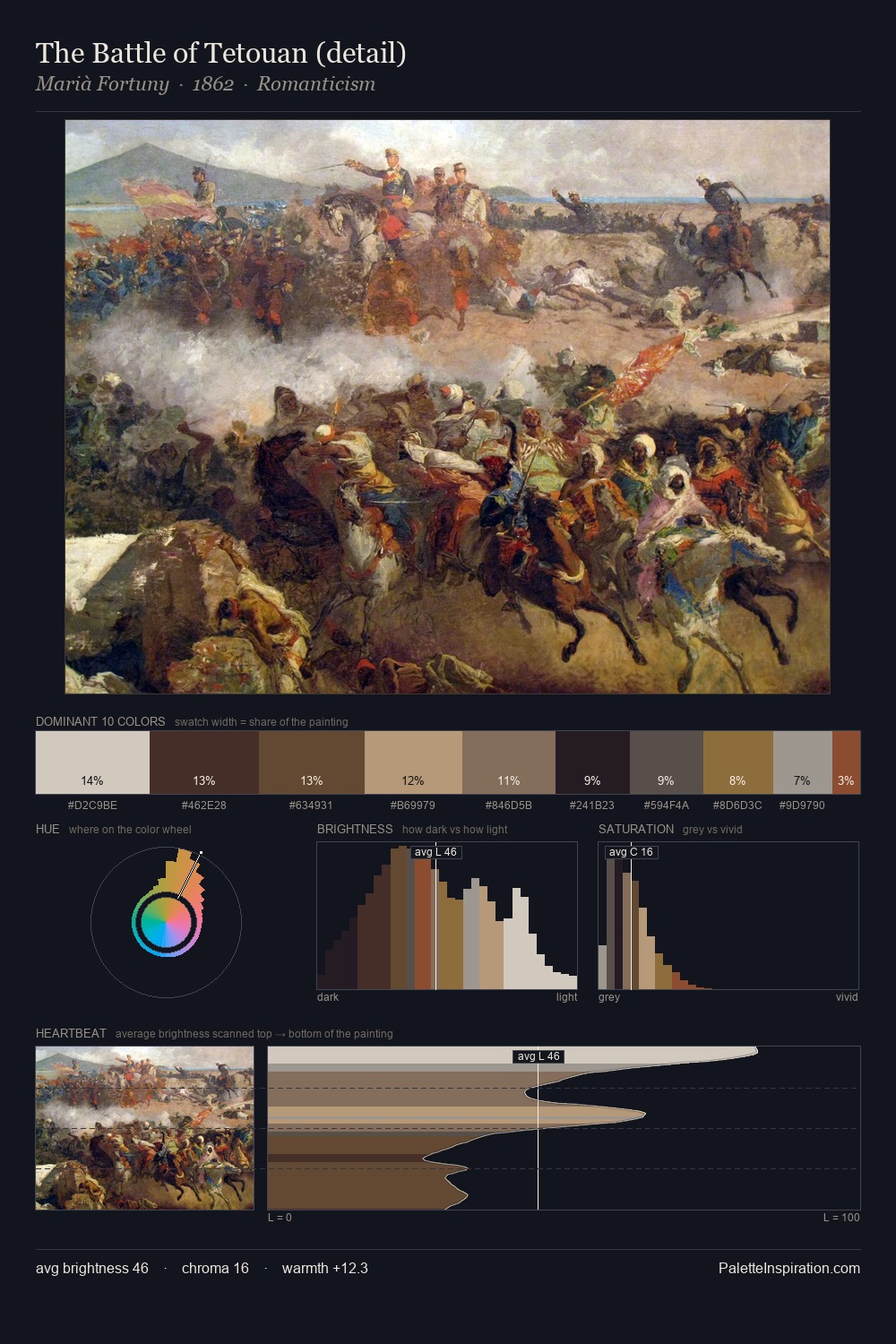
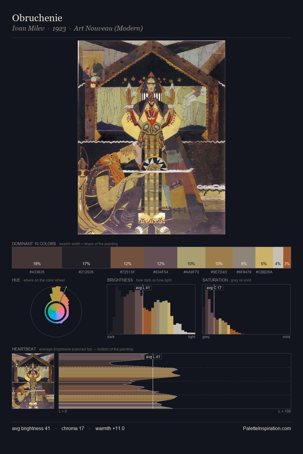
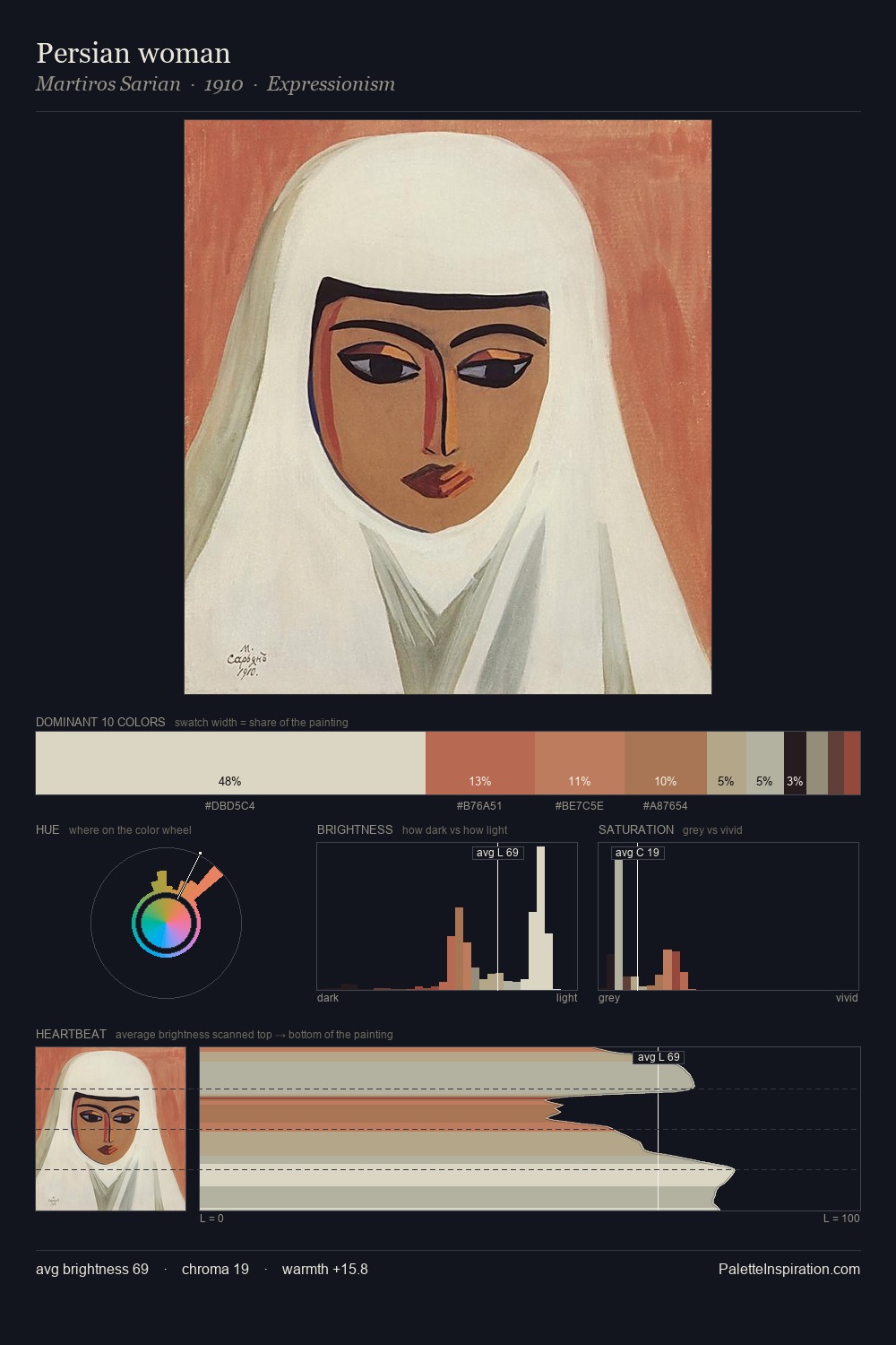
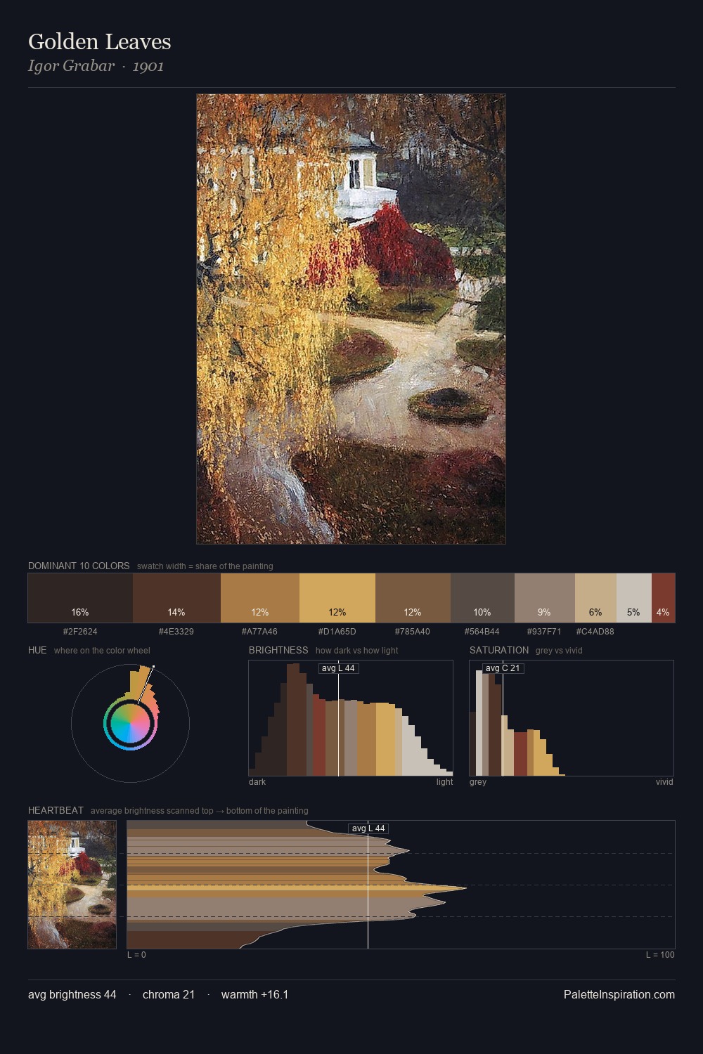
Values in Orientalism tilt decisively toward white, giving the palette its luminous character. Warm hues command this palette; it favours the reds, oranges, and yellows of firelight and earth. Saturation is deliberately withheld - the beauty here lies in the near-monochromatic gradations rather than colour difference. #694A36 functions as the palette's exclamation mark: highest chroma, lowest percentage (7.5%). The palette spans 54 value units: a measured range that delivers coherence over drama.
Example use cases
- exhibition design
- foundation branding
- estate management
- art education
- museums & galleries
I Love This!
Use This Palette
Copy, export, or download for your project
Copy, export, or download for your project
Copy:
Download:
Share: