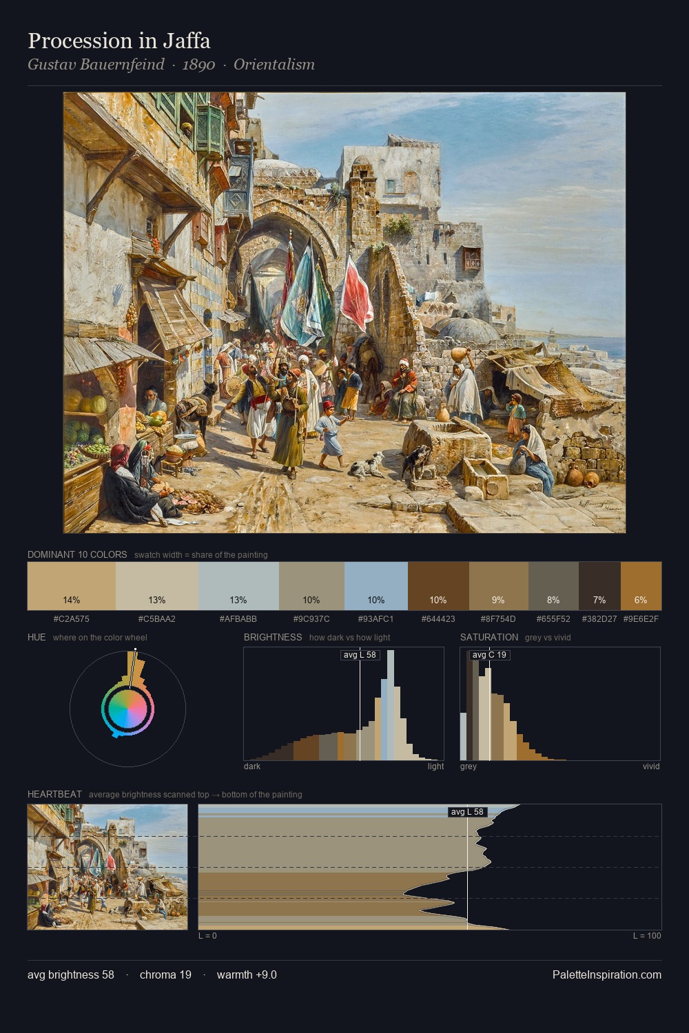
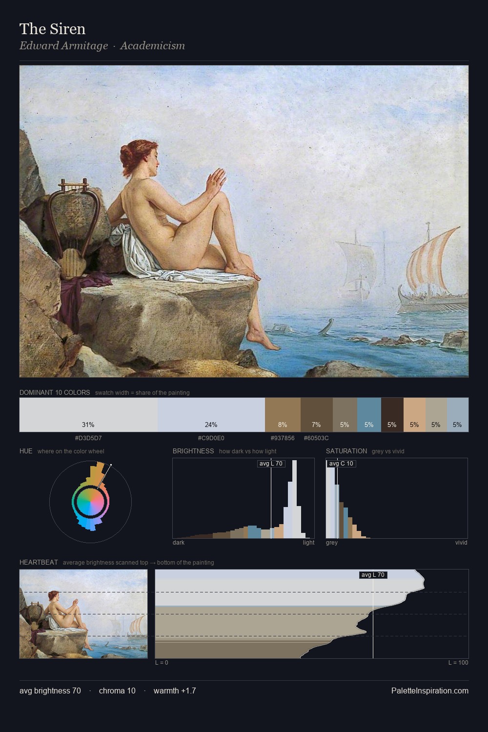
Orientalism Palette 3
Soft Ivory
Soft Low-contrast, gentle chroma - mid-key values and low saturation, approachable and calm.
Ivory Warm creamy white - the color of natural ivory, warmer than pure white.

Palette Analysis
Orientalism is high in key: pale, luminous, and filled with optical air. Warm and cool are kept in productive tension, creating the kind of chromatic harmony that sustains the eye. Every colour is desaturated; the palette proceeds through near-neutrals and gently-coloured greys. The saturated accent, #C0A473, registers at 7.1% - sparse enough to feel like a deliberate surprise. At 51 units across the value scale, the palette keeps contrast readable without letting it dominate.
Example use cases
- exhibition design
- foundation branding
- estate management
- art education
- museums & galleries
I Love This!
Use This Palette
Copy, export, or download for your project
Copy, export, or download for your project
Copy:
Download:
Share: