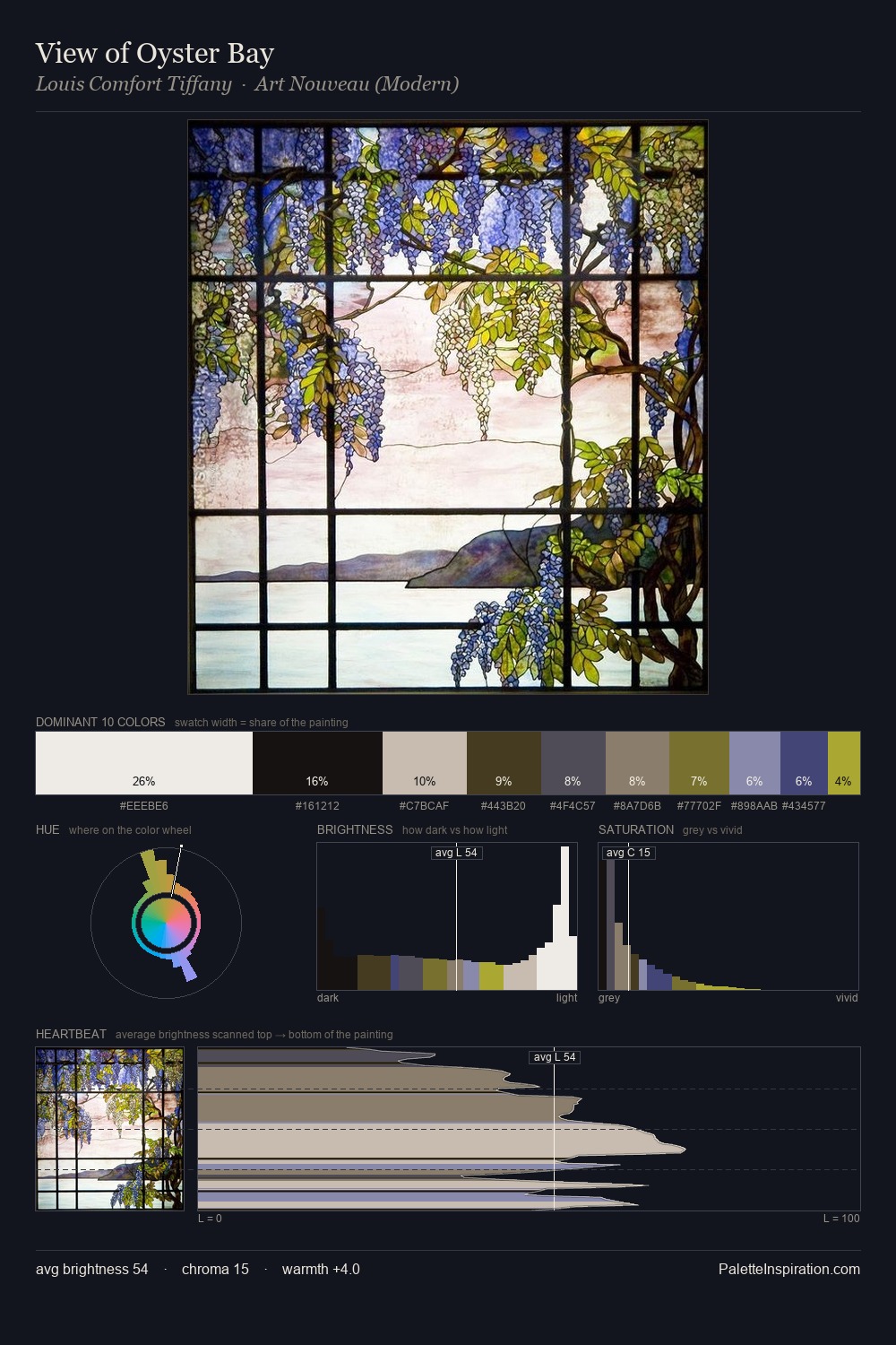
Op Art Palette 2
Muted Parchment
Muted Deliberately desaturated - chroma pulled toward gray, the restraint of tonal painting.
Parchment Aged warm neutral - the color of old manuscript parchment, tan and slightly yellowed.

Palette Analysis
Op Art sits in the centre of the value range, lending the palette a sense of even, sustained light. The artist keeps warm and cool in parity, a balance that lends the work a perceptual shimmer. All colours lean toward grey, building depth through value rather than colour punch. The highest-chroma note - #392911 - appears at just 3.3%, deployed as a precision accent against the quieter ground. From deepest dark to palest light, the palette traverses 78 units of the value scale - a span that creates natural depth.
Example use cases
- archival print
- university identity
- rare books
- cultural institutions
- nonprofit identity
I Love This!
Use This Palette
Copy, export, or download for your project
Copy, export, or download for your project
Copy:
Download:
Share: