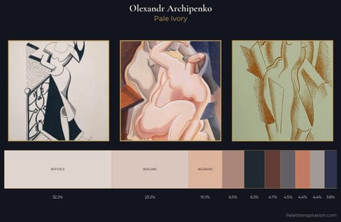
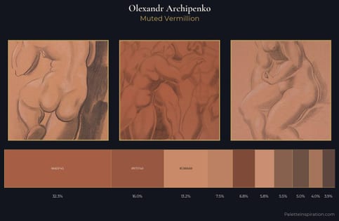
Olexandr Archipenko Palette 1
Palette Analysis
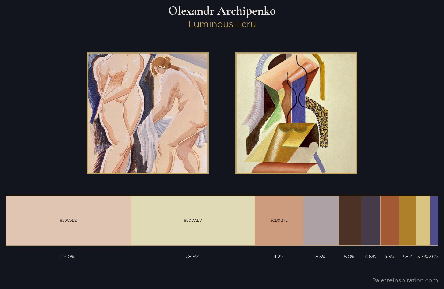
Light floods Olexandr Archipenko; the palette keeps values pale and airy across its range. Heat pervades this palette; warm chromatic identities outweigh cool ones at almost every weight. Saturation is deliberately withheld - the beauty here lies in the near-monochromatic gradations rather than colour difference. The dominant colour, #E0C5B2, takes 29.0% of the total area, establishing the overall mood before any other hue is introduced. Only 3.3% is devoted to #D9C380, yet that small allocation delivers the palette's entire chromatic tension. 54 units of value spread create a palette that is varied but unified - contrast in the service of harmony. Palette 1 sits within the larger chromatic argument that Olexandr Archipenko's complete body of work advances.
Example use cases
- food packaging
- leather accessories
- travel & outdoor
- natural cosmetics
- interior design
I Love This!
Copy, export, or download for your project