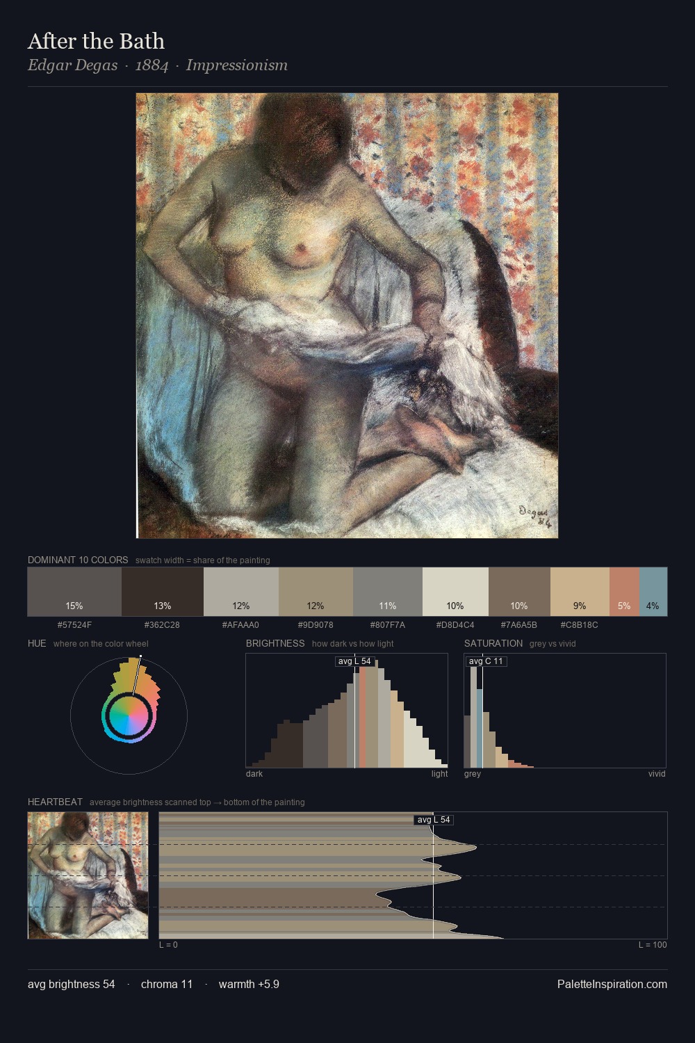
Oda Krohg Palette 1
Soft Vellum
Soft Low-contrast, gentle chroma - mid-key values and low saturation, approachable and calm.
Vellum Smooth pale tan - the color of prepared calf-skin vellum, warmer than parchment.

Palette Analysis
The high-key values of Oda Krohg give it an effulgent, almost bleached quality. Cool tones set the register here - the blues and greens easily outweigh any warm accents. Chroma is kept low across all colours, producing the soft, enveloping quality that characterises tonal painting. The most saturated colour, #AF8057, is reserved to 6.0% of the surface, where it acts as a focal punctuation. A value spread of 61 units gives the palette both depth and air - shadows are genuinely dark, lights genuinely light. The palette has the character of outdoor light: cool, mid-bright, with colour rendered faithfully rather than expressively. Palette 1 sits within the larger chromatic argument that Oda Krohg's complete body of work advances.
Example use cases
- exhibition design
- foundation branding
- estate management
- art education
- museums & galleries
I Love This!
Use This Palette
Copy, export, or download for your project
Copy, export, or download for your project
Copy:
Download:
Share: