Johann Jakob Zeiller Palette 1

Palette Analysis
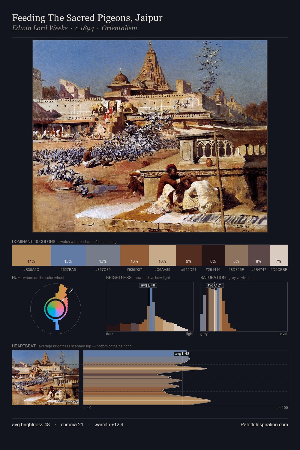
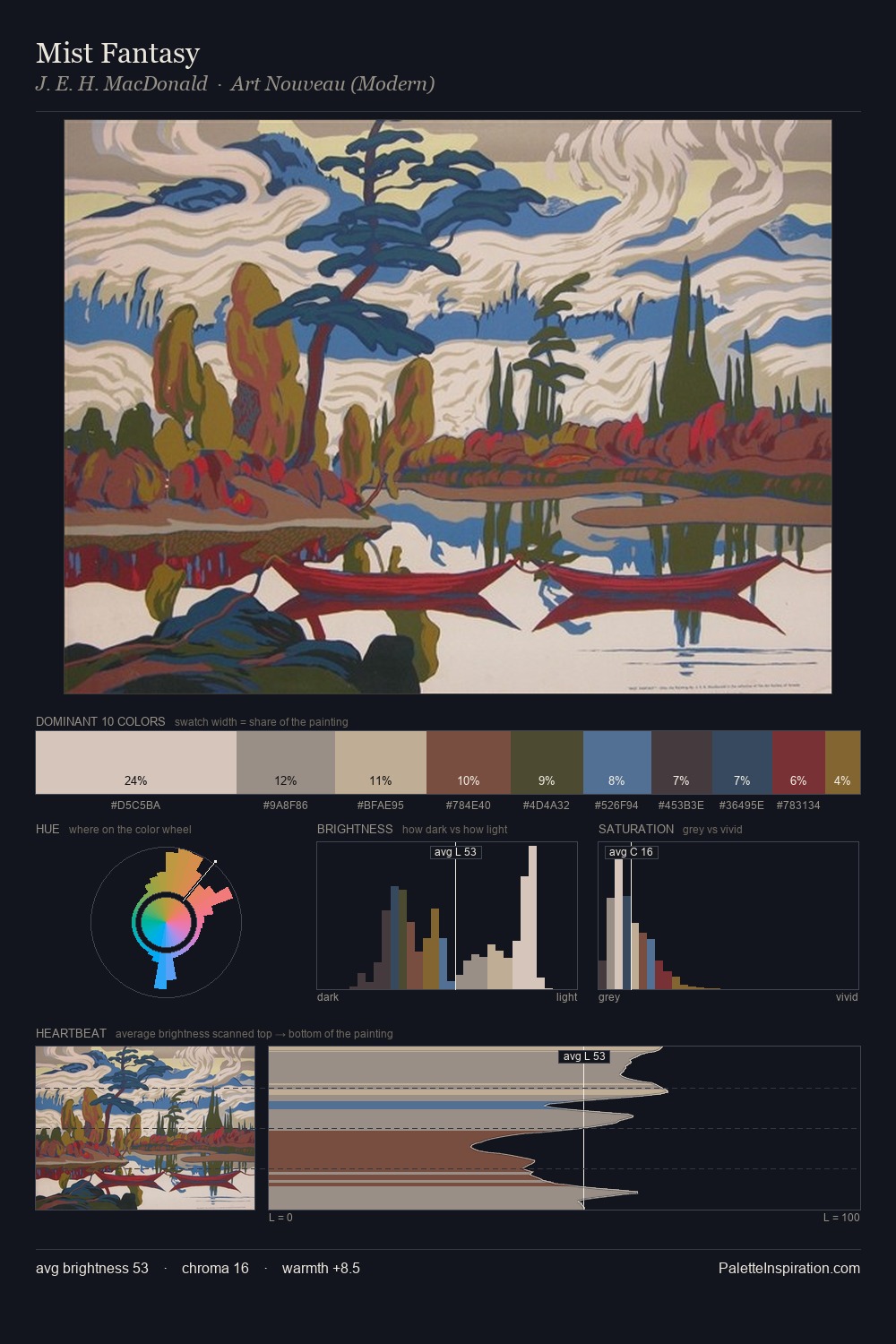
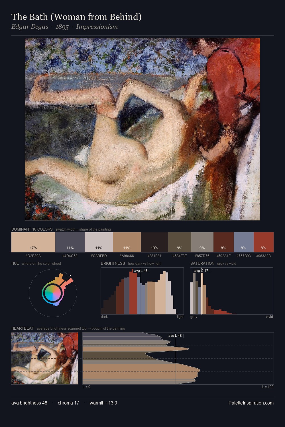
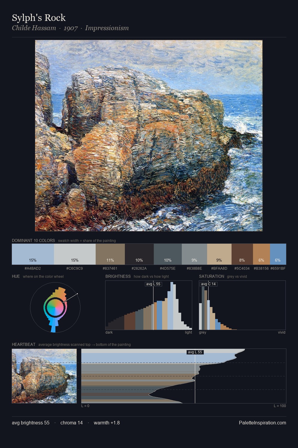
Johann Jakob Zeiller works in the upper reaches of the value scale, creating an atmosphere of brightness and expansiveness. The palette achieves thermal balance - reds and blues, ochres and greens, each holding the other in check. The absence of saturated colour is itself an expressive choice: this is a palette of restraint and atmosphere. Johann Jakob Zeiller gives 25.4% of the composition to a single #B5B3BA - a decisive chromatic anchor. The saturated accent, #AA7B49, registers at 5.9% - sparse enough to feel like a deliberate surprise. Value range is moderate at 53 units - enough contrast for legibility, not so much as to fragment the tonal unity. In the context of Johann Jakob Zeiller's full range of palettes, group 1 represents one movement in an ongoing chromatic dialogue.
Example use cases
- exhibition design
- foundation branding
- estate management
- art education
- museums & galleries
I Love This!
Copy, export, or download for your project