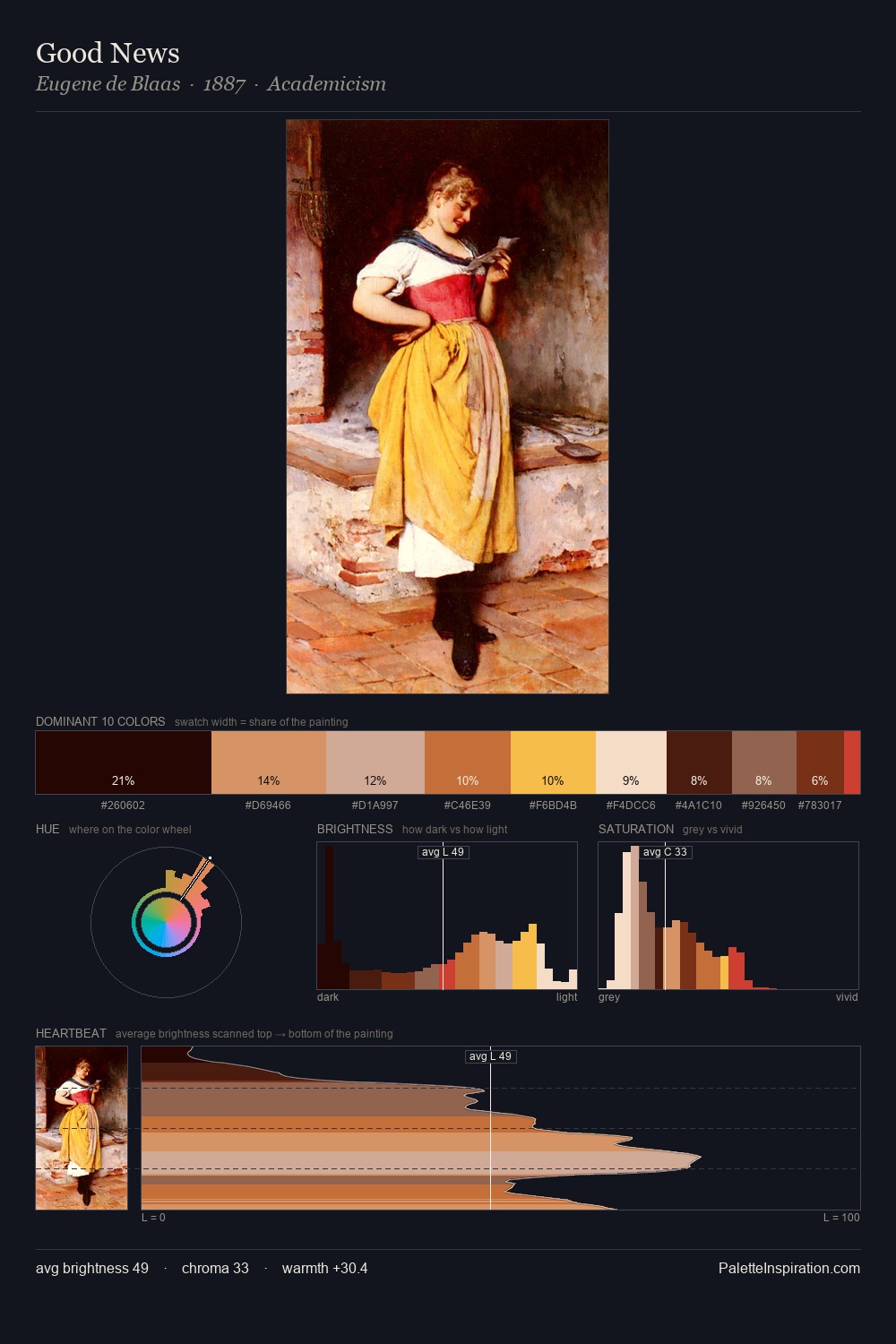
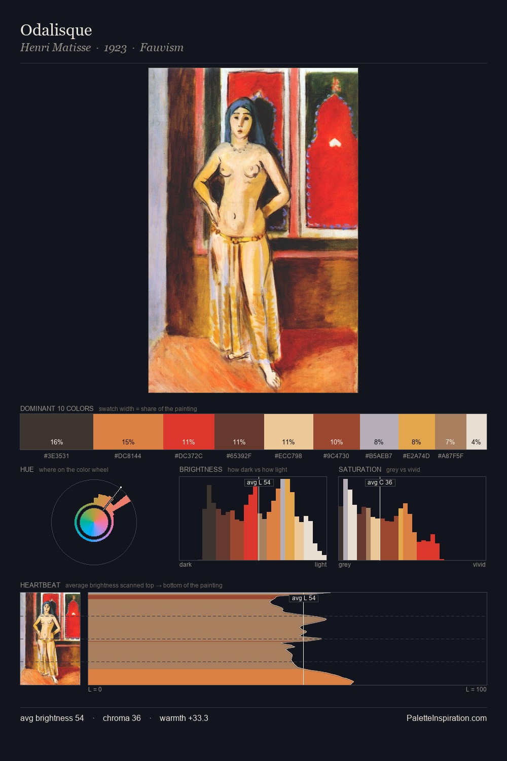
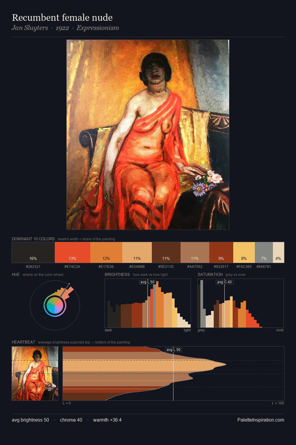
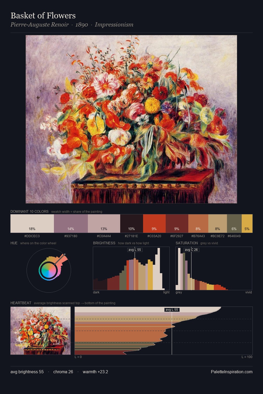
Norman Rockwell Palette 5

Palette Analysis
Norman Rockwell sits in the centre of the value range, lending the palette a sense of even, sustained light. Warmth dominates - the palette of Norman Rockwell leans heavily on the yellow-orange-red arc of the colour wheel. Saturation is measured and controlled, giving the palette presence without visual aggression. A single dominant - #DDC6B6 at 26.6% - sets the character of the whole composition. At 1.9%, #E6B24E carries the palette's sharpest chromatic charge: an accent that earns its place precisely because it is withheld. The full value range is 76 units: broad enough to build convincing three-dimensional form. Norman Rockwell's palette 5 carries its own internal logic while remaining in conversation with the artist's broader colour intelligence.
Example use cases
- publishing
- corporate identity
- consumer apps
- hospitality
- design agencies
I Love This!
Copy, export, or download for your project