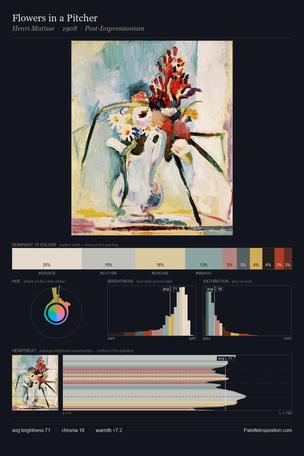
Norman Rockwell Palette 4

Palette Analysis
Norman Rockwell works in the upper reaches of the value scale, creating an atmosphere of brightness and expansiveness. Warmth dominates - the palette of Norman Rockwell leans heavily on the yellow-orange-red arc of the colour wheel. Muted throughout, the palette achieves its effects through value and temperature rather than chromatic force. At 30.0%, #F3DDD3 functions less as a colour accent and more as a complete atmospheric environment. The most saturated colour, #5C2219, is reserved to 5.7% of the surface, where it acts as a focal punctuation. A value spread of 72 units gives the palette both depth and air - shadows are genuinely dark, lights genuinely light. Palette 4 sits within the larger chromatic argument that Norman Rockwell's complete body of work advances.
Example use cases
- craft & artisan brands
- specialty coffee
- home goods
- lifestyle retail
- ceramics & pottery
I Love This!
Copy, export, or download for your project