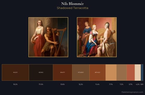
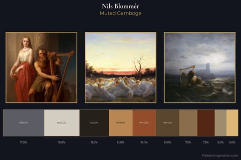
Nils Blommér Palette 3
Palette Analysis
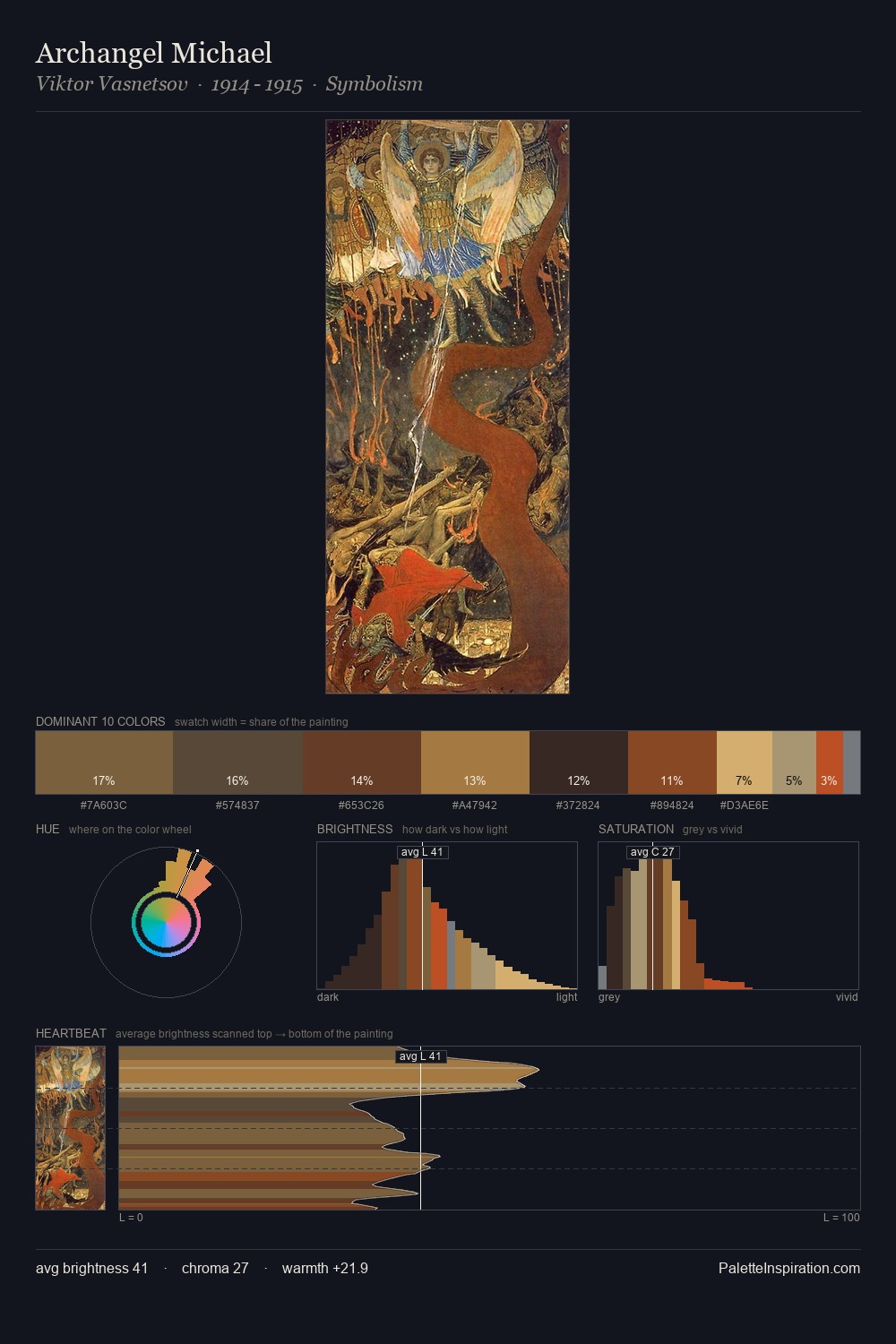
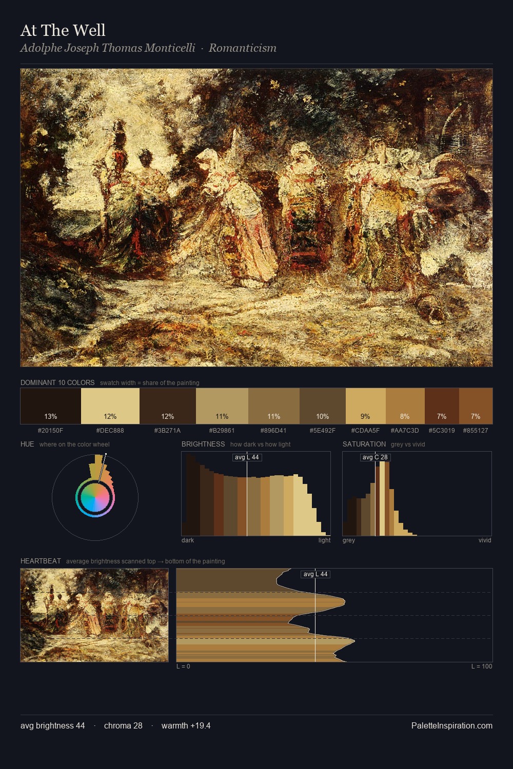
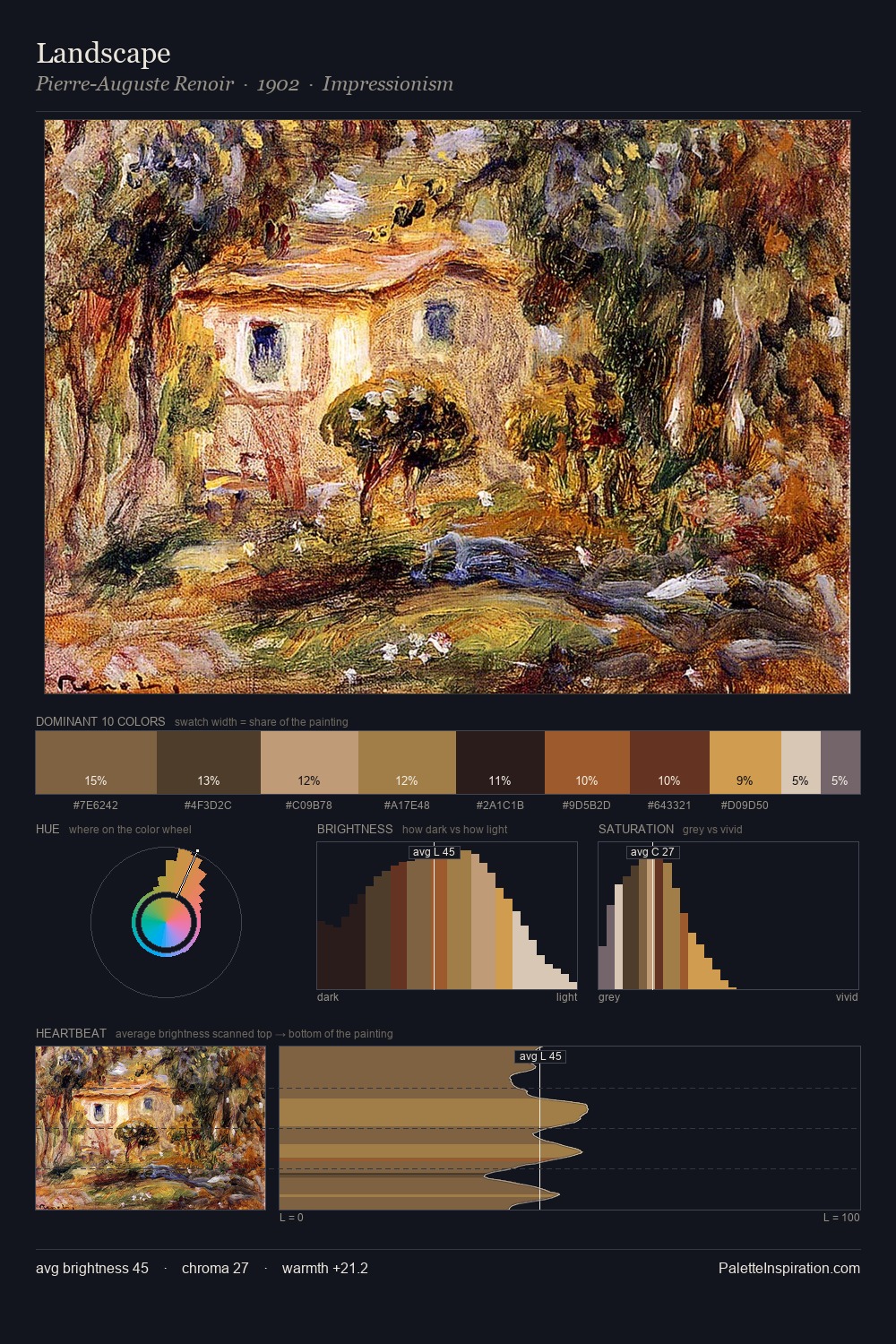
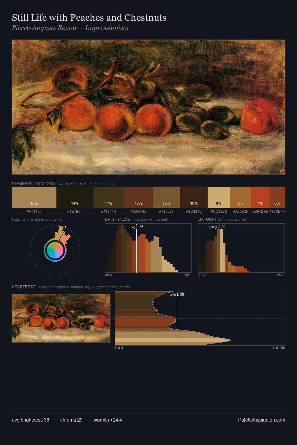
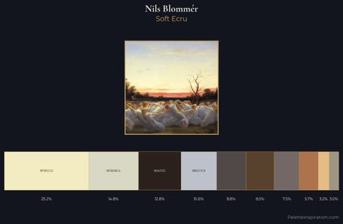
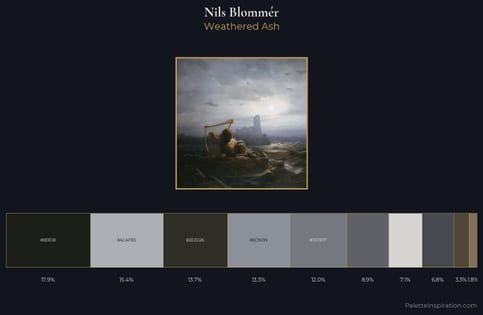
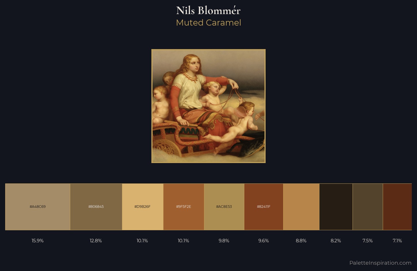
Nils Blommér sits in the centre of the value range, lending the palette a sense of even, sustained light. Nils Blommér balances warm and cool with remarkable evenness, giving the composition its characteristic vibrancy. Colours are neither washed out nor blazing; they occupy the productive middle ground of the chroma scale. The highest-chroma note - #5B2B16 - appears at just 7.1%, deployed as a precision accent against the quieter ground. Spanning 54 units on the value axis, the palette achieves the balance between tonal flatness and fragmentation. The palette reads as an Impressionist one - light-biased, chromatically direct, and built on temperature contrast rather than value opposition. Palette 3 sits within the larger chromatic argument that Nils Blommér's complete body of work advances.
Example use cases
- ceramics & pottery
- boutique hospitality
- menswear
- heritage food brands
- craft & artisan brands
I Love This!
Copy, export, or download for your project