Nikolai Kulbin Palette 1
Gleaming Ecru
Gleaming Bright and polished - high-key, often warm, suggesting reflective or luminous surfaces.
Ecru Unbleached linen - warm mid-neutral, slightly grayed, raw and natural.

Palette Analysis
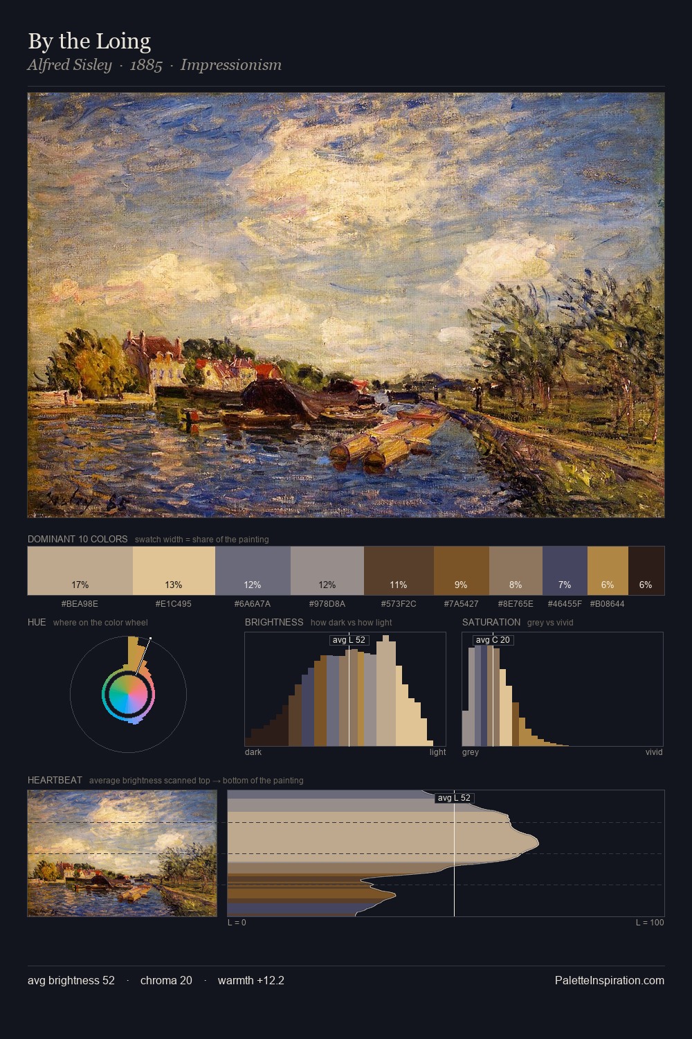
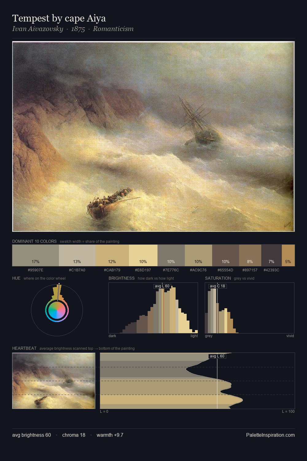
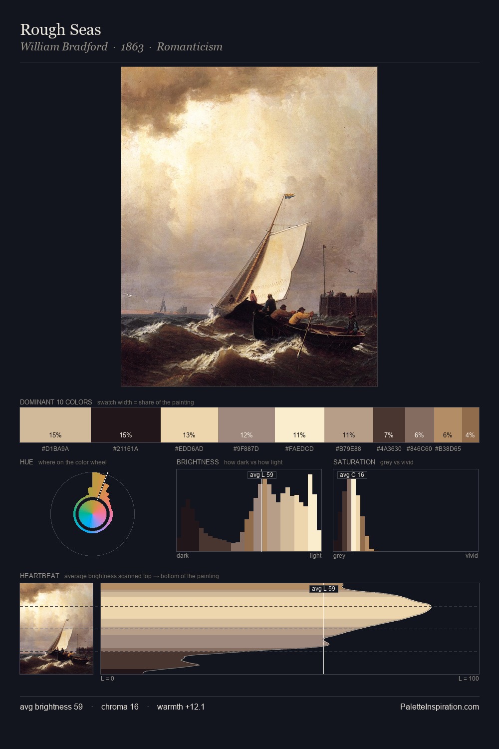
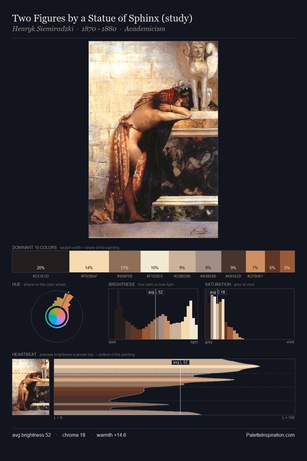
Nikolai Kulbin is high-key - luminous, open, and weighted toward light. The palette achieves thermal balance - reds and blues, ochres and greens, each holding the other in check. Every colour is desaturated; the palette proceeds through near-neutrals and gently-coloured greys. The most saturated colour, #B6A28D, is reserved to 7.3% of the surface, where it acts as a focal punctuation. At 54 units across the value scale, the palette keeps contrast readable without letting it dominate. In the context of Nikolai Kulbin's full range of palettes, group 1 represents one movement in an ongoing chromatic dialogue.
Example use cases
- art galleries
- creative studios
- consumer goods
- lifestyle media
- professional services
I Love This!
Use This Palette
Copy, export, or download for your project
Copy, export, or download for your project
Copy:
Download:
Share: