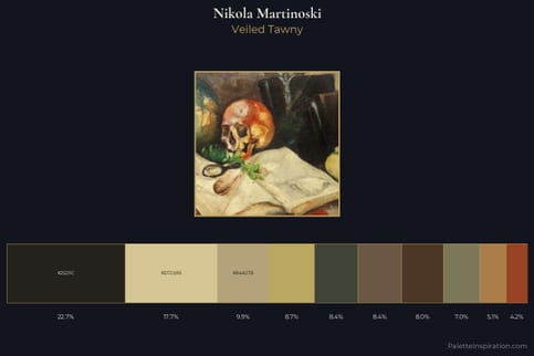
Nikola Martinoski Palette 1
Veiled Tawny
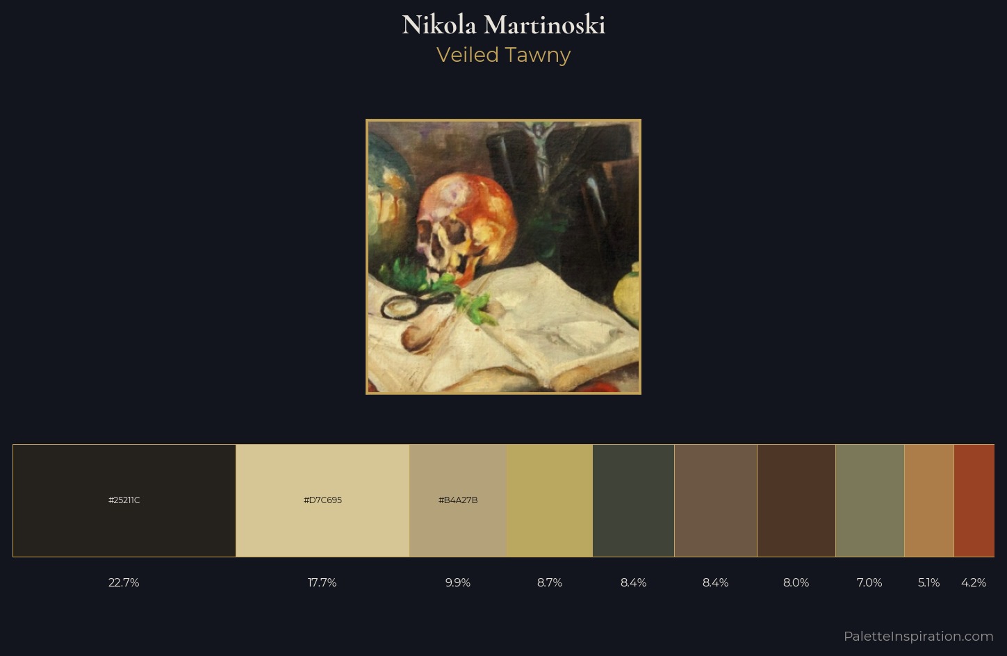
Veiled Partially obscured light - mid-dark with a hazy, scrim-filtered quality.
Tawny Warm orange-brown - a traditional term for the color of tanned leather or lion fur.
Palette Analysis
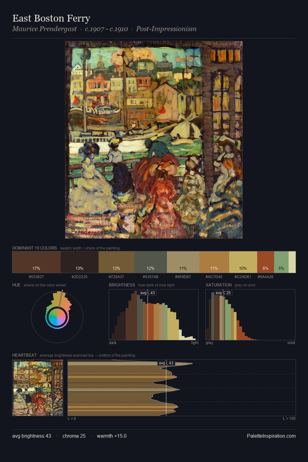
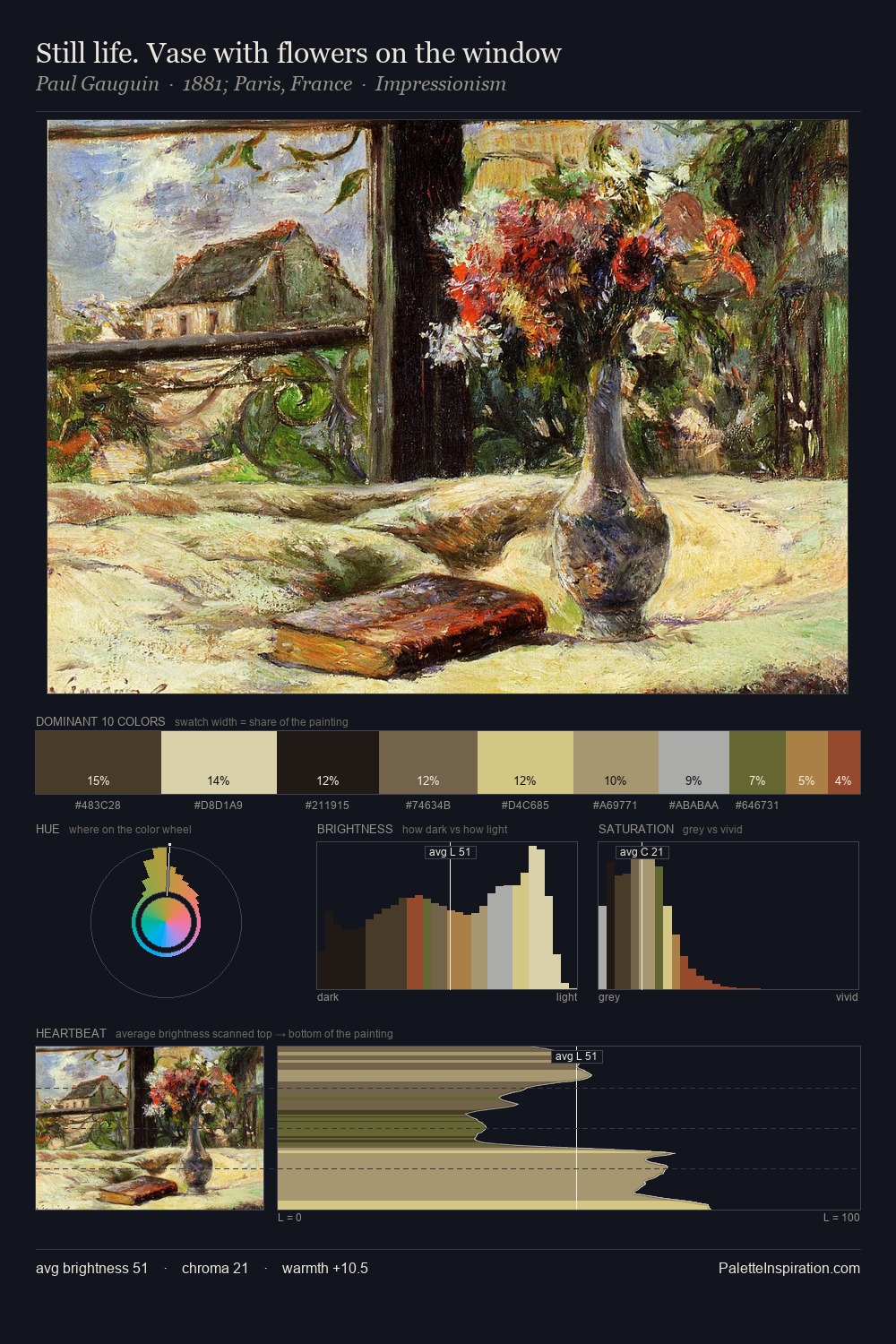
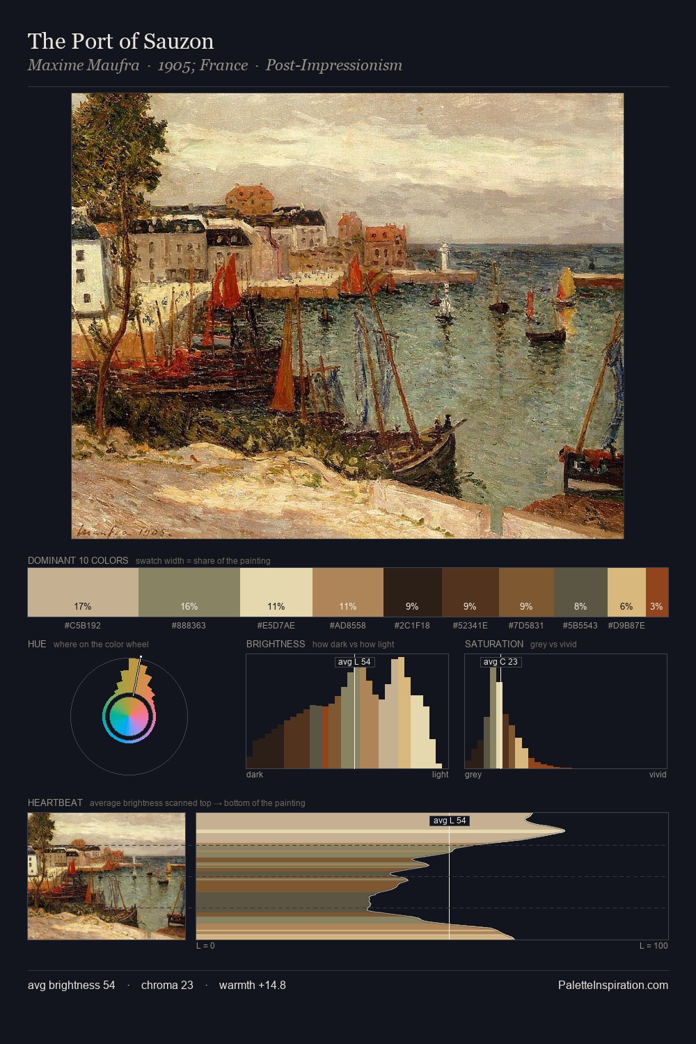
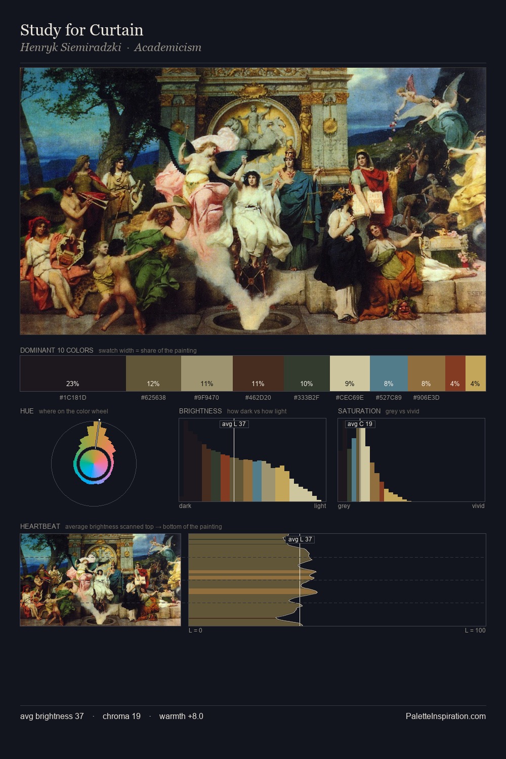
Nikola Martinoski occupies the comfortable middle of the value scale, avoiding both extremes to hold the eye in a sustained middle grey. Warm and cool tones are held in careful balance - neither family dominates, creating tension and resolution simultaneously. Every colour is desaturated; the palette proceeds through near-neutrals and gently-coloured greys. The highest-chroma note - #AD7D49 - appears at just 5.1%, deployed as a precision accent against the quieter ground. From deepest dark to palest light, the palette traverses 58 units of the value scale - a span that creates natural depth. This is palette 1 of Nikola Martinoski's sequence - a single chapter in a chromatic story told across many works.
Example use cases
- theater design
- jewelry brands
- tobacco-adjacent retail
- event branding
- film & entertainment
I Love This!
Use This Palette
Copy, export, or download for your project
Copy, export, or download for your project
Copy:
Download:
Share: