Nikifor Krynicki Palette 4

Palette Analysis
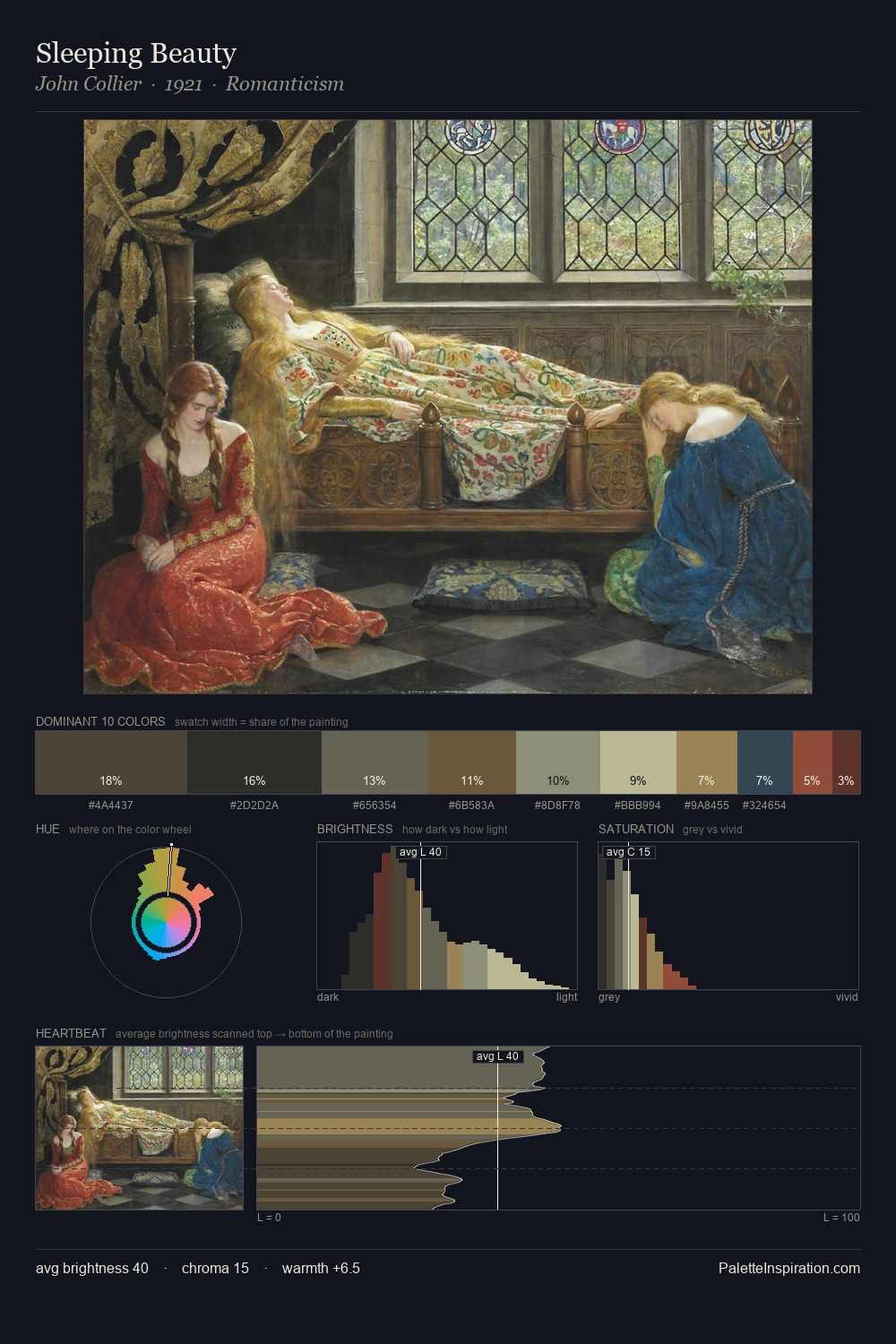
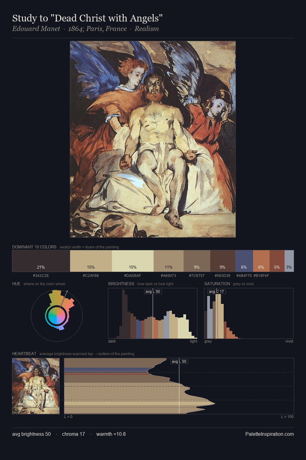
Nikifor Krynicki keeps values measured and balanced, a hallmark of tonal restraint. Nikifor Krynicki builds on cool foundations: the palette favours the blue-cyan-green arc. Saturation is deliberately withheld - the beauty here lies in the near-monochromatic gradations rather than colour difference. #BCC3B0 at 26.6% of the palette: an overwhelming presence that pulls all other colours into its gravitational field. #AA9174 functions as the palette's exclamation mark: highest chroma, lowest percentage (7.3%). Spanning 53 units on the value axis, the palette achieves the balance between tonal flatness and fragmentation. The mid-to-high key, cool bias, and moderate chroma point to outdoor observation - sky and diffused daylight as the dominant light source. Nikifor Krynicki's palette 4 carries its own internal logic while remaining in conversation with the artist's broader colour intelligence.
Example use cases
- exhibition design
- foundation branding
- estate management
- art education
- museums & galleries
I Love This!
Copy, export, or download for your project