Nicolae Tonitza Palette 10

Palette Analysis
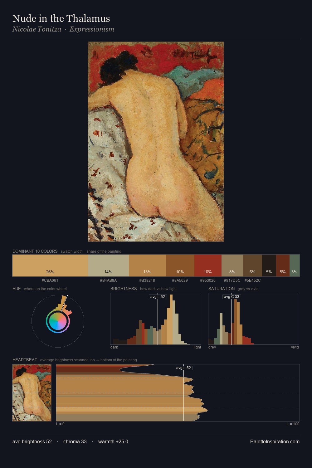
Values in Nicolae Tonitza rest in the mid-range - neither dramatically lit nor steeped in shadow. Nicolae Tonitza balances warm and cool with remarkable evenness, giving the composition its characteristic vibrancy. Colours are neither washed out nor blazing; they occupy the productive middle ground of the chroma scale. #CEA466 at 27.1% of the palette: an overwhelming presence that pulls all other colours into its gravitational field. The most saturated colour, #6A3A1E, is reserved to 6.5% of the surface, where it acts as a focal punctuation. The palette spans 52 value units: a measured range that delivers coherence over drama. The palette reads as an Impressionist one - light-biased, chromatically direct, and built on temperature contrast rather than value opposition. Palette 10 sits within the larger chromatic argument that Nicolae Tonitza's complete body of work advances.
Example use cases
- interior design
- furniture brands
- cookbook publishing
- wine & spirits
- food packaging
I Love This!
Copy, export, or download for your project