Nicholas Roerich Master Palette
Dimmed Parchment
Dimmed Moderate shadow - values pulled toward mid-dark, as if a light source has been reduced.
Parchment Aged warm neutral - the color of old manuscript parchment, tan and slightly yellowed.

Palette Analysis
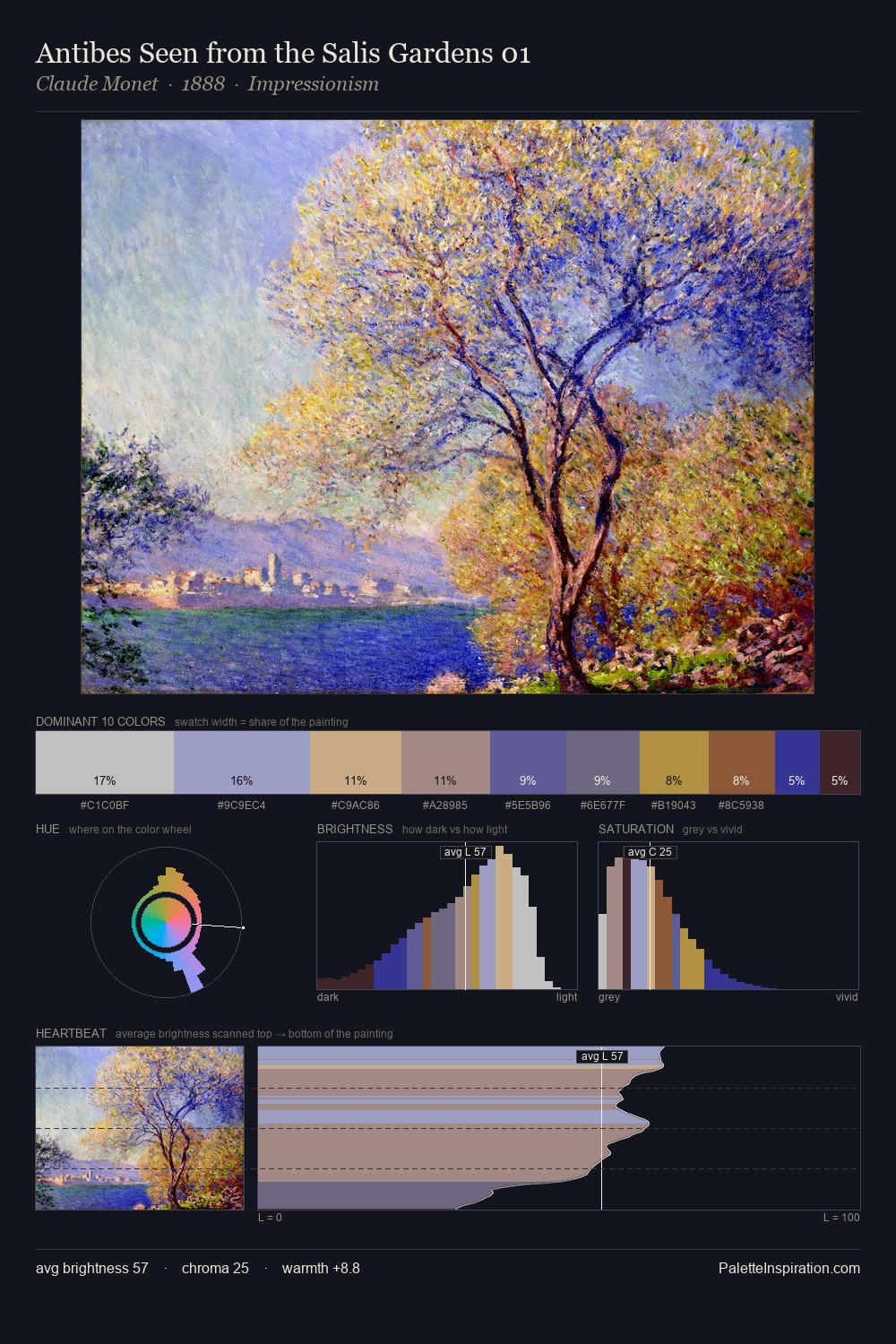
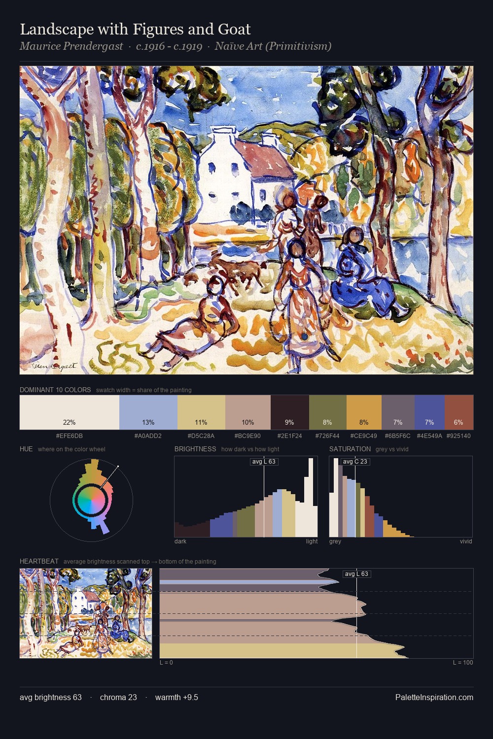
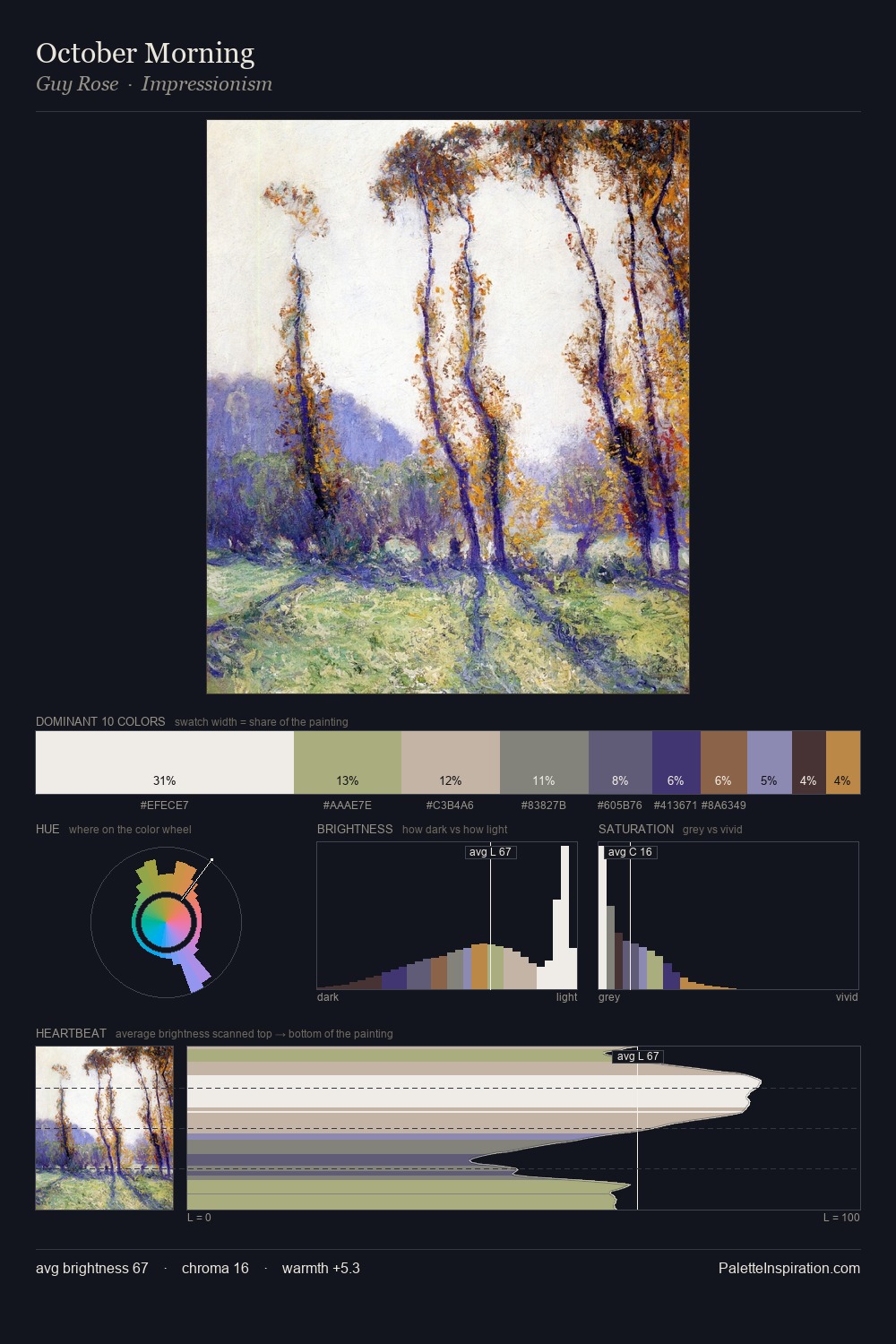
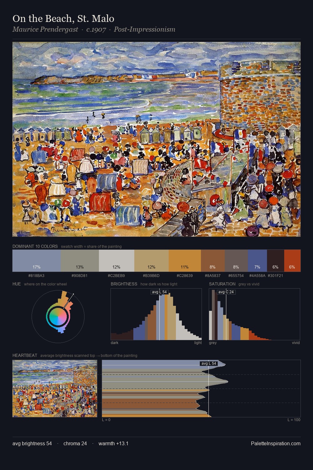
Values in Nicholas Roerich rest in the mid-range - neither dramatically lit nor steeped in shadow. Warm and cool are kept in productive tension, creating the kind of chromatic harmony that sustains the eye. Chroma is kept low across all colours, producing the soft, enveloping quality that characterises tonal painting. The saturated accent, #D6BD92, registers at 4.1% - sparse enough to feel like a deliberate surprise. 55 units of value range underpin the palette's structural clarity: the eye always knows where light falls. The palette is a signature: Nicholas Roerich's particular sense of value, warmth, and colour weight made legible.
Example use cases
- archival print
- university identity
- rare books
- cultural institutions
- nonprofit identity
I Love This!
Use This Palette
Copy, export, or download for your project
Copy, export, or download for your project
Copy:
Download:
Share: