Niccolo Cannicci Palette 5

Palette Analysis
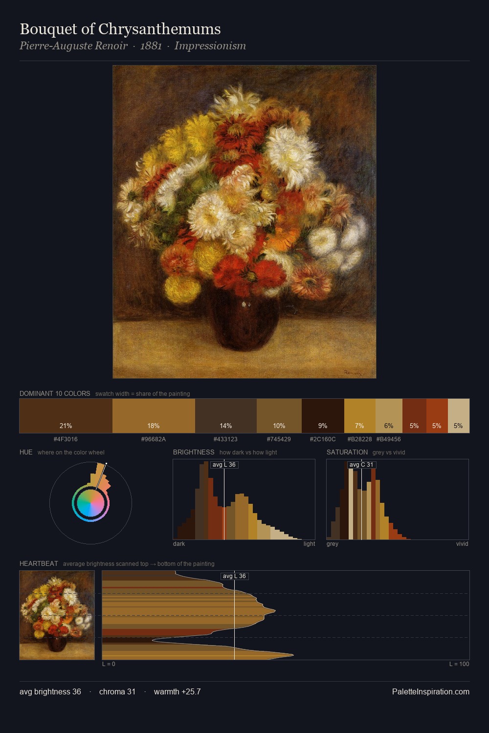
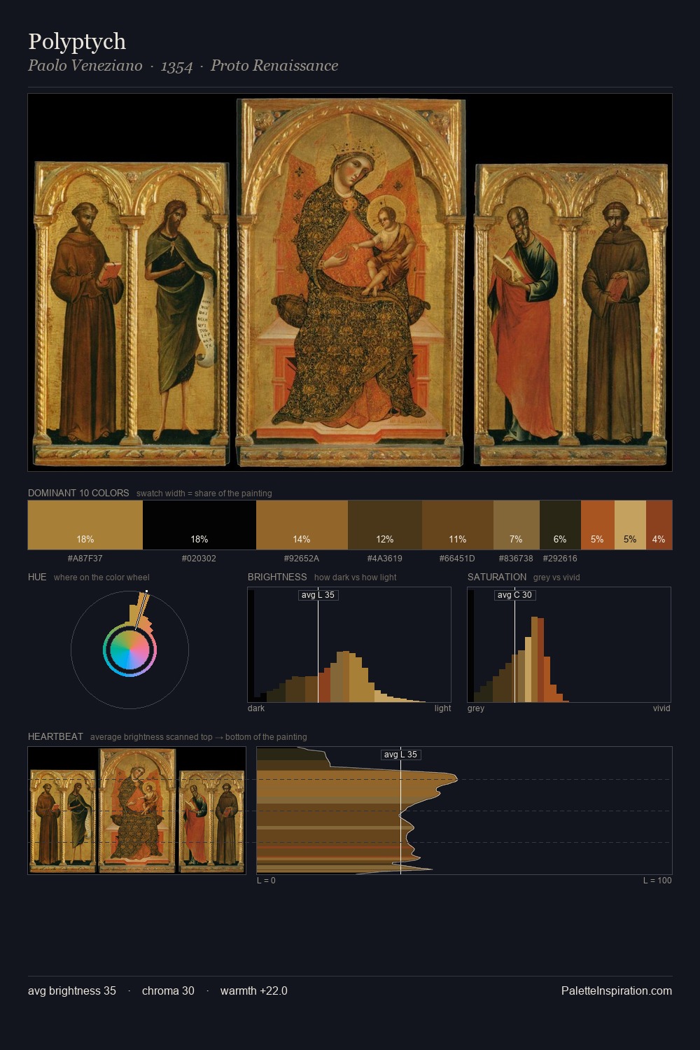
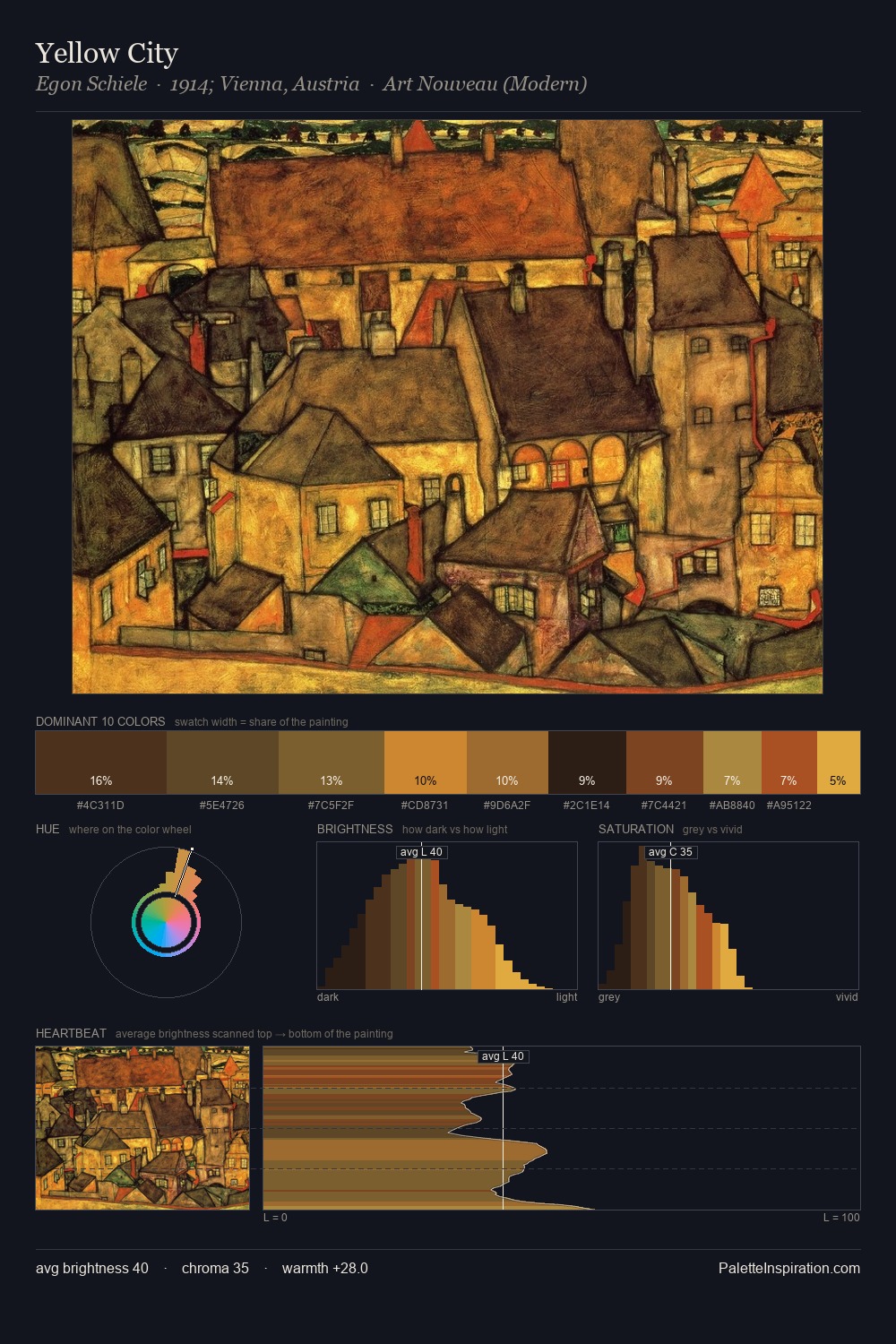
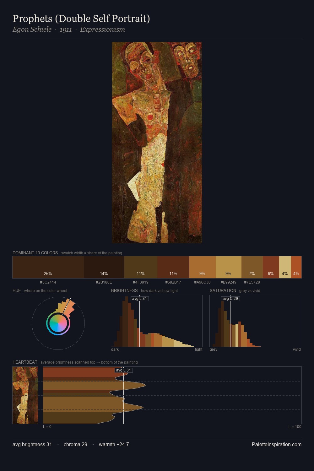
Niccolo Cannicci occupies the comfortable middle of the value scale, avoiding both extremes to hold the eye in a sustained middle grey. Niccolo Cannicci balances warm and cool with remarkable evenness, giving the composition its characteristic vibrancy. Colours are neither washed out nor blazing; they occupy the productive middle ground of the chroma scale. The most saturated colour, #513314, is reserved to 13.9% of the surface, where it acts as a focal punctuation. 39 units of value spread create a palette that is varied but unified - contrast in the service of harmony. The palette reads as an Impressionist one - light-biased, chromatically direct, and built on temperature contrast rather than value opposition. This is palette 5 of Niccolo Cannicci's sequence - a single chapter in a chromatic story told across many works.
Example use cases
- theater design
- jewelry brands
- tobacco-adjacent retail
- event branding
- film & entertainment
I Love This!
Copy, export, or download for your project