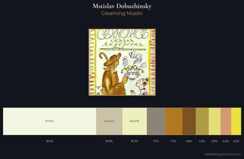
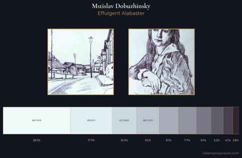
Mstislav Dobuzhinsky Palette 3
Pale Ecru
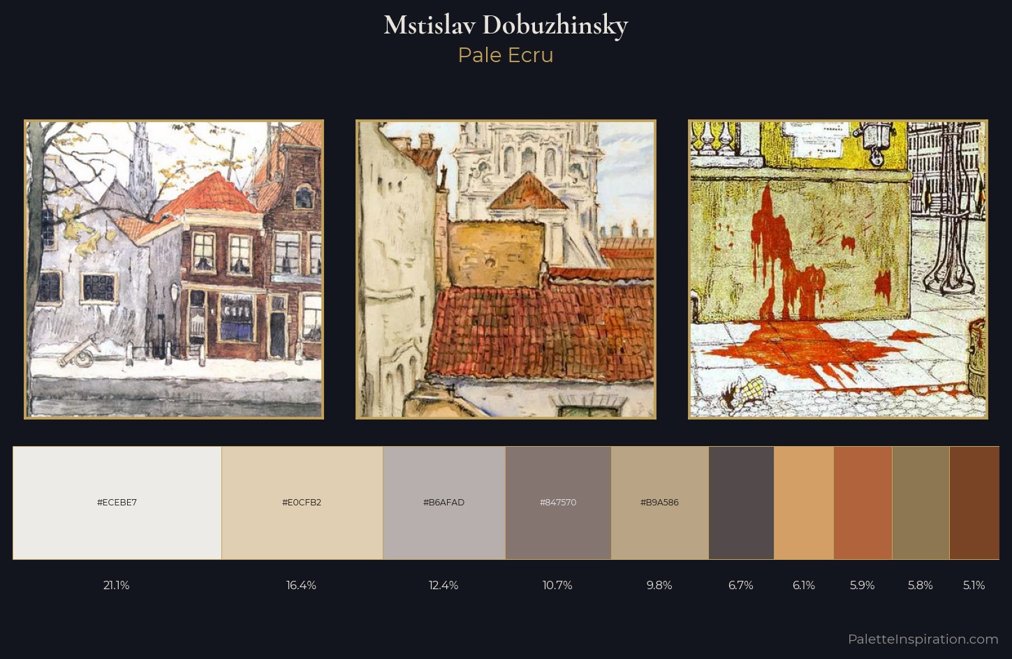
Pale High-key and low-chroma - delicate, bleached, washed with light.
Ecru Unbleached linen - warm mid-neutral, slightly grayed, raw and natural.
Palette Analysis
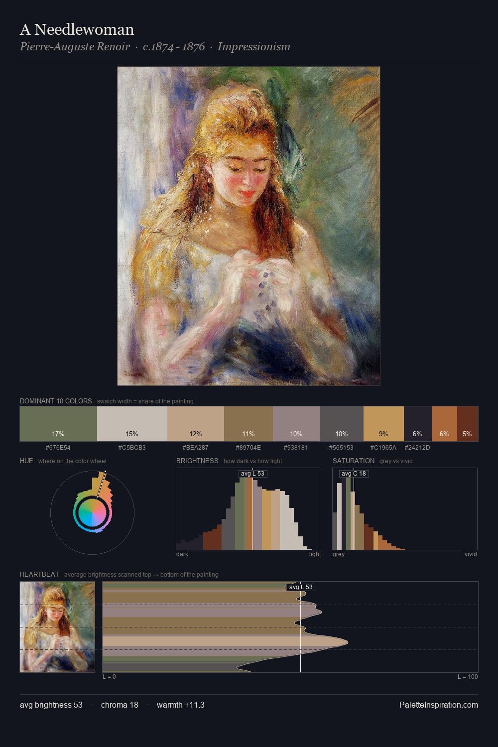
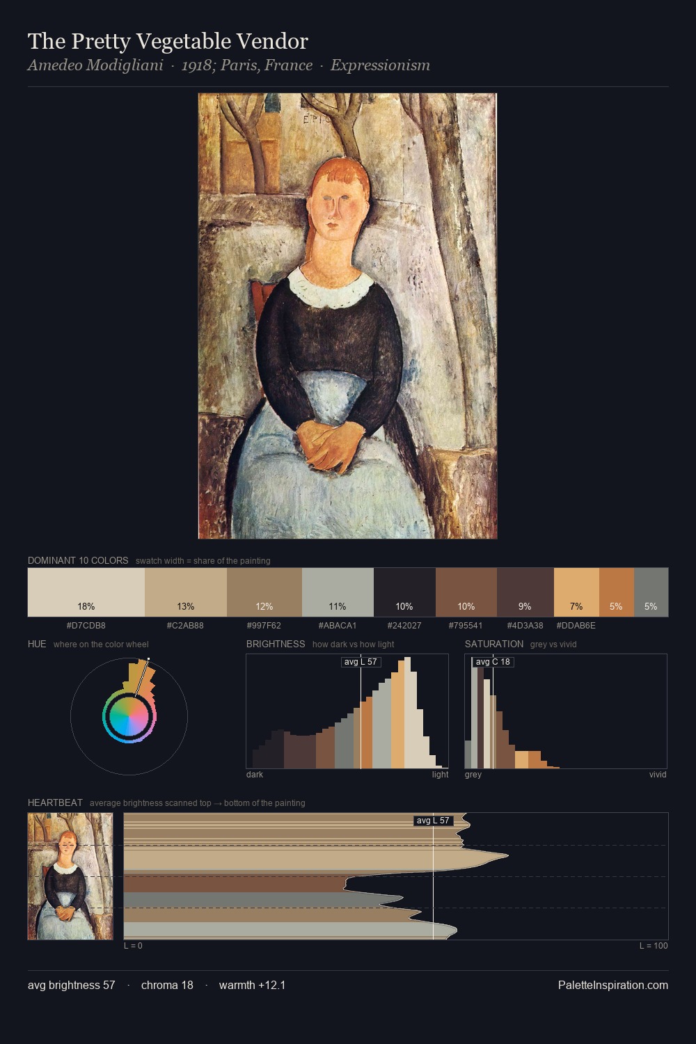
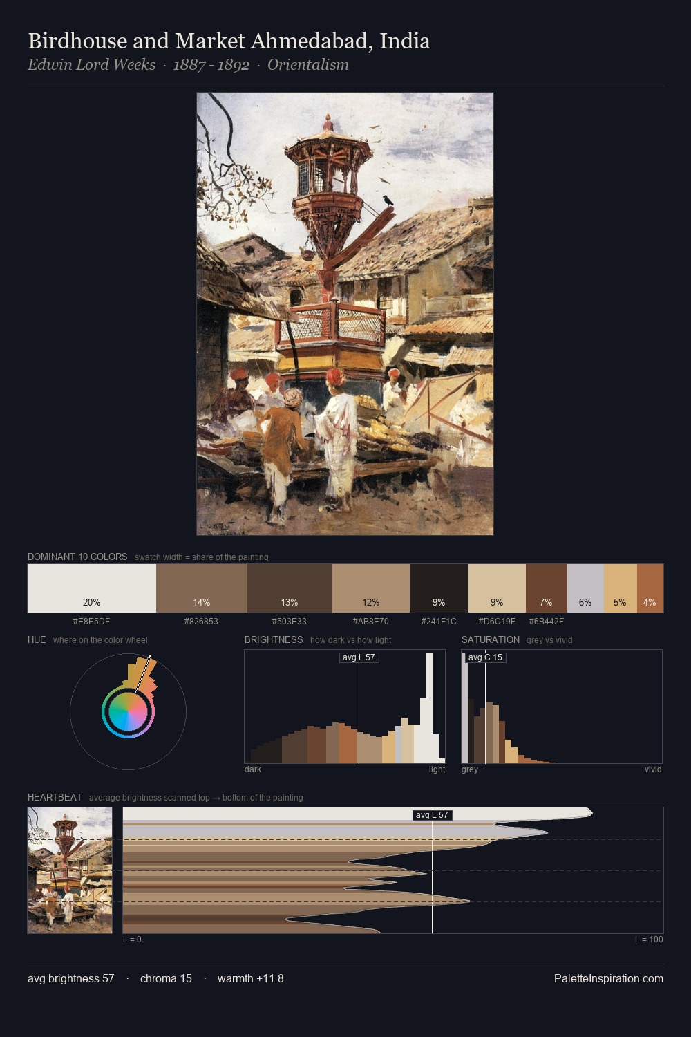
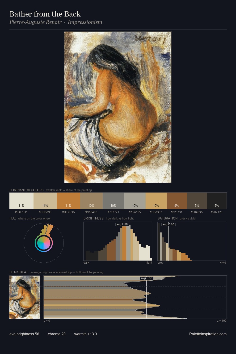
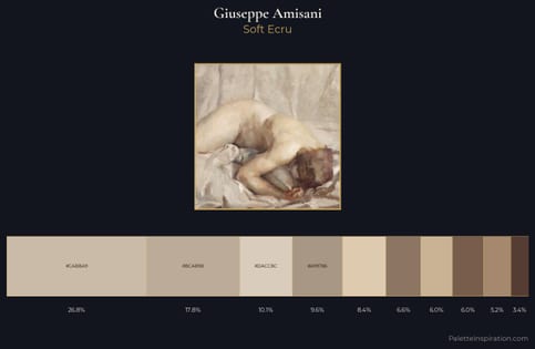
Light floods Mstislav Dobuzhinsky; the palette keeps values pale and airy across its range. Warm and cool are kept in productive tension, creating the kind of chromatic harmony that sustains the eye. The absence of saturated colour is itself an expressive choice: this is a palette of restraint and atmosphere. Only 5.1% is devoted to #794325, yet that small allocation delivers the palette's entire chromatic tension. Value range is moderate at 52 units - enough contrast for legibility, not so much as to fragment the tonal unity. Mstislav Dobuzhinsky's palette 3 carries its own internal logic while remaining in conversation with the artist's broader colour intelligence.
Example use cases
- ceramics & pottery
- boutique hospitality
- menswear
- heritage food brands
- craft & artisan brands
I Love This!
Use This Palette
Copy, export, or download for your project
Copy, export, or download for your project
Copy:
Download:
Share: