Mozarabic Master Palette

Palette Analysis
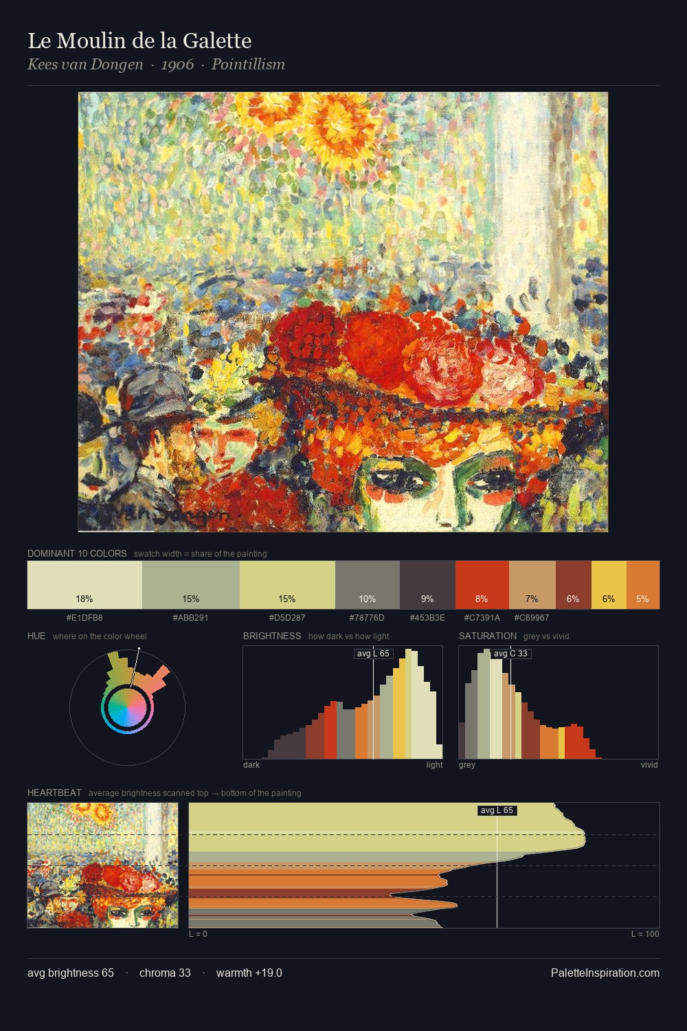
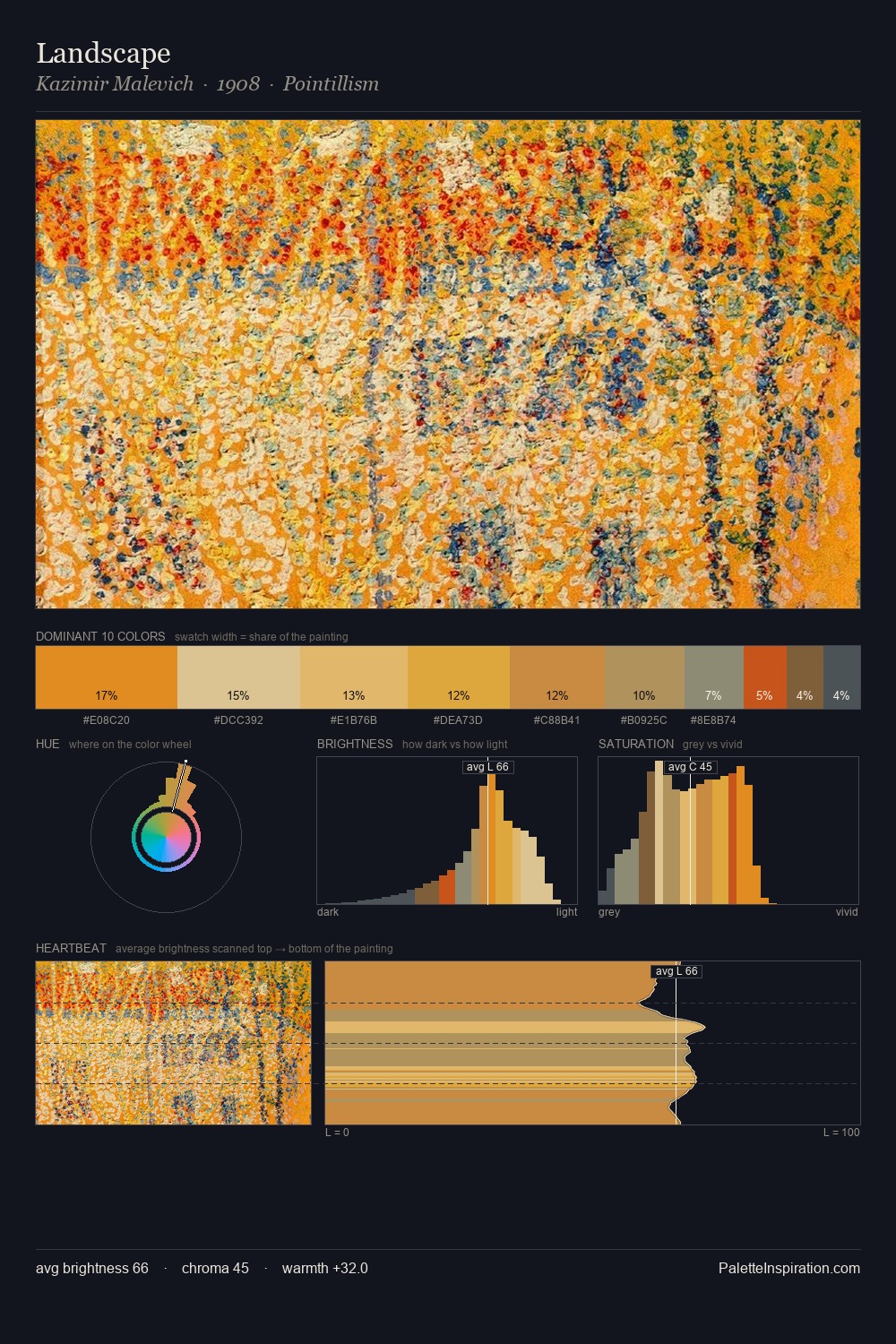
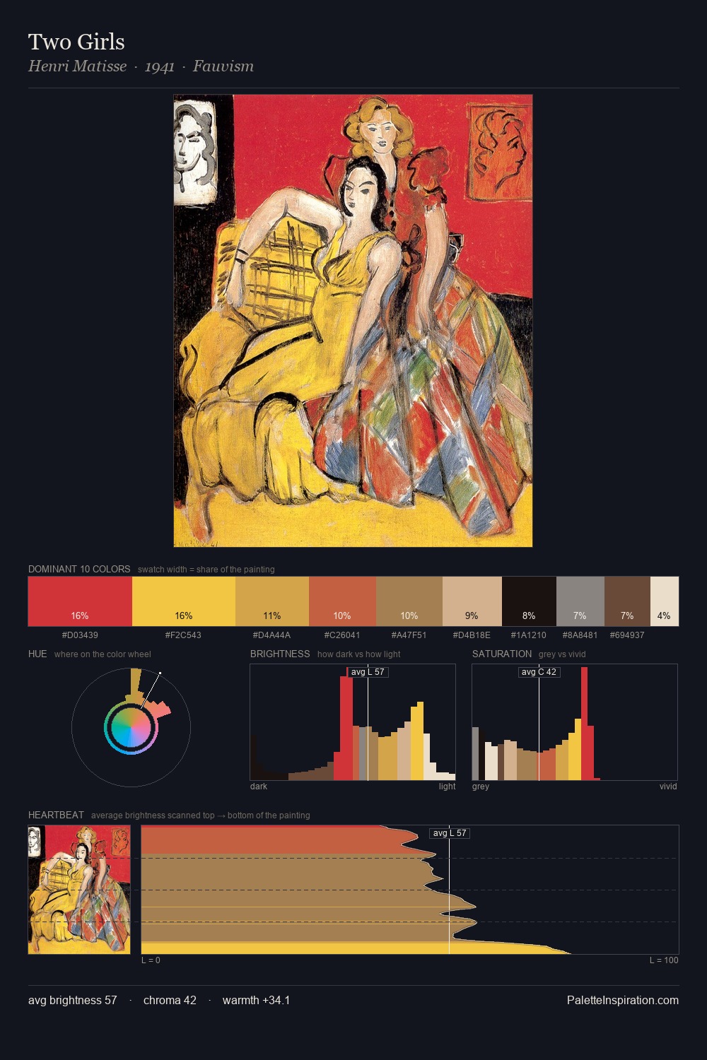
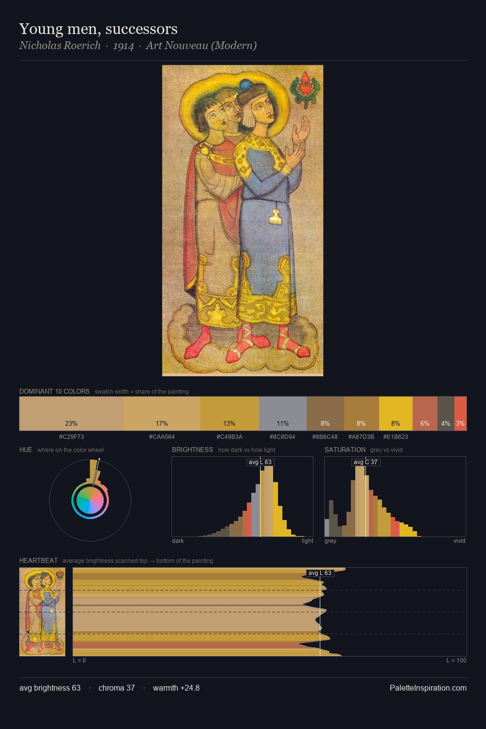
Mozarabic painters returned to these tonal relationships repeatedly; this palette is their shared chromatic grammar. Mozarabic sits in the centre of the value range, lending the palette a sense of even, sustained light. The palette achieves thermal balance - reds and blues, ochres and greens, each holding the other in check. A restrained, mid-chroma palette: every hue is present and legible, but nothing shouts. The most saturated colour, #DAA23E, is reserved to 7.1% of the surface, where it acts as a focal punctuation. 46 units of value spread create a palette that is varied but unified - contrast in the service of harmony. The palette reads as an Impressionist one - light-biased, chromatically direct, and built on temperature contrast rather than value opposition. The Mozarabic movement spoke in this palette's vocabulary.
Example use cases
- ceramics & pottery
- boutique hospitality
- menswear
- heritage food brands
- craft & artisan brands
I Love This!
Copy, export, or download for your project