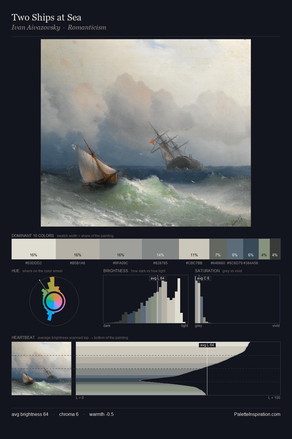
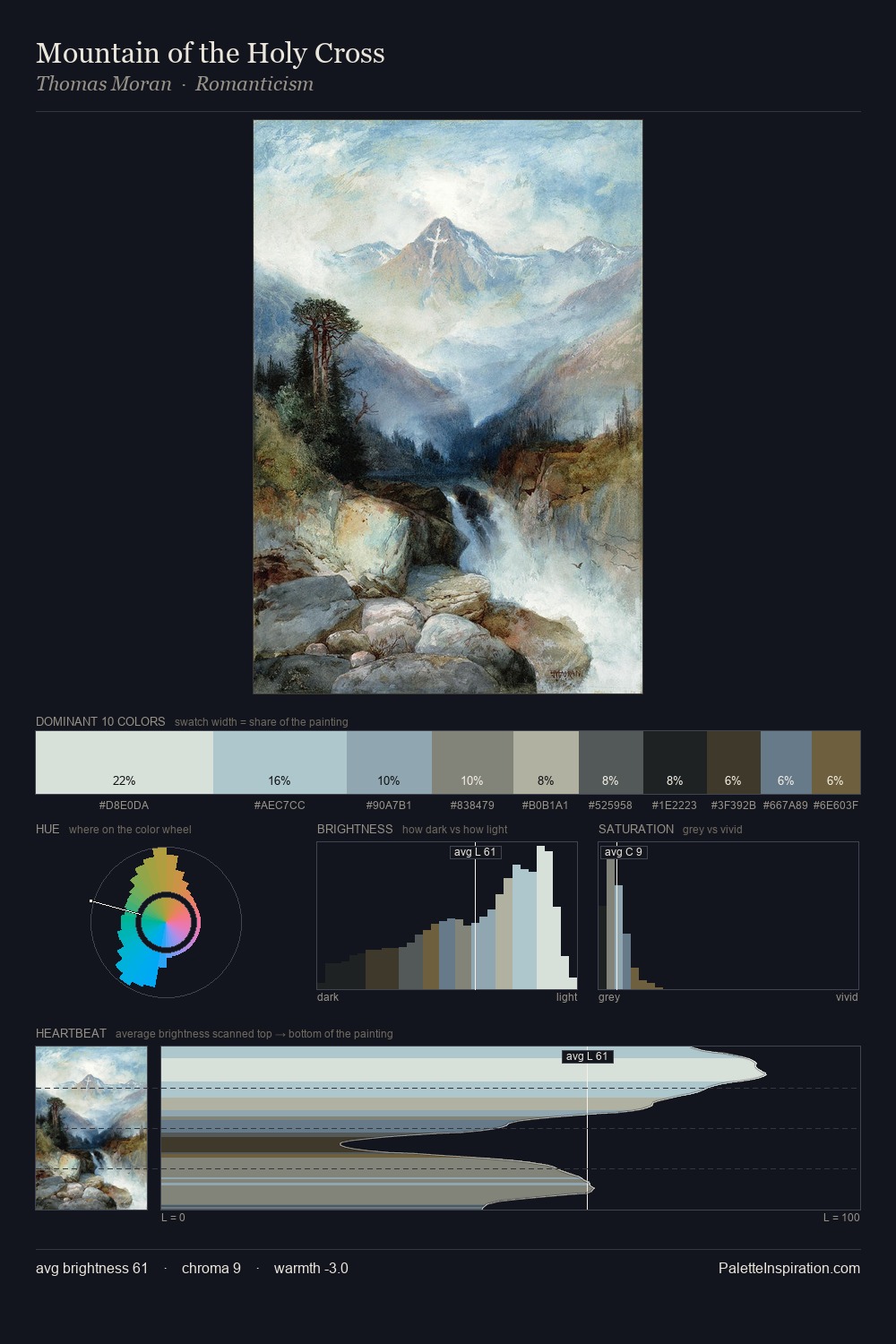
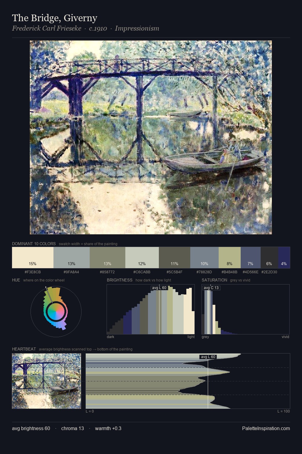
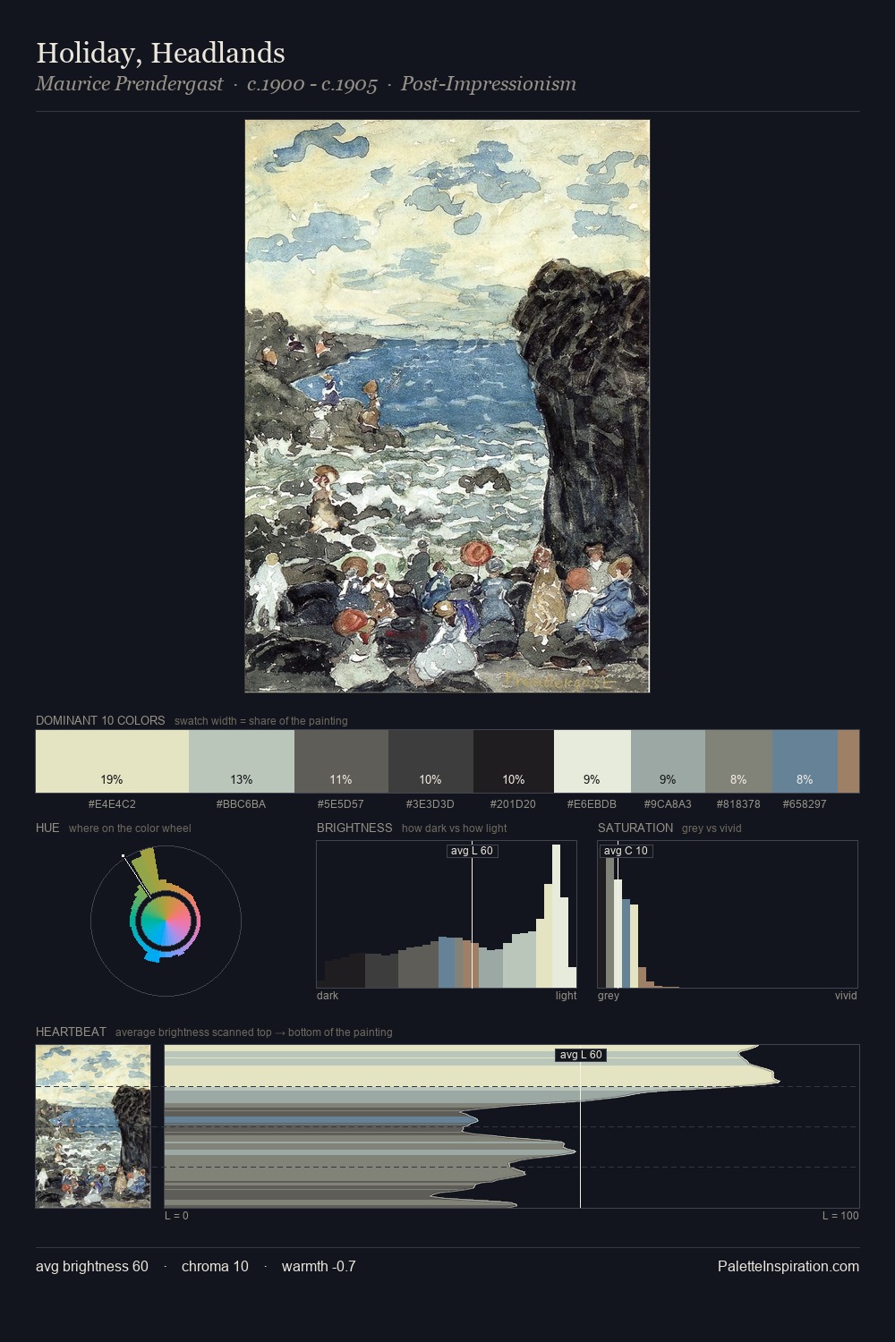
Moritz Müller II Palette 1
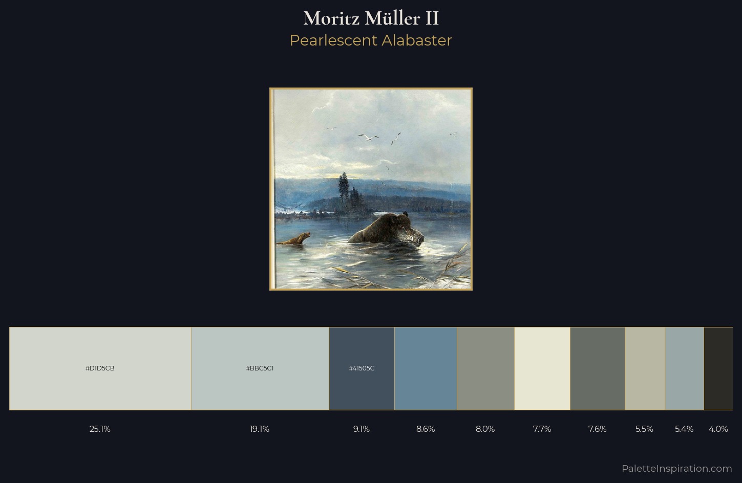
Palette Analysis
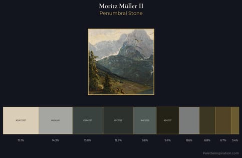
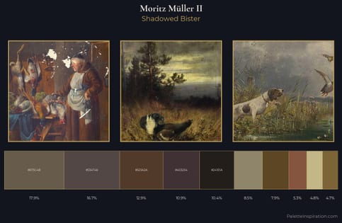
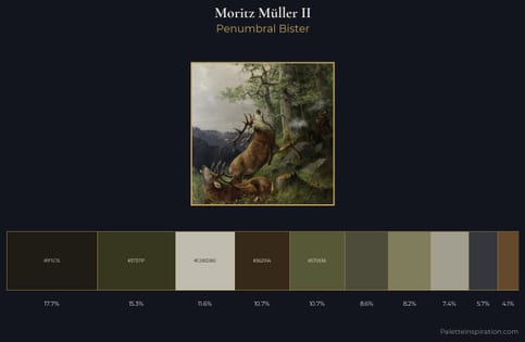
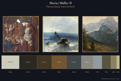
Moritz Müller II is high-key - luminous, open, and weighted toward light. Moritz Müller II tilts toward cool - blues and silver-greys carry the structural weight. Muted throughout, the palette achieves its effects through value and temperature rather than chromatic force. #D1D5CB at 25.1% of the palette: an overwhelming presence that pulls all other colours into its gravitational field. #E6E6D3 functions as the palette's exclamation mark: highest chroma, lowest percentage (7.7%). 63 units of value range underpin the palette's structural clarity: the eye always knows where light falls. High luminosity and cool temperature suggest the plein-air condition: unfiltered daylight and open sky. Moritz Müller II's palette 1 carries its own internal logic while remaining in conversation with the artist's broader colour intelligence.
Example use cases
- print magazines
- beauty brands
- real estate
- high-end packaging
- editorial design
I Love This!
Copy, export, or download for your project